Configure word cloud widget settings
You can configure the appearance of the words in the word cloud widget.
If the widget configuration dialog box is not already open, do as follows:
If the widget is on a Grid layout dashboard, click the Menu icon
 in the top right-hand corner of the widget and select Settings.
If the widget is on a Fluid layout dashboard, on the floating toolbar for the widget, click the Settings icon:
.
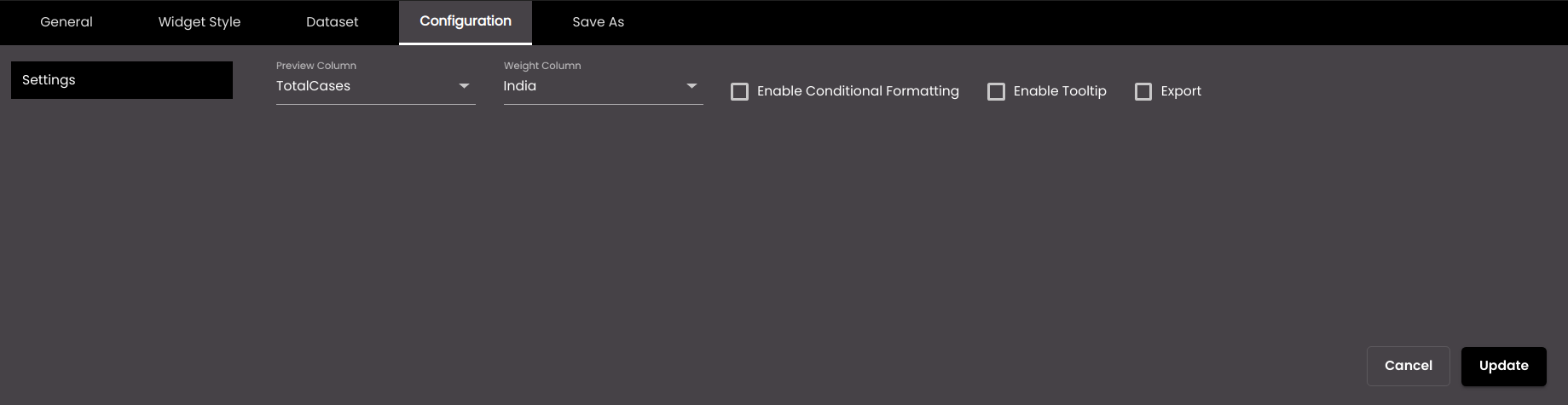
In the widget configuration dialog box, click the Configuration tab.
On the left-hand side, click Settings.
Change the settings as required:
Setting
Description
Preview Column
The dataset field that contains the words to be displayed in this widget.
Weight Column
The dataset field which determines the weight i.e. size of each word displayed in the widget.
Enable Conditional Formatting
Displays the Conditional Formatting setting which is used to configure different colors for words in the widget based on the value of a dataset field.
Export
Displays an Export icon
 in the top right-hand corner of the widget, containing print and export options.
Enable Tooltip
Displays the Tooltip setting which is used to display a tooltip based on the selected dataset field
If Enable Tooltip has been selected above, then configure the tooltip which is displayed when the mouse pointer hovers over a word.
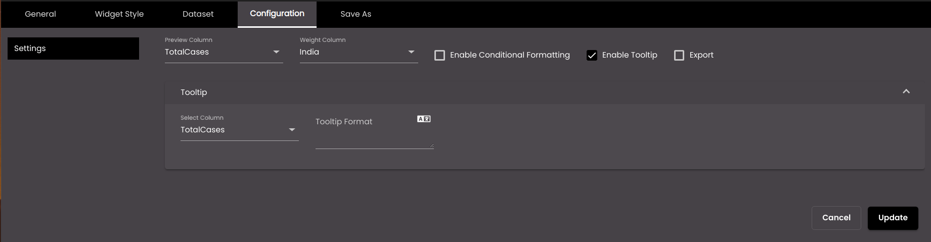
Setting
Description
Select Column
Select a column from the dataset that contains the values to be displayed in the tooltip.
Tooltip Format
The HTML code for the tooltip format.
You can also translate this text by clicking on the Translate icon
 and entering the translation of the desired language selected. Auto-suggestions are also available where the reused contents are auto-suggested.
If Enable Conditional Formatting has been selected above, then configure the formatting options in Conditional Formatting.
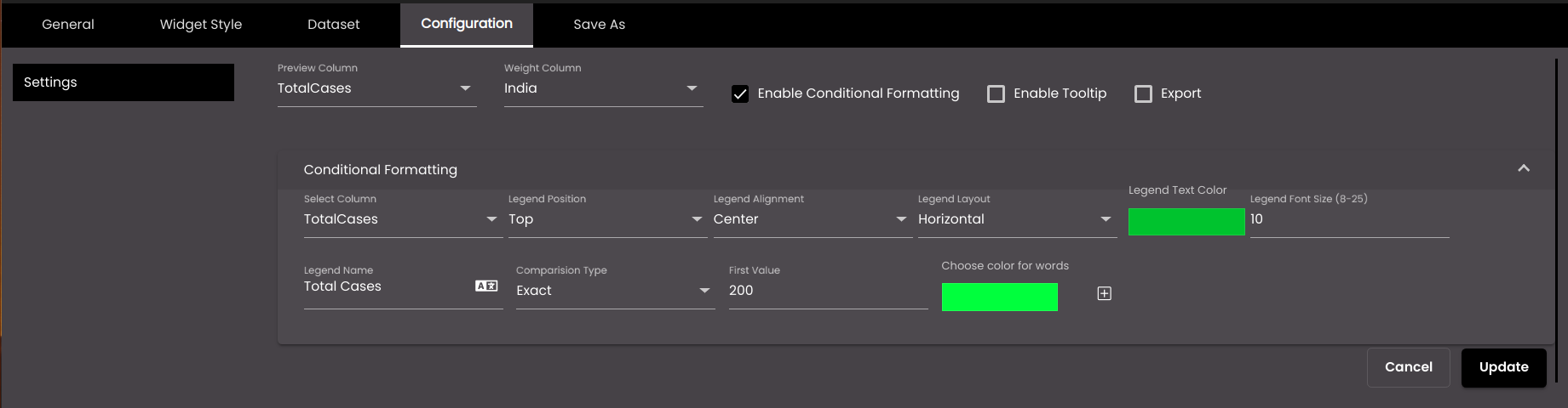
Setting
Description
Select Column
Select a column from the dataset that contains the conditional values to be used to format the words.
Legend Position
Vertical position of the legend. The options are as follows:
Top Legends are displayed at the top.
Bottom Legends are displayed at the bottom.
Legend Alignment
Horizontal position of the legends relative to the word cloud widget. The options are as follows:
Left Legends are positioned to the left of the widget.
Right Legends are positioned to the right of the widget.
Center Legends are positioned in the center of the widget.
Legend Layout
The layout of the legends. The options are as follows:
Horizontal Legends are displayed in a row.
Vertical Legends are stacked in a column.
Legend Text Color
The font color of the legends.
Also, based on the Palette in the Widget Style tab, a set of Preset colors are available to directly choose from, which if selected, change based on the theme.
Legend Font Size
The font size of the legends.
Note
The allowed values are from 8-25.
Legend Name
The legend name to be displayed.
You can also translate this text by clicking on the Translate icon
and entering the translation of the desired language selected. Auto-suggestions are also available where the reused contents are auto-suggested.Comparison Type
The comparison to be performed on the column value and the value in the First Value box to the right. Exact can be used with any data type; the others can be used only with numeric data types.
First Value
Select the literal value to be compared with the value of the selected dataset attribute.
Second Value
The upper value of the range, if Comparison Type is Between.
Choose color for words
Select the display color to be used for words which meet this condition.
+
Enables you to add another condition.
Click the Update button to save the widget configuration.