Configure datagrid widget style
You can configure the overall layout of the datagrid widget, including spacing; presence of filter, sort, and export options; and presence of column headers and grid lines.
If the widget configuration dialog box is not already open, do as follows:
If the widget is on a Grid layout dashboard, click the Menu icon
 in the top right-hand corner of the widget and select Settings.
If the widget is on a Fluid layout dashboard, on the floating toolbar for the widget, click the Settings icon:
.
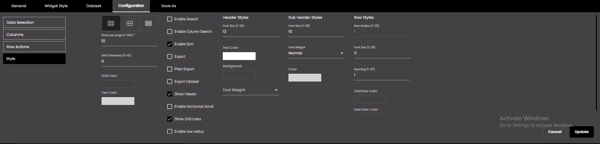
Click the Configuration tab.
On the left-hand side, click Style.
Change the settings as required:
Setting
Description
Datagrid spacing:
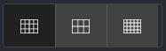
The space between rows and columns. The options are as follows:
Default Normal spacing
Comfortable Loose spacing
Compact Tight spacing
Rows per page
The number of rows to display on each page, where the datagrid has to display data on more than one page.
Note
The number of rows per page should be between 1 and 100.
Enable Search
Displays a search field above the datagrid to enable you to filter the data on a particular string. The string is searched for in all columns.
Enable Column Search
Displays a search field above each of the datagrid columns to enable you to filter the data on a particular string. The string is searched for in that respective column.
Enable Sort
Enables you to sort the values in each column in ascending order by clicking the column title. Clicking the title again causes the values to be sorted in descending order.
Note
If the Show Header check box is cleared, you cannot use the sort function.
Export
Displays an Export button above the datagrid so that you can export the content of the datagrid to a CSV, Excel or PDF file. The following are present in the downloaded Excel and PDF files:
XLS
Header - The application logo, report name (same as the widget name), a text mentioning the date range covered (if the Request Parameters in the Dataset tab contain from and to) and the selected sensors (if present in the dataset).
Footer - The date and time when the report was generated and the application name.
PDF
Header - The application logo, report name (same as the widget name), a text mentioning the date range covered (if the Request Parameters in the Dataset tab contain from and to) and the selected sensors (if present in the dataset).
Footer - The page number, date and time when the report was generated and the application name.
Watermark of the application logo on all the pages of the PDF.
Plain Export
Export the datagrid to PDF with Plain background and Watermark.
Export Dataset
Displays an Export button above the datagrid so that you can export the complete dataset of the datagrid to a CSV, Excel or PDF file. The following are present in the downloaded Excel and PDF files:
XLS
Header - The application logo, report name (same as the widget name), a text mentioning the date range covered (if the Request Parameters in the Dataset tab contain from and to) and the selected sensors (if present in the dataset).
Footer - The date and time when the report was generated and the application name.
PDF
Header - The application logo, report name (same as the widget name), a text mentioning the date range covered (if the Request Parameters in the Dataset tab contain from and to) and the selected sensors (if present in the dataset).
Footer - The page number, date and time when the report was generated and the application name.
Watermark of the application logo on all the pages of the PDF.
Show Header
Displays the column headings in a frozen state.
Enable Horizontal Scroll
Displays a horizontal scroll bar which helps to horizontally scroll among columns when there are many columns.
Show Grid Lines
Displays a horizontal line between rows.
Grid Thickness
The thickness of the horizontal line between rows. It is applicable only when the Show Grid Lines checkbox is checked.
Note
Allowed values are from 0-10 points.
Grid Color
The color of the horizontal line between rows. It is applicable only when the Show Grid Lines checkbox is checked.
Also, based on the Palette in the Widget Style tab, a set of Preset colors are available to directly choose from, which if selected, change based on the theme.
Text Color
The color of the text in the rows and columns.
Also, based on the Palette in the Widget Style tab, a set of Preset colors are available to directly choose from, which if selected, change based on the theme.
Enable row radius
If enabled, it allows to set the corner radius for the rows.
Enable Number of rows
If enabled, it displays the number of rows that are currently being displayed out of the total number of rows. For example, if the total number of rows is 50 and the Rows per page is 10 then the 1st page displays 1-10 of 50, the 2nd page displays 11-20 of 50 and so on.
Enable Pagination
If enabled, it displays the page numbers to navigate between pages that display one page of results at a time.
Header Styles
The styles applied to the header.
Font Size
The header font size in points.
Note
Allowed values are from 1-25 points.
Text Color
The color of the text in the header.
Also, based on the Palette in the Widget Style tab, a set of Preset colors are available to directly choose from, which if selected, change based on the theme.
Background
The header background color.
Also, based on the Palette in the Widget Style tab, a set of Preset colors are available to directly choose from, which if selected, change based on the theme.
Font Weight
The thickness of the header font which can be one of the following:
Normal
Bold
Sub Header Styles
The styles applied to the sub header.
Font Size
The sub header font size in points.
Note
Allowed values are from 1-25 points.
Font Weight
The thickness of the sub header font which can be one of the following:
Normal
Bold
Color
The color of the text in the sub header.
Also, based on the Palette in the Widget Style tab, a set of Preset colors are available to directly choose from, which if selected, change based on the theme.
Row Styles
The styles applied to each row.
Row radius
The corner radius of the rows.
Note
Allowed values are from 1-25 points.
Font Size
The row text font size in points.
Note
Allowed values are from 1-25 points.
Spacing
The spacing above each row.
Note
Allowed values are from 1-25 points.
Even row color
The background color of the even numbered rows.
Also, based on the Palette in the Widget Style tab, a set of Preset colors are available to directly choose from, which if selected, change based on the theme.
Odd row color
The background color of the odd numbered rows.
Also, based on the Palette in the Widget Style tab, a set of Preset colors are available to directly choose from, which if selected, change based on the theme.
Click Save.