Display map widget heat map
If a heat map has been set up in the map widget configuration (see Configure map widget visualization), you can display each marker in a color that corresponds to the value of one of the dataset fields associated with that marker.
In the Designer Panel, click the Heat Map icon:

In the heat map tool, all the heat maps for all layers are shown.
Select the heat map(s) that you want to display.
The map displays markers in the colors defined by the heat map configuration.
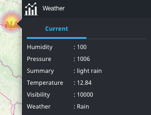
The example screenshot below shows a marker that is colored yellow, corresponding to a temperature value of 12.84: