Configure chart widget style
You can configure a chart's appearance in more detail, including the axes, the data labels, legends, 3D appearance, and tooltips.
If the widget configuration dialog box is not already open, do as follows:
If the widget is on a Grid layout dashboard, click the Menu icon
 in the top right-hand corner of the widget and select Settings.
If the widget is on a Fluid layout dashboard, on the floating toolbar for the widget, click the Settings icon:
.
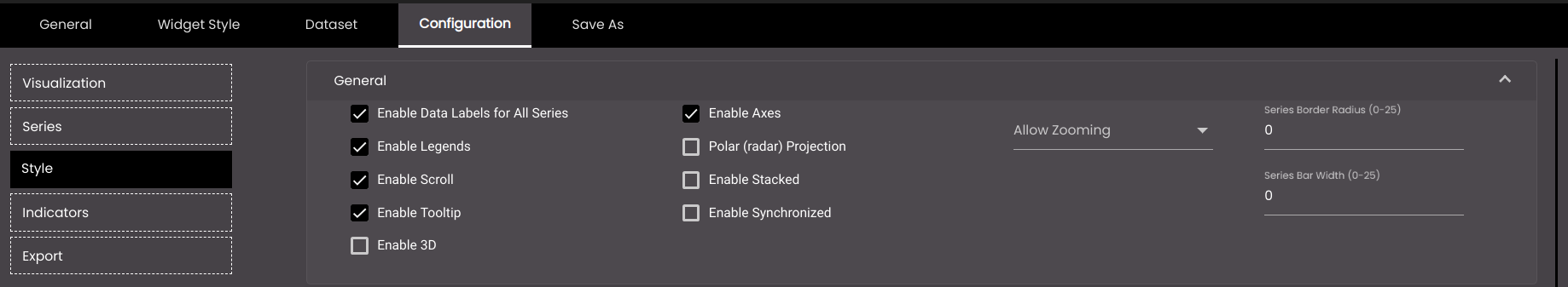
Click the Configuration tab.
On the left-hand side, click Style.
A number of drop-down panels are displayed, depending on which options are selected in the General panel. Click one and change the settings as required.
Note
Not all of the following settings apply to all chart visualizations.
Setting
Description
Enable Data Labels for All Series
Displays the numeric value next to each data point. When selected, the Data Labels drop-down panel is also displayed below, for you to configure the position and format of the labels.
Enable Legends
Displays the name(s) of the series alongside the chart. When selected, the Legends drop-down panel is also displayed below, for you to configure the position and format of the legends.
Enable Scroll
Displays a horizontal scroll bar to scroll horizontally and view all the data points on the chart.
Enable Tooltip
Displays a tooltip when the mouse pointer hovers over a data point. When selected, the Tooltip drop-down panel is also displayed below, for you to configure the format of the tooltips.
Enable Pie Sliced (pie chart only)
Displays the selected portion of the pie a little outward than the remaining portions of it. By default, the first data item is selected.
Enable 3D
Displays the chart in three-dimensional appearance. When selected, the 3D Chart drop-down panel is also displayed below, for you to configure the appearance.
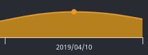
Enable Markers (line chart and area chart only)
Displays a point that indicates the exact position of a data point. For example, the yellow point in the image below:
Pie Inner Size (pie chart only)
The size of a hole in the center of the pie. If the value is blank or zero, there is no hole.
Note
Allowed values are from 0 to 200.
Choose Color (pie chart only)
The color of the outlines of the pie chart.
Also, based on the Palette in the Widget Style tab, a set of Preset colors are available to directly choose from, which if selected, change based on the theme.
Enable Axes
Displays the x- and y-axes. When selected, the Axes drop-down panel is also displayed below, for you to configure the position and format of the axes.
Polar (radar) Projection
Displays the data in a circular format, with the x-axis as the circumference of the circle. When selected, the Enable 3D, Enable Gridlines, Chart Inverted, and Allow Zooming settings do not apply.
Enable Gridlines
Displays lines across the chart for each value on the y-axis.
Chart Inverted
Swaps the x- and y-axes, so that the x-axis is displayed where the y-axis was, and the y-axis is displayed where the x-axis was.
Enable Stacked
Displays the chart values one on top of each other like a stack when there is more than one attribute for each item on the x-axis and the height of each is calculated based on their y values.
Enable Synchronized
Displays individual horizontal lines representing the x-axis for each legend and displays the data values for them.
Allow Zooming
Enables you to zoom in on part of the chart. The options are as follows:
None Zooming is disabled.
X Zooming is enabled along the x-axis.
Y Zooming is enabled along the y-axis.
X and Y Zooming is enabled along both the x- and y-axes.
To find out how to use this feature, see Zoom in on a chart widget.
Series Border Radius
The radius of the border corners in a bar and column chart.
Note
Allowed values are from 0-25 points.
Series Bar Width
The width of the bars in a bar and column chart.
Note
Allowed values are from 0-25 points.
Fill Opacity (area chart only)
The degree of transparency of the area chart shading. However, the line that joins the data points will be a solid line.
Note
Allowed values are from 0-1.
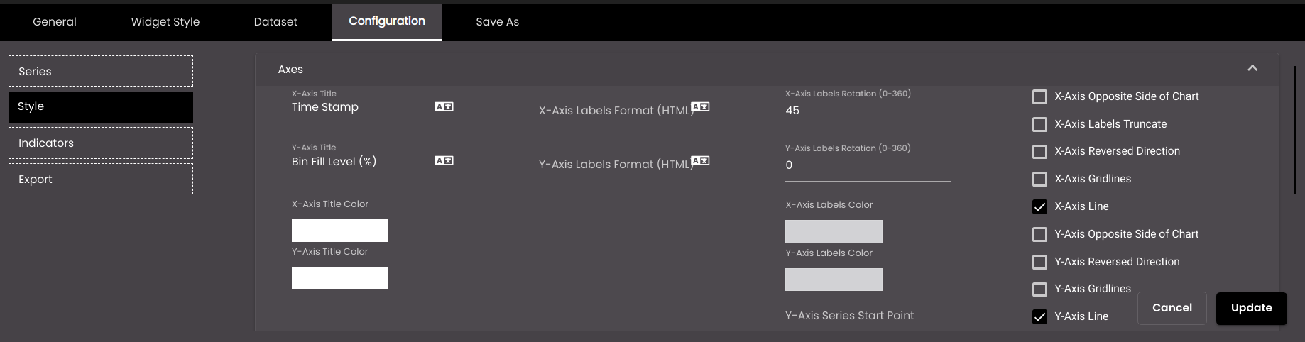
The following settings refer to the x- and y-axes.
Setting
Description
X-Axis Title
The name that is displayed next to the x-axis.
You can also translate this text by clicking on the Translate icon
 and entering the translation of the desired language selected. Auto-suggestions are also available where the reused contents are auto-suggested.
Y-Axis Title
The name that is displayed next to the y-axis.
You can also translate this text by clicking on the Translate icon
and entering the translation of the desired language selected. Auto-suggestions are also available where the reused contents are auto-suggested.X-Axis Labels Format
HTML code to format the x-axis labels that indicate the data values. The original text of the label is represented by {value}. For example, to make the labels bold, enter <b>{value}</b>.
You can also translate this text by clicking on the Translate icon
and entering the translation of the desired language selected. Auto-suggestions are also available where the reused contents are auto-suggested.Y-Axis Labels Format
HTML code to format the y-axis labels that indicate the data values. The original text of the label is represented by {value}. For example, to make the labels bold, enter <b>{value}</b>.
You can also translate this text by clicking on the Translate icon
and entering the translation of the desired language selected. Auto-suggestions are also available where the reused contents are auto-suggested.X-Axis Labels Rotation
The number of degrees through which the x- axis labels that indicate the data values are rotated clockwise.
Y-Axis Labels Rotation
The number of degrees through which the y-axis labels that indicate the data values are rotated clockwise.
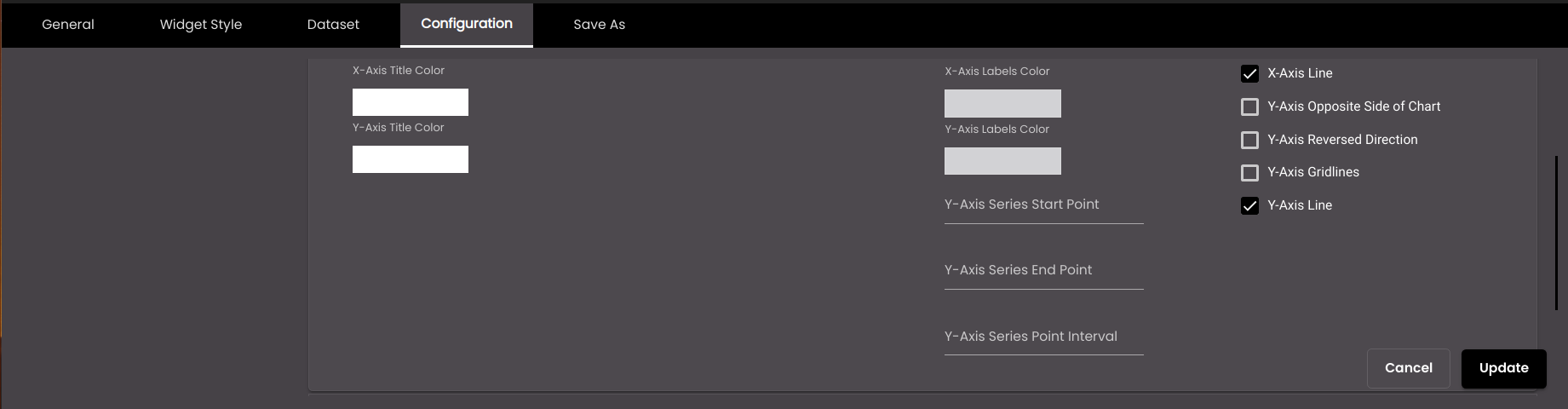
X-Axis Title Color
The color of the x-axis titles.
Also, based on the Palette in the Widget Style tab, a set of Preset colors are available to directly choose from, which if selected, change based on the theme.
Y-Axis Title Color
The color of the y-axis titles.
Also, based on the Palette in the Widget Style tab, a set of Preset colors are available to directly choose from, which if selected, change based on the theme.
X-Axis Labels Color
The color of the x-axis labels.
Also, based on the Palette in the Widget Style tab, a set of Preset colors are available to directly choose from, which if selected, change based on the theme.
Y-Axis Labels Color
The color of the y-axis labels.
Also, based on the Palette in the Widget Style tab, a set of Preset colors are available to directly choose from, which if selected, change based on the theme.
Y-Axis Series Start Point
The starting point from which the y-axis should begin.
Y-Axis Series End Point
The ending point at which the y-axis should end.
Y-Axis Series Point Interval
The intervals between points on the y-axis.
X-Axis Opposite Side of Chart
Displays the x-axis at the top of the chart (if it is currently at the bottom) or on the right-hand side of the chart (if it is currently on the left-hand side).
X-Axis Labels Truncate
Truncates the x-axis labels if they are too long.
X-Axis Reversed Direction
Reverses the order of the data values on the x-axis.
X-Axis Gridlines
The vertical lines at points on the x-axis.
X-Axis Line
The line that denotes the x-axis.
Y-Axis Opposite Side of Chart
Displays the y-axis at the top of the chart (if it is currently at the bottom) or on the right-hand side of the chart (if it is currently on the left-hand side).
Y-Axis Reversed Direction
Reverses the order of the data values on the y-axis.
Y-Axis Gridlines
The horizontal lines at points on the y-axis.
Y-Axis Line
The line that denotes the y-axis.
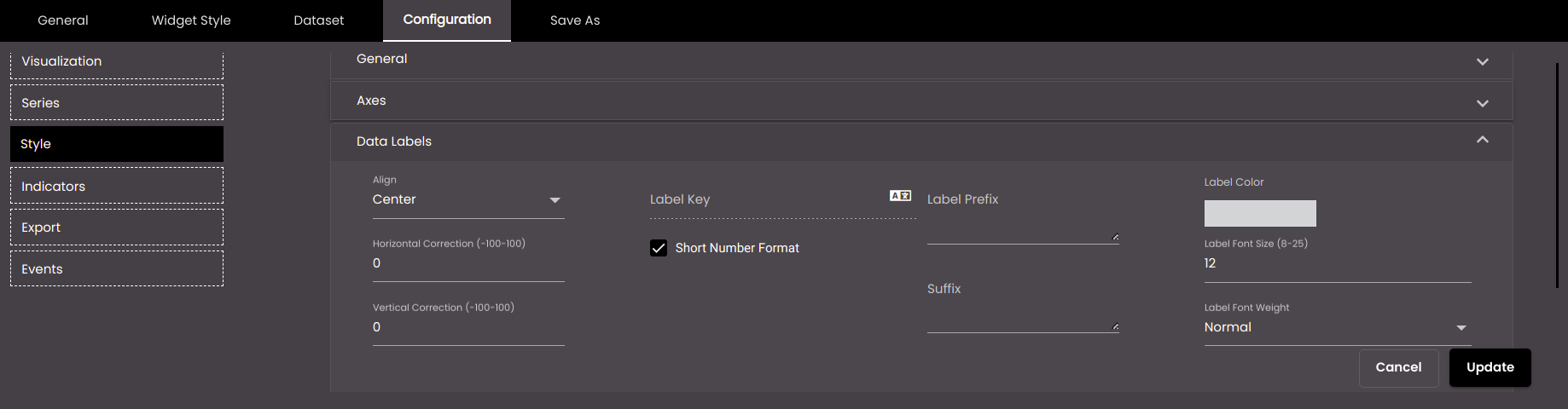
The following settings refer to the labels that display the numeric value next to each data point.
Setting
Description
Align
The horizontal alignment of the labels with respect to the data points.
Choose Color
The color of the labels.
Also, based on the Palette in the Widget Style tab, a set of Preset colors are available to directly choose from, which if selected, change based on the theme.
Label Key
HTML code to format the labels. The original text of the labels is represented by {value}. For example, to make the labels bold, enter <b>{value}</b>.
You can also translate this text by clicking on the Translate icon
and entering the translation of the desired language selected. Auto-suggestions are also available where the reused contents are auto-suggested.Short Number Format
If selected, the numeric values are displayed in short forms which are as follows:
K - Thousand. Eg: 1,000 is represented as 1K.
M - Million. Eg: 1,000,000 is represented as 1M.
B - Billion. Eg: 1,000,000,000 is represented as 1B.
Label Prefix (shown only if Short Number Format is selected)
Text in plain text or HTML code to display before each label.
Suffix (shown only if Short Number Format is selected)
Text in plain text or HTML code to display after each label.
Label Font Weight
The thickness of the label font which can be one of the following:
Normal
Bold
Horizontal Correction
The number of pixels by which each label is offset horizontally from each data point. A negative value repositions labels to the left; a positive value repositions labels to the right.
Note
Allowed values are from -100 to 100.
Vertical Correction
The number of pixels by which each label is offset vertically from each data point. A negative value repositions labels upward; a positive value repositions labels downward.
Note
Allowed values are from -100 to 100.
Label Font Size
The label font size in points.
Note
Allowed values are from 8-25 points.
Distance (pie chart only)
The distance of each label from each data point, in pixels.
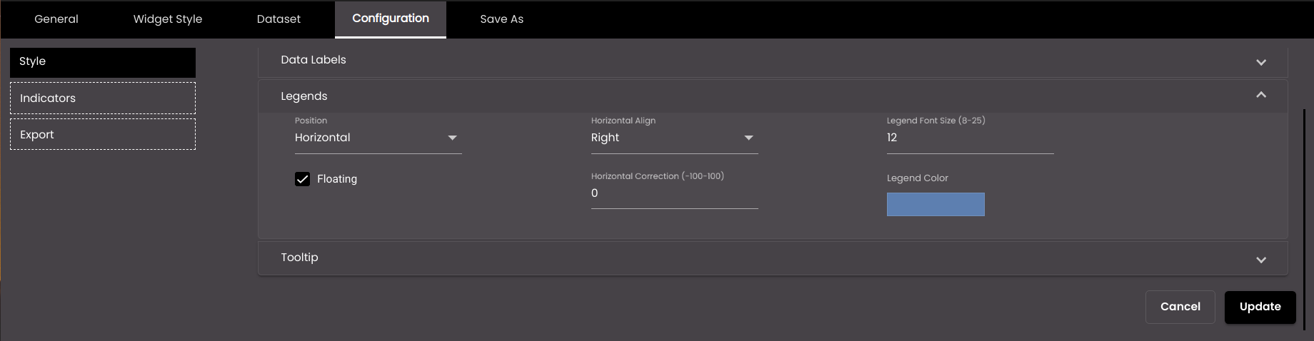
The following settings refer to the name(s) of the series alongside the chart.
Setting
Description
Position
The layout of the legends. The options are as follows:
Horizontal Legends are displayed in a row. The Horizontal Align and Horizontal Correction settings are displayed in this panel.
Vertical Legends are stacked in a column. The Vertical Align and Vertical Correction settings are displayed in this panel.
Floating
Displays the legends within the chart instead of alongside. If Floating is selected, Horizontal Align and Vertical Align can be used to position the legends in various positions within the chart.
Horizontal Align
The horizontal position of the legends relative to the chart. The options are as follows:
Left Legends are positioned to the left of the chart.
Right Legends are positioned to the right of the chart.
Center Legends are positioned in the center of the chart.
Horizontal Correction
The number of pixels by which the legends are offset horizontally from the position specified by Horizontal Align. A negative value repositions legends to the left; a positive value repositions legends to the right.
Vertical Align
The vertical position of the legends relative to the chart. The options are as follows:
Top Legends are positioned above the chart.
Middle Legends are positioned in the middle of the chart.
Bottom Legends are positioned below the chart.
Vertical Correction
The number of pixels by which the legends are offset vertically from the position specified by Vertical Align. A negative value repositions legends upward; a positive value repositions legends downward.
Legend Font Size
The font size of the legends, in points.
Note
Allowed values are from 8-25 points.
Choose Color
The font color of the legends.
Also, based on the Palette in the Widget Style tab, a set of Preset colors are available to directly choose from, which if selected, change based on the theme.
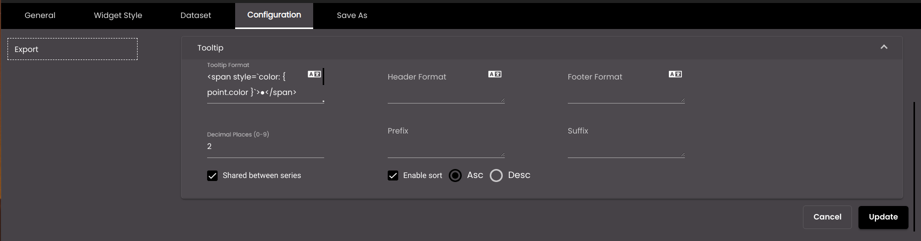
The following settings refer to the tooltips that are displayed when the mouse pointer hovers over a data point.
Setting
Description
Tooltip Format
The HTML code for the tooltip format.
You can also translate this text by clicking on the Translate icon
and entering the translation of the desired language selected. Auto-suggestions are also available where the reused contents are auto-suggested.Header Format
The text that appears at the top of a tooltip. You can use either plain text or HTML code.
You can also translate this text by clicking on the Translate icon
and entering the translation of the desired language selected. Auto-suggestions are also available where the reused contents are auto-suggested.Footer Format
The text that appears at the bottom of a tooltip. You can use either plain text or HTML code.
You can also translate this text by clicking on the Translate icon
and entering the translation of the desired language selected. Auto-suggestions are also available where the reused contents are auto-suggested.Decimal Places
The number of decimal places to display for numeric values in the tooltip.
Note
Allowed values are from 0-9.
Prefix
Text to display before the tooltip.
Suffix
Text to display after the tooltip.
Shared between series
Includes the values of all series for a particular x-axis value.
Enable sort
Sorts the values of the tooltip in the order selected. The options are as follows:
Asc
Desc
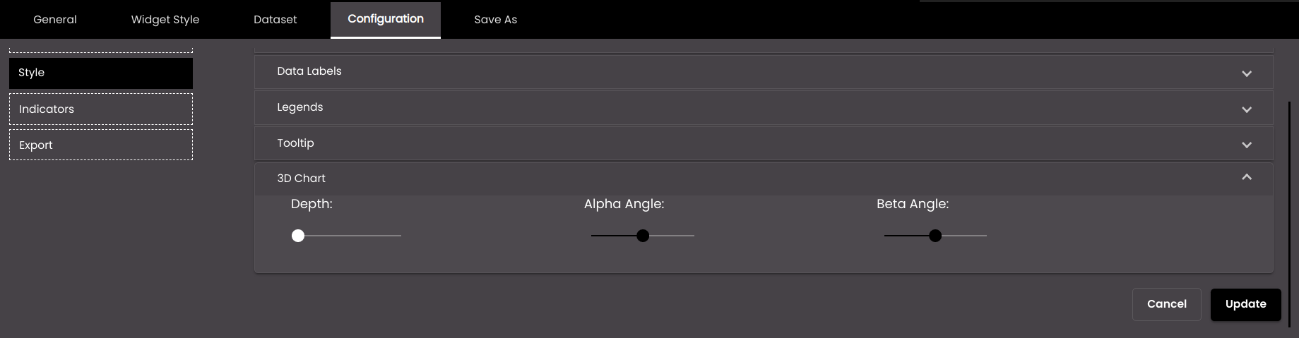
The following settings apply to the three-dimensional appearance of the chart. They are applicable mainly to the bar and column charts.
Setting
Description
Depth
The distance from the 'front' of the chart to the 'back', given that the data representations appear to project away from you.
Alpha Angle
The angle at which to display the chart, which is above the point at which you view the chart head on. For example, with the slider control to the right, you appear to be looking at the chart from above.
Beta Angle
The angle at which to display the chart, which is to the left or right of the point at which you view the chart head on. For example, with the slider control to the left, you appear to be looking at the chart from the left-hand side.
Click Save.