Configure map drilldown widget styling
If the widget configuration dialog box is not already open, do as follows:
If the widget is on a Grid layout dashboard, click the Menu icon
 in the top right-hand corner of the widget and select Settings.
If the widget is on a Fluid layout dashboard, on the floating toolbar for the widget, click the Settings icon:
.
In the widget configuration dialog box, click the Configuration tab.
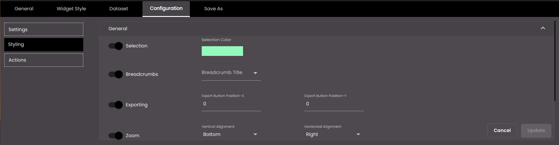
On the left-hand side, click Styling.
Change the General settings as required:
Setting
Description
Selection
Displays the Selection Color of the selected feature.
Selection Color
The color shown on clicking a feature. Selection should be enabled for this to be displayed.
Breadcrumbs
Displays the Breadcrumb Title while drilling down to the next level.
Breadcrumb Title
The level title of the feature while drilling down to the next level. Breadcrumbs should be enabled for this to be displayed.
Exporting
Displays an Export icon
 in the top right-hand corner of the widget, containing print and export options.
Export Button Position-X
The position of the Export icon
along the x-axis.Export Button Position-Y
The position of the Export icon
along the y-axis.Zoom
Enables you to zoom in on part of the map.
Vertical Alignment
The vertical position of the zoom controls
 . The options are as follows:
Top Zoom controls are positioned to the top.
Middle Zoom controls are positioned to the middle.
Bottom Zoom controls are positioned to the bottom.
Horizontal Alignment
The horizontal position of the zoom controls
. The options are as follows:Left Zoom controls are positioned to the left.
Center Zoom controls are positioned to the center.
Right Zoom controls are positioned to the right.
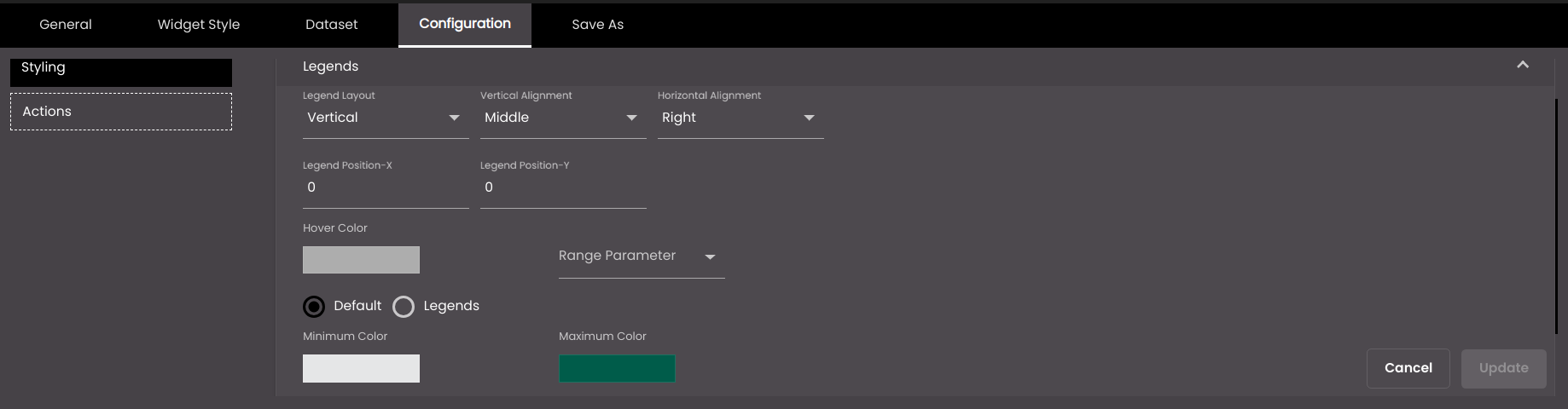
Change the Legends settings as required:
Setting
Description
Legend Layout
The alignment of the layout of the legends. The options are as follows:
Horizontal Legends are displayed in a row.
Vertical Legends are stacked in a column.
Vertical Alignment
The vertical position of the legends. The options are as follows:
Top Legends are positioned to the top.
Middle Legends are positioned to the middle.
Bottom Legends are positioned to the bottom.
Horizontal Alignment
The horizontal position of the legends. The options are as follows:
Left Legends are positioned to the left.
Center Legends are positioned to the center.
Right Legends are positioned to the right.
Legend Position-X
The position of the legend along the x-axis.
Legend Position-Y
The position of the legend along the y-axis.
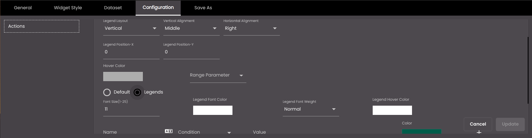
Font Size
The font size of the legend, in points.
Note
Allowed values are from 1-25.
Legend Font Color
The font color of the legend.
Legend Font Weight
The thickness of the legend font which can be one of the following:
Normal
Bold
Hover Color
The color of the feature when the mouse is hovered over it.
Range Parameter
The parameter based on which the features are distinguished.
Default
If selected, displays the default colored range indicator on the right-hand side of the widget based on the Minimum Color and Maximum Color selected.
Legends
If selected, you can create legends of different colors for custom values present between the Range Parameter value. On clicking a legend, you can view only the features that come under that legend.
Minimum Color (available if Default is selected)
The starting color of the feature based on the Range Parameter value.
Maximum Color (available if Default is selected)
The ending color of the feature based on the Range Parameter value.
Name (available if Legends is selected)
The legend name to be displayed.
You can also translate this text by clicking on the Translate icon
 and entering the translation of the desired language selected. Auto-suggestions are also available where the reused contents are auto-suggested.
Condition (available if Legends is selected)
The operator to be used to compare the value of the Range Parameter field against the value in the Value box.
Value (available if Legends is selected)
The value against which to compare the value of the Range Parameter field.
From (available if Legends is selected)
The starting value of the legend against which to compare the value of the Range Parameter field, if Condition is set to Between.
To (available if Legends is selected)
The ending value of the legend against which to compare the value of the Range Parameter field, if Condition is set to Between.
Color (available if Legends is selected)
Select the custom color to be used for the features whose Value or From and To values are present between the Range Parameter .
+
Adds another legend.

Deletes the legend.
Note
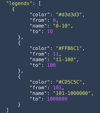
If the legends are present in the dataset for each of the first or next levels in the map drilldown widget then the widget will use those dynamic legend configurations instead of the ones created manually in the above Legends section. However, the legends in the dataset should be in the following format and contain the following attributes as illustrated below.
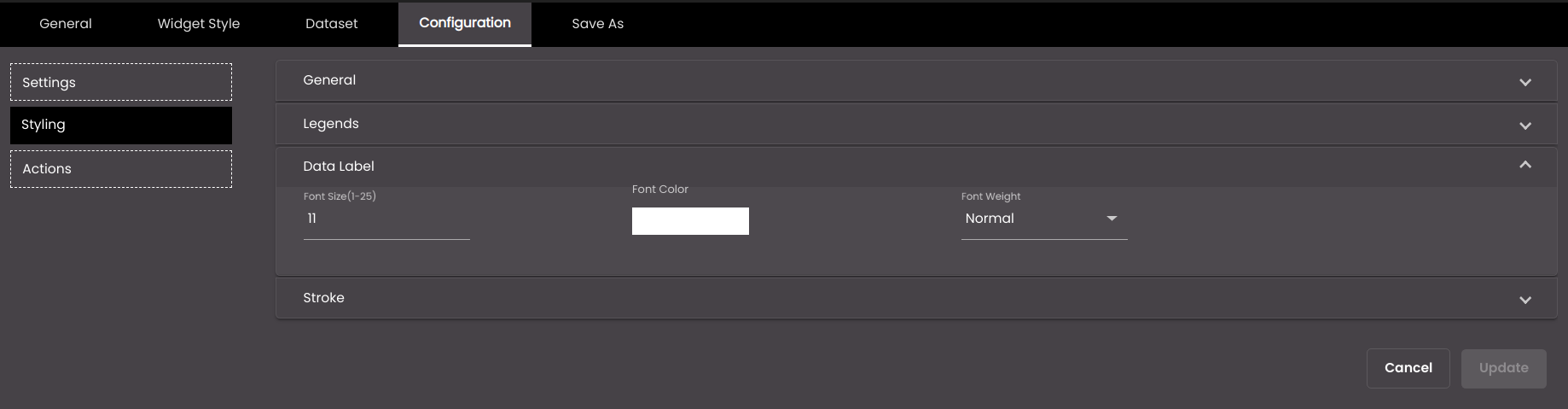
Configure the Data Label settings.
Setting
Description
Font Size
The font size of the data label, in points.
Note
Allowed values are from 1-25.
Font Color
The color of the data label.
Font Weight
The thickness of the data label font which can be one of the following:
Normal
Bold
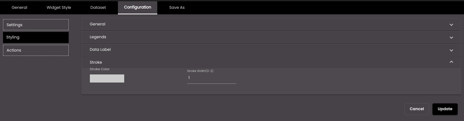
Configure the Stroke settings.
Setting
Description
Stroke Color
The color of the outline or boundary of the feature.
Stroke Width
The thickness of the outline or boundary of the feature.
Note
Allowed values are from 0.0 to 2.0 points.
Click Update.