Configure Data Selector widget general settings
If the widget configuration dialog box is not already open, do as follows:
If the widget is on a Grid layout dashboard, click the Menu icon
 in the top right-hand corner of the widget and select Settings.
If the widget is on a Fluid layout dashboard, on the floating toolbar for the widget, click the Settings icon:
.
In the widget configuration dialog box, click the Configuration tab.
On the left-hand side, click General.
The data selector(s) are displayed which you have selected in Visualization. You can rename the data selector(s). Click the Edit icon and enter the new name and click the Update icon.
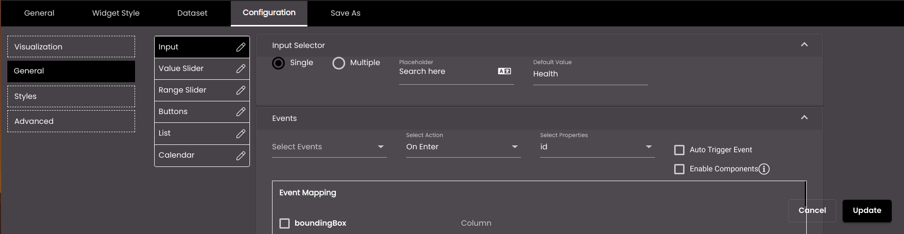
If you selected the Input data selector, configure the following settings as required:
Expand the Input Selector section and select whether the input type is to be Single or Multiple. This determines whether the user can enter a single value or multiple values. You can also optionally enter a default value for the input field.
Expand the Events section and select which dashboard events should be triggered by this widget using the On Enter or On Blur actions. If you want the event to be immediately triggered with the default value when the form is first displayed then select the Auto Trigger Event option.
If a custom data selector is selected in Visualization, then the Enable Components option is displayed. If selected, it send all the other data selectors data, which are there in the custom data selector, to other widgets.
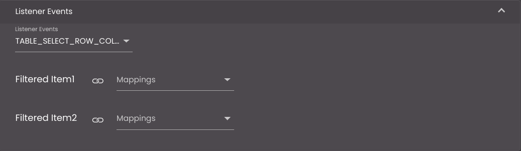
If a custom data selector is selected in Visualization, then expand the Listener Events section and select which dashboard events should be triggered by this widget to filter the data based on the event mappings.
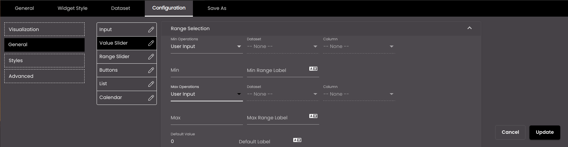
If you selected the Value Slider data selector, configure the following settings as required:
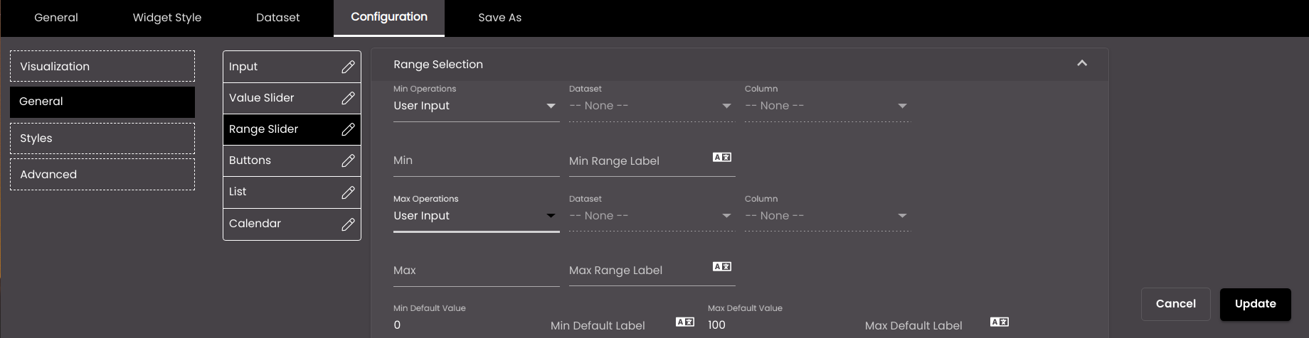
Expand the Range Selection section and configure the settings.
Setting
Description
Min Operations
Determines whether to simply display a specific value from a dataset column or to perform an operation on all the values in that column to represent the minimum value. The operations apply only when the dataset is retrieving all the rows of data from the data source, instead of using request parameters to retrieve a single row. The options are as follows:
Sum The sum of the values in the selected column.
Min The minimum value in the selected column.
Max The maximum value in the selected column.
Average The average of the values in the selected column.
Count The number of values in the selected column.
Distinct The number of unique values in the selected column.
Value A specific value from the selected column.
User Input A numeric value that you enter in the Min box.
Dataset
The dataset that is selected.
Column
The column from which you want to display data.
If the dataset is returning a sequence of key–value pairs, the options are as follows:
Key The title of the column.
Value The value in the column.
Min (available only if Operation is set to User Input)
A fixed numeric value that you want to display as the minimum value. For this setting, it doesn't matter which dataset is selected because it's not retrieving a value from a dataset; instead you're entering the value yourself.
Min Range Label
The label for the minimum value. You can use either plain text or HTML code.
You can also translate this text by clicking on the Translate icon
 and entering the translation of the desired language selected. Auto-suggestions are also available where the reused contents are auto-suggested.
Max Operations
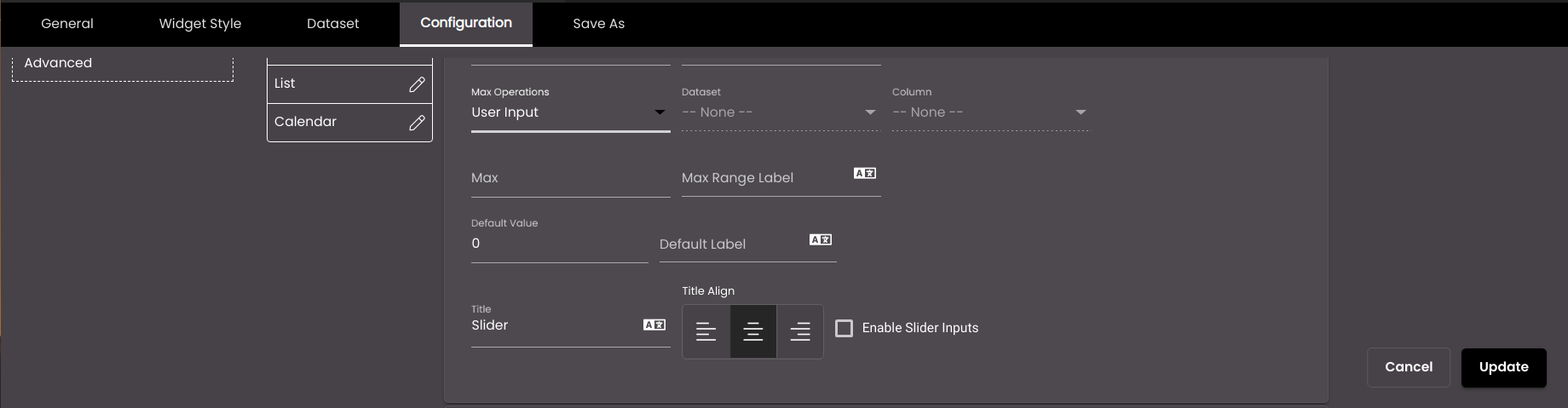
Determines whether to simply display a specific value from a dataset column or to perform an operation on all the values in that column to represent the maximum value. The operations apply only when the dataset is retrieving all the rows of data from the data source, instead of using request parameters to retrieve a single row. The options are as follows:
Sum The sum of the values in the selected column.
Min The minimum value in the selected column.
Max The maximum value in the selected column.
Average The average of the values in the selected column.
Count The number of values in the selected column.
Distinct The number of unique values in the selected column.
Value A specific value from the selected column.
User Input A numeric value that you enter in the Max box.
Dataset
The dataset that is selected.
Column
The column from which you want to display data.
If the dataset is returning a sequence of key–value pairs, the options are as follows:
Key The title of the column.
Value The value in the column.
Max (available only if Operation is set to User Input)
A fixed numeric value that you want to display as the maximum value. For this setting, it doesn't matter which dataset is selected because it's not retrieving a value from a dataset; instead you're entering the value yourself.
Max Range Label
The label for the maximum value. You can use either plain text or HTML code.
You can also translate this text by clicking on the Translate icon
and entering the translation of the desired language selected. Auto-suggestions are also available where the reused contents are auto-suggested.Title
The title for the value slider. You can use either plain text or HTML code.
You can also translate this text by clicking on the Translate icon
and entering the translation of the desired language selected. Auto-suggestions are also available where the reused contents are auto-suggested.Title Align
The alignment of the title - left, center or right.
Enable Slider Inputs
Displays an input field above the slider to enter the value of the desired position on the slider as an alternative to sliding to a particular position on the slider.
Default Value
The minimum default value.
Default Label
The minimum default label. You can use either plain text or HTML code.
You can also translate this text by clicking on the Translate icon
and entering the translation of the desired language selected. Auto-suggestions are also available where the reused contents are auto-suggested.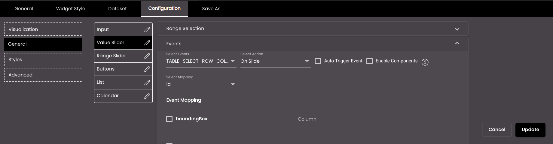
Expand the Events section and select which dashboard events should be triggered by this widget using the On Slide action. The events get triggered a second after the sliding is stopped. If you want the event to be immediately triggered with the min default value when the value slider is first displayed then select the Auto Trigger Event option.
If a custom data selector is selected in Visualization, then the Enable Components option is displayed. If selected, it send all the other data selectors data, which are there in the custom data selector, to other widgets.
If a custom data selector is selected in Visualization, then expand the Listener Events section and select which dashboard events should be triggered by this widget to filter the data based on the event mappings.
If you selected the Range Slider data selector, configure the following settings as required:
Expand the Range Selection section and configure the settings.

Setting
Description
Min Operations
Determines whether to simply display a specific value from a dataset column or to perform an operation on all the values in that column to represent the minimum value. The operations apply only when the dataset is retrieving all the rows of data from the data source, instead of using request parameters to retrieve a single row. The options are as follows:
Sum The sum of the values in the selected column.
Min The minimum value in the selected column.
Max The maximum value in the selected column.
Average The average of the values in the selected column.
Count The number of values in the selected column.
Distinct The number of unique values in the selected column.
Value A specific value from the selected column.
User Input A numeric value that you enter in the Min box.
Dataset
The dataset that is selected.
Column
The column from which you want to display data.
If the dataset is returning a sequence of key–value pairs, the options are as follows:
Key The title of the column.
Value The value in the column.
Min (available only if Operation is set to User Input)
A fixed numeric value that you want to display as the minimum value. For this setting, it doesn't matter which dataset is selected because it's not retrieving a value from a dataset; instead you're entering the value yourself.
Min Range Label
The label for the minimum value. You can use either plain text or HTML code.
You can also translate this text by clicking on the Translate icon
and entering the translation of the desired language selected. Auto-suggestions are also available where the reused contents are auto-suggested.Max Operations
Determines whether to simply display a specific value from a dataset column or to perform an operation on all the values in that column to represent the maximum value. The operations apply only when the dataset is retrieving all the rows of data from the data source, instead of using request parameters to retrieve a single row. The options are as follows:
Sum The sum of the values in the selected column.
Min The minimum value in the selected column.
Max The maximum value in the selected column.
Average The average of the values in the selected column.
Count The number of values in the selected column.
Distinct The number of unique values in the selected column.
Value A specific value from the selected column.
User Input A numeric value that you enter in the Max box.
Dataset
The dataset that is selected.
Column
The column from which you want to display data.
If the dataset is returning a sequence of key–value pairs, the options are as follows:
Key The title of the column.
Value The value in the column.
Max (available only if Operation is set to User Input)
A fixed numeric value that you want to display as the maximum value. For this setting, it doesn't matter which dataset is selected because it's not retrieving a value from a dataset; instead you're entering the value yourself.
Max Range Label
The label for the maximum value. You can use either plain text or HTML code.
You can also translate this text by clicking on the Translate icon
and entering the translation of the desired language selected. Auto-suggestions are also available where the reused contents are auto-suggested.Title
The title for the range slider. You can use either plain text or HTML code.
You can also translate this text by clicking on the Translate icon
and entering the translation of the desired language selected. Auto-suggestions are also available where the reused contents are auto-suggested.Title Align
The alignment of the title - left, center or right.
Enable Slider Inputs
Displays two input fields above the slider to enter the two range values of the desired positions on the slider as an alternative to sliding to their particular positions on the slider.
Min Default Value
The minimum default value.
Min Default Label
The minimum default label. You can use either plain text or HTML code.
You can also translate this text by clicking on the Translate icon
and entering the translation of the desired language selected. Auto-suggestions are also available where the reused contents are auto-suggested.Max Default Value
The maximum default value.
Max Default Label
The minimum default label. You can use either plain text or HTML code.
You can also translate this text by clicking on the Translate icon
and entering the translation of the desired language selected. Auto-suggestions are also available where the reused contents are auto-suggested.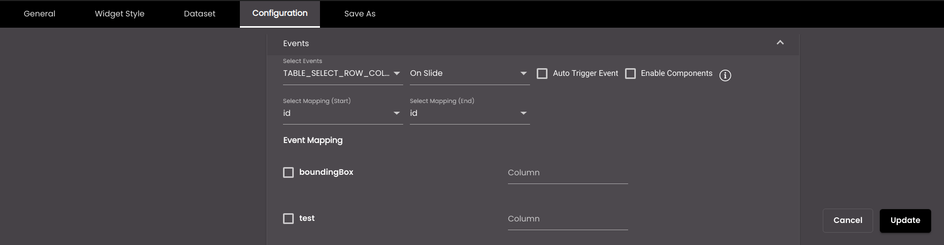
Expand the Events section and select which dashboard events should be triggered by this widget using the On Slide or On Click action. For On Slide the events get triggered a second after the sliding is stopped. If you want the event to be immediately triggered with the min default value and max default value when the range slider is first displayed then select the Auto Trigger Event option.
If a custom data selector is selected in Visualization, then the Enable Components option is displayed. If selected, it send all the other data selectors data, which are there in the custom data selector, to other widgets.
If a custom data selector is selected in Visualization, then expand the Listener Events section and select which dashboard events should be triggered by this widget to filter the data based on the event mappings.
If you selected the Buttons data selector, configure the following settings as required:
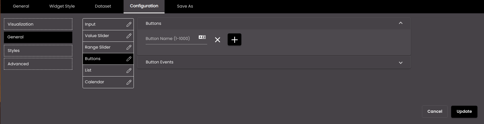
Expand the Buttons section and configure the settings.
Setting
Description
Button name
The name of the button to be displayed.
You can also translate this text by clicking on the Translate icon
and entering the translation of the desired language selected. Auto-suggestions are also available where the reused contents are auto-suggested.Note
It must be 1-1000 characters only.
+
Adds another button.

Deletes the button.
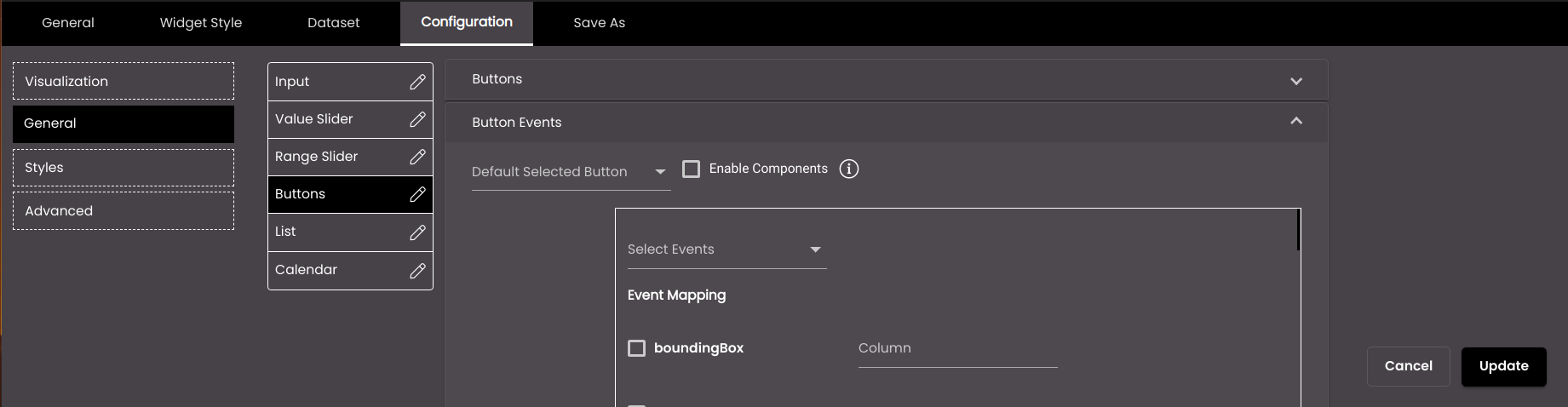
Expand the Button Events section and select which dashboard events should be triggered by this widget on clicking the button. If you want the event to be immediately triggered with the button value when the button is first displayed then select that button value from the Default Selected Button option.
If a custom data selector is selected in Visualization, then the Enable Components option is displayed. If selected, it send all the other data selectors data, which are there in the custom data selector, to other widgets.
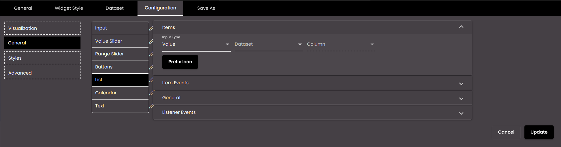
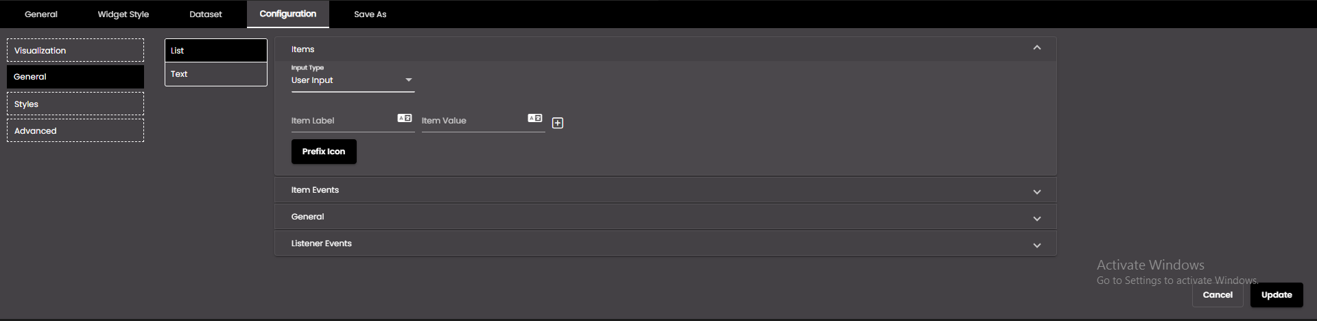
If you selected the List data selector, configure the following settings as required:
Expand the Items section and configure the settings.
Setting
Description
Input Type
Determines whether to display a specific value from a dataset column or input values. The options are as follows:
Value The dataset that is to be used.
User Input The values that you enter in the Item Label and Item Value boxes.
Dataset (available only if Input Type is set to Dataset)
The dataset that is selected.
Column (available only if Input Type is set to Dataset)
The column from which you want to display data.
Item Label (available only if Input Type is set to User Input)
The label of the list item.
You can also translate this text by clicking on the Translate icon
and entering the translation of the desired language selected. Auto-suggestions are also available where the reused contents are auto-suggested.Item Value (available only if Input Type is set to User Input)
The value of the list item.
You can also translate this text by clicking on the Translate icon
and entering the translation of the desired language selected. Auto-suggestions are also available where the reused contents are auto-suggested.+
Adds another item.
Deletes the item.
Prefix Icon
Click this to select an icon to display next to the list.
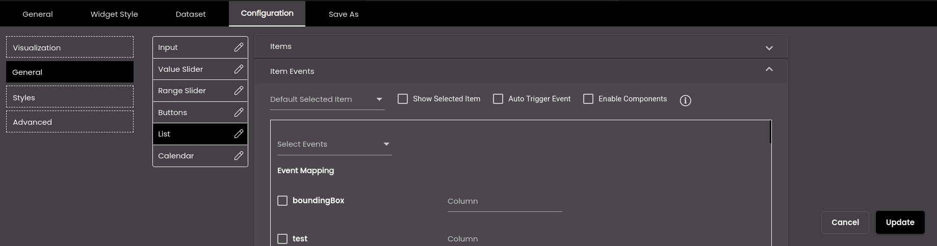
Expand the Item Events section and select which dashboard events should be triggered by this widget based on the Default Selected Item. You can select or deselect all the items in the Default Selected Item list at once by selecting the Select/UnSelect All checkbox. If the Default Selected Item is present in the dataset, the list item gets selected based on it otherwise if it is not available in the dataset then the first item in the list is selected. If Show Selected Item is selected, the item selected in the list is displayed as the selected item and not the item selected in the Default Selected Item.
Also, if you have selected Multiple Selection for the list in the General section, then also select on performing which action like On Panel Close or On Select, the event should be triggered. If you want the event to be immediately triggered with the default selected item when the list is first displayed then select the Auto Trigger Event option.
If a custom data selector is selected in Visualization, then the Enable Components option is displayed. If selected, it send all the other data selectors data, which are there in the custom data selector, to other widgets.
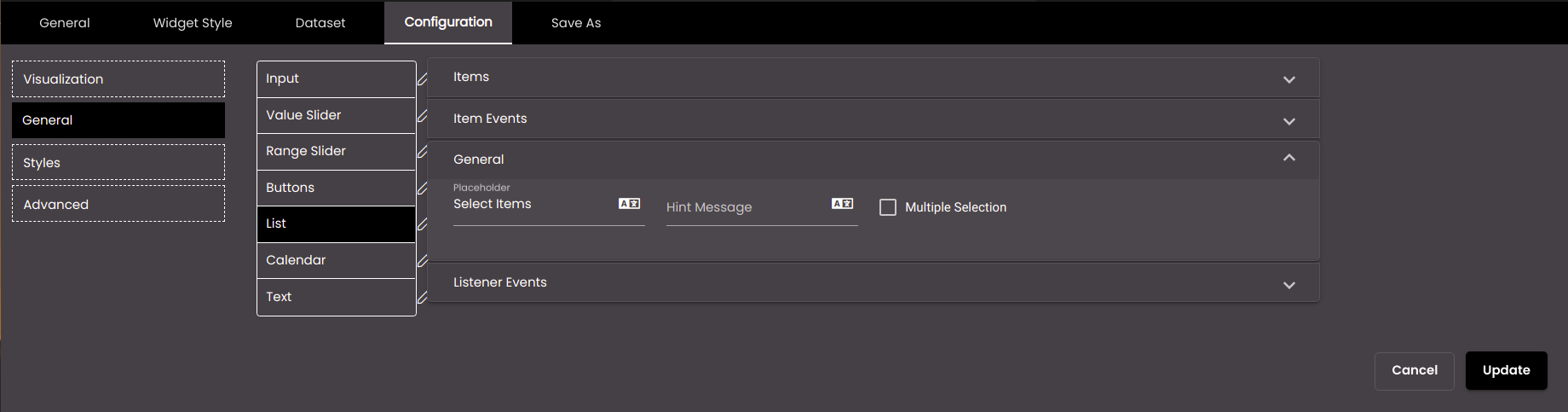
Expand the General section and in the Placeholder field enter the text that needs to be displayed as the placeholder for the list. In the Hint Message field you can enter the text that needs to be displayed as the hint below the list. Select the Multiple Selection checkbox to allow multiple selection of the list items in the list. For multiple selection you can select or deselect all the items in the list at once by selecting the Select/UnSelect All checkbox. Also, if you selected the Multiple Selection checkbox, the Select All Display Value, Select All Payload Key and Select All Payload Value fields are displayed. The text that is entered in Select All Display Value will be displayed in the list, the event mapping can be selected from the Select All Payload Key drop-down and the Select All Payload Value field can be used in the SQL queries at the dataset scripting level, to represent all the list items, when they are all selected.
If a custom data selector is selected in Visualization, then expand the Listener Events section and select which dashboard events should be triggered by this widget to filter the data based on the event mappings.
If you selected the Calendar data selector, configure the following settings as required:
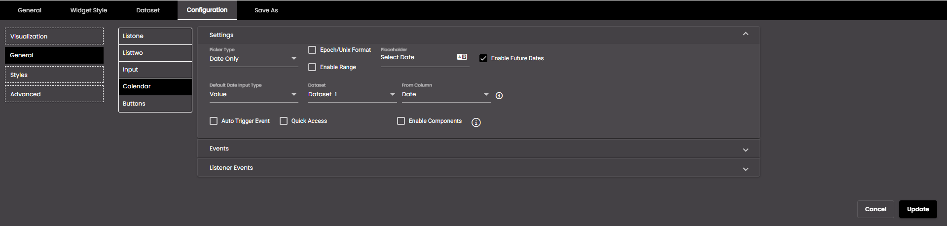
Expand the Settings section and configure the settings.
Setting
Description
Picker Type
The type of data to be shown in the picker. The options are as follows:
Date Only
Time Only
Date Time
Epoch/Unix Format
If selected, the type selected in the Picker Type will be sent in milliseconds (starting from 1 January 1970).
Enable Range
If selected, in the calendar you can select a range of dates if Date Only is selected or dates with times if Date Time is selected in the Picker Type.
Placeholder
The text used as a placeholder label.
You can also translate this text by clicking on the Translate icon
and entering the translation of the desired language selected. Auto-suggestions are also available where the reused contents are auto-suggested.Enable Future Dates
If selected, future dates will be displayed in the calendar.
Default Date Input Type
Determines whether to display today's or yesterday's date and current time or this week's or last week's or last to last week's dates and times or a specific value from a dataset column or select dates and times from a calendar as the default date. The options are as follows:
Yesterday Yesterday's date is displayed if Date Only is selected or yesterday's date with current time if Date Time is selected in the Picker Type.
Today Today's date is displayed if Date Only is selected or today's date with current time if Date Time is selected in the Picker Type.
This Week The current week's dates are displayed if Date Only is selected or the current week's dates with time if Date Time is selected in the Picker Type.
Last Week The previous week's dates are displayed if Date Only is selected or the previous week's dates with time if Date Time is selected in the Picker Type.
Last to Last Week The week prior to the previous week's dates are displayed if Date Only is selected or the week prior to the previous week's dates with time if Date Time is selected in the Picker Type.
Value The value from a dataset that is to be used.
User Input The dates that you select in the Default date field.
Note
Start of the week is Sunday.
Dataset (available only if Default Date Input Type is set to Value)
The dataset that is selected.
From Column (available only if Default Date Input Type is set to Value)
The column from which you want to display the 'From' data.
Note
The date column selected must be in the tenant format only.
To Column (available only if Default Date Input Type is set to Value)
The column from which you want to display the 'To' data.
Note
The date column selected must be in the tenant format only.
Default date (available only if Default Date Input Type is set to User Input)
The dates and times that you select from a calendar.
Auto Trigger Event
Triggers the set date or default date immediately when the date selector is displayed.
Quick Access
This provides a variety of pre-defined time periods, allowing you to quickly select specific dates or date ranges.
Enable Components
If a custom data selector is selected in Visualization, then the Enable Components option is displayed. If selected, it send all the other data selectors data, which are there in the custom data selector, to other widgets.
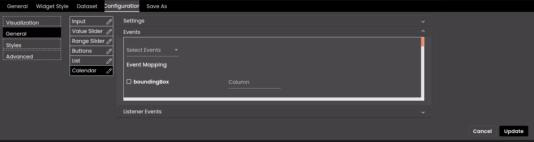
Expand the Events section and select which dashboard events should be triggered by this widget on selecting the calendar.
If a custom data selector is selected in Visualization, then expand the Listener Events section and select which dashboard events should be triggered by this widget to filter the data based on the event mappings.
If you selected the Text data selector using a custom data selector, configure the following settings as required:
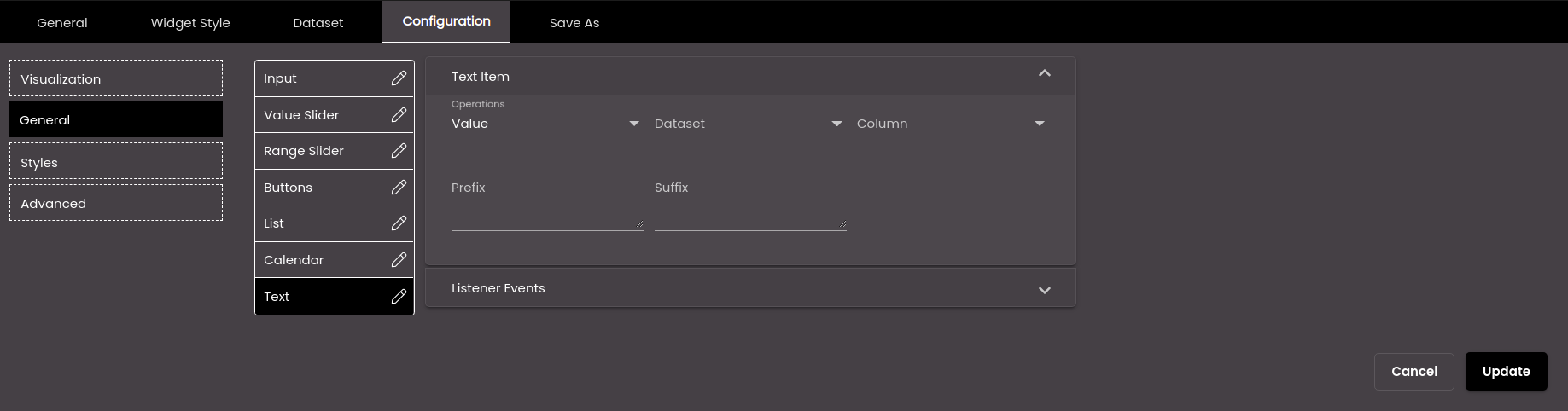
Expand the Text Item section and configure the settings.
Note
The direct navigation to other dashboards is available only for the Text data selector and not the other data selectors.
Setting
Description
Operations
Display a specific value from a dataset column or enter a value or navigate to a dashboard. The options are as follows:
Value A specific value from the selected column.
User Input A text value that you enter in the User Input box.
You can also translate this text by clicking on the Translate icon
and entering the translation of the desired language selected. Auto-suggestions are also available where the reused contents are auto-suggested.Dashboard Directly navigates to the selected dashboard and displays it in another window of the web browser.
Dataset
The dataset that is selected.
Column
The column from which you want to display data.
If the dataset is returning a sequence of key–value pairs, the options are as follows:
Key The title of the column.
Value The value in the column.
User Input (available only if Operation is set to User Input)
A fixed numeric value that you want to display. For this setting, it doesn't matter which dataset is selected because it's not retrieving a value from a dataset; instead you're entering the value yourself.
Dashboard (available only if Operations is set to Dashboard)
Select or search for another dashboard to directly navigate to upon clicking the dashboard name, from the list of dashboards in the drop-down.
Enable Custom Name (available only if Operations is set to Dashboard)
If enabled, displays the Display Name field to enter the desired custom name for the selected dashboard.
Display Name (available only if Operations is set to Dashboard)
The custom name for the selected dashboard. It is displayed if Enable Custom Name is enabled.
You can also translate this text by clicking on the Translate icon
and entering the translation of the desired language selected. Auto-suggestions are also available where the reused contents are auto-suggested.Prefix
Text to display before the text.
Suffix
Text to display after the text.
If a custom data selector is selected in Visualization, then expand the Listener Events section and select which dashboard events should be triggered by this widget to filter the data based on the event mappings.
Click Update.