Configure map widget visualization
For each map layer, you can specify how markers on the map are displayed, for example which icons are used, their color, and how their appearance changes depending on the dataset values that they represent. You can also specify when markers should be clustered together and how clusters should be represented.
If the widget configuration dialog box is not already open, do as follows:
If the widget is on a Grid layout dashboard, click the Menu icon
 in the top right-hand corner of the widget and select Settings.
If the widget is on a Fluid layout dashboard, on the floating toolbar for the widget, click the Settings icon:
.
In the widget configuration dialog box, click the Visualization tab.
On the left-hand side, if there is more than one layer, click the layer for which you want to configure visualization.
Note
If there are multiple layers, then there are no configurations available for the parent layer. Instead, all the configurations are present only for the child layers.
The drop-down panels on the right-hand side contain the visualization settings for that layer. Click one and change the settings as required.
The following settings refer to the icon that is shown for markers on this layer by default.
Setting
Description
Attribute
The dataset field that is used to determine how each marker should be displayed. For example, on a layer that shows street lights, you could select the status field. Then, in this panel and the other panels below, you could specify the appearance of each marker depending on the value of status that is associated with that marker. If status is 'On', a particular icon is displayed; if it is 'Off', a different icon is displayed.
Dataset (read only)
The dataset from which you select the Attribute. This is the same as the dataset on which the layer is based. To view the data, click the View Dataset icon
 next to it.
Shape
The shape that is used for the marker. The options are as follows:
Point If the dataset includes Point coordinates for each feature, the marker would be displayed as an icon or text at those coordinates. For example, the coordinates may specify the position of a street light.
Line If the dataset includes LineString coordinates for each feature, the marker would be displayed as a line that joins those coordinates. For example, the coordinates may specify the positions of the start and end points of a road.
Polygon If the dataset includes Polygon coordinates for each feature, the marker would be displayed as a shape that joins those coordinates. For example, the coordinates may specify the positions of points on the outline of a region of a country.
Multi Point If the dataset includes two or more Point coordinates for each feature, the markers would be displayed as an icon or text at those coordinates. For example, the coordinates may specify the position of street lights.
Multi Line If the dataset includes an array of LineString coordinate arrays for each feature, the markers would be displayed as lines that joins those coordinates. For example, the coordinates may specify the positions of the start and end points of roads.
Multi Polygon If the dataset includes an array of Polygon coordinate arrays for each feature, the markers would be displayed as a shape that joins those coordinates. For example, the coordinates may specify the positions of points on the outline of regions of countries.
Icon Type
The icon that is used for the marker. The options are as follows:
Icon Picker Enables you to select an icon from a pop-up by clicking ICON. For "canvas" tag datasets used to load large number of markers, you can also select an icon to represent a marker(s) that is selected on the map, from a pop-up by clicking SELECTED ICON. For more information on loading large number of markers see, Load large number of markers in a map widget.
Size Enables you to upload configurable size icons in the following sizes
16*16
20*20
24*24
32*32
48*48
64*64
128*128
256*256
512*512
Buffer Enables you to choose either a textual representation or a textual representation within a solid circle.
For a textual representation within a solid circle you can select any of the following colors to be displayed along with the transparency:
Solid - A single color to be displayed all over.
Linear - Multiple colors are used, where one color gradually fades and changes into another color, linearly.
The following options are available for the Linear color type:
You can select the colors to be displayed in an area of the background by clicking on the color strip and can remove the color selected by clicking on the
 icon.
icon.You can set the direction of the color progression from left to right or center or top to bottom.
Radial - Multiple colors are used, where one color gradually fades and changes into another color, radially.
The following options are available for the Radial color type:
You can select the colors to be displayed in an area of the background by clicking on the color strip and can remove the color selected by clicking on the
icon.You can set the direction of the color progression from left to right or center or top to bottom.
Also, based on the Palette in the Widget Style tab, a set of Preset colors are available to directly choose from, which if selected, change based on the theme.
Dot Enables you to display the marker as a dot.
Note
It is displayed only when the Dataset tab has the tag "canvas". For more information see, Load large number of markers in a map widget.
Point Color (only when Shape is Point or Multi Point)
The color of the point. This applies if you have selected the Icon Type as Buffer and Text.
Also, based on the Palette in the Widget Style tab, a set of Preset colors are available to directly choose from, which if selected, change based on the theme.
Default Color (only when Shape is Point or Multi Point)
The color of the point. This applies if you have selected the Icon Type as Buffer and HTML.
Also, based on the Palette in the Widget Style tab, a set of Preset colors are available to directly choose from, which if selected, change based on the theme.
Line Color (only when Shape is Line or Multi Line)
The color of the line.
Also, based on the Palette in the Widget Style tab, a set of Preset colors are available to directly choose from, which if selected, change based on the theme.
Fill Area Color (only when Shape is Polygon or Multi Polygon
The color of the filled area of the polygon.
Also, based on the Palette in the Widget Style tab, a set of Preset colors are available to directly choose from, which if selected, change based on the theme.
Boundary Color (only when Shape is Polygon or Multi Polygon
The color of the boundary of the polygon.
Also, based on the Palette in the Widget Style tab, a set of Preset colors are available to directly choose from, which if selected, change based on the theme.
Label Name
The legend name to be displayed in the Summary Panel.
You can also translate this text by clicking on the Translate icon
 and entering the translation of the desired language selected. Auto-suggestions are also available where the reused contents are auto-suggested.
Zone Of Influence/Strength
The colored area that is used to highlight markers on the map based on the parameter selected in Search Parameter. The options are as follows:
Zone Of Influence – The zone around the marker is filled with color.
Strength – The zone around the marker is outlined in color.
Select Parameter
The dataset field that is used to determine how the Zone Of Influence/Strength of each marker should be displayed.
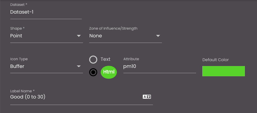
The example below shows the configuration for the default visualization of PM10 pollution levels – the visualization that is used if the PM10 value does not match one of the conditions in the Legends panel:
On the map, this appears as follows, for a PM10 value of 19.0:

The following settings refer to the icon that is shown for markers on this layer when the Attribute field has a particular value. Ensure that the Legends slider is slid to the right so that you can open the panel.
Click on the Add Legend
 icon to add the legends.
Setting
Description
Shape
The shape that is used for the marker. The options are as follows:
Point If the dataset includes Point coordinates for each feature, the marker would be displayed as an icon or text at those coordinates. For example, the coordinates may specify the position of a street light.
Line If the dataset includes LineString coordinates for each feature, the marker would be displayed as a line that joins those coordinates. For example, the coordinates may specify the positions of the start and end points of a road.
Polygon If the dataset includes Polygon coordinates for each feature, the marker would be displayed as a shape that joins those coordinates. For example, the coordinates may specify the positions of points on the outline of a region of a country.
Multi Point If the dataset includes two or more Point coordinates for each feature, the markers would be displayed as an icon or text at those coordinates. For example, the coordinates may specify the position of street lights.
Multi Line If the dataset includes an array of LineString coordinate arrays for each feature, the markers would be displayed as lines that joins those coordinates. For example, the coordinates may specify the positions of the start and end points of roads.
Multi Polygon If the dataset includes an array of Polygon coordinate arrays for each feature, the markers would be displayed as a shape that joins those coordinates. For example, the coordinates may specify the positions of points on the outline of regions of countries.
Icon Type
The icon that is used for the marker. The options are as follows:
Icon Picker Enables you to select an icon from a pop-up by clicking ICON. For "canvas" tag datasets used to load large number of markers, you can also select an icon to represent a marker(s) that is selected on the map, from a pop-up by clicking SELECTED ICON. For more information on loading large number of markers see, Load large number of markers in a map widget.
Buffer Enables you to choose either a textual representation or a textual representation within a solid circle.
For a textual representation within a solid circle you can select any of the following colors to be displayed along with the transparency:
Solid - A single color to be displayed all over.
Linear - Multiple colors are used, where one color gradually fades and changes into another color, linearly.
The following options are available for the Linear color type:
You can select the colors to be displayed in an area of the background by clicking on the color strip and can remove the color selected by clicking on the
icon.You can set the direction of the color progression from left to right or center or top to bottom.
Radial - Multiple colors are used, where one color gradually fades and changes into another color, radially.
The following options are available for the Radial color type:
You can select the colors to be displayed in an area of the background by clicking on the color strip and can remove the color selected by clicking on the
icon.You can set the direction of the color progression from left to right or center or top to bottom.
Also, based on the Palette in the Widget Style tab, a set of Preset colors are available to directly choose from, which if selected, change based on the theme.
Dot Enables you to display the marker as a dot.
Note
It is displayed only when the Dataset tab has the tag "canvas". For more information see, Load large number of markers in a map widget.
Point Color(only when Shape is Point or Multi Point)
The color of the point. This applies if you have selected the Icon Type as Buffer and Text.
Also, based on the Palette in the Widget Style tab, a set of Preset colors are available to directly choose from, which if selected, change based on the theme.
Default Color (only when Shape is Point or Multi Point)
The color of the point. This applies if you have selected the Icon Type as Buffer and HTML.
Also, based on the Palette in the Widget Style tab, a set of Preset colors are available to directly choose from, which if selected, change based on the theme.
Line Color (only when Shape is Line or Multi Line)
The color of the line.
Also, based on the Palette in the Widget Style tab, a set of Preset colors are available to directly choose from, which if selected, change based on the theme.
Fill Area Color (only when Shape is Polygon or Multi Polygon
The color of the filled area of the polygon.
Also, based on the Palette in the Widget Style tab, a set of Preset colors are available to directly choose from, which if selected, change based on the theme.
Boundary Color (only when Shape is Polygon or Multi Polygon
The color of the boundary of the polygon.
Also, based on the Palette in the Widget Style tab, a set of Preset colors are available to directly choose from, which if selected, change based on the theme.
Label Name
The legend name to be displayed in the Summary Panel.
You can also translate this text by clicking on the Translate icon
and entering the translation of the desired language selected. Auto-suggestions are also available where the reused contents are auto-suggested.Background Color
The background color of the legend.
You can select any of the following color types to be displayed along with the transparency:
Solid - A single color to be displayed all over.
Linear - Multiple colors are used, where one color gradually fades and changes into another color, linearly.
The following options are available for the Linear color type:
You can select the colors to be displayed in an area of the background by clicking on the color strip and can remove the color selected by clicking on the
icon.You can set the direction of the color progression from left to right or center or top to bottom.
Radial - Multiple colors are used, where one color gradually fades and changes into another color, radially.
The following options are available for the Radial color type:
You can select the colors to be displayed in an area of the background by clicking on the color strip and can remove the color selected by clicking on the
icon.You can set the direction of the color progression from left to right or center or top to bottom.
Also, based on the Palette in the Widget Style tab, a set of Preset colors are available to directly choose from, which if selected, change based on the theme.
Attribute
The dataset field that is used to determine how each marker should be displayed. It is shown when the Icon Type selected is Buffer.
Note
If the dataset is edited or updated later such that the property selected in Attribute is removed, a message is briefly displayed once the dataset is refreshed and Update is clicked in the Dataset tab, intimating that the Legend attribute is missing.

Adds a condition for the legend.

Combines multiple conditions of legends using the And and Or operators.

Deletes a condition for the legend.

Deletes the multiple conditions of legends created having the And and Or operators.
Operation
The operation to be performed to compare the value of the Attribute field for each marker against the value in the Value box.
Value
The value against which to compare the value of the Attribute field for each marker.
Second Value
The upper end of the range of values against which to compare the value of the Attribute field for each marker, if Operation is set to Between.

Deletes the legend.

Adds another legend.
You can reorder the legends by dragging and dropping them at the positions you require and they will be displayed accordingly in that order in the Summary Panel.
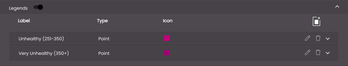
The example below shows the configuration for the visualization of specific PM10 pollution levels:
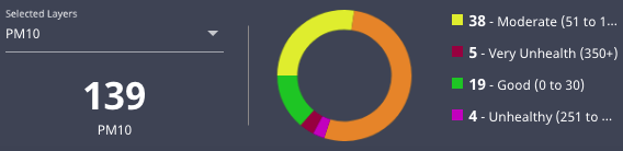
On the map, this appears as follows, for a PM10 value of 291.0 and a value of 556.0:


On the Summary Panel, the visualizations are listed, with the number of markers that have values in each range:
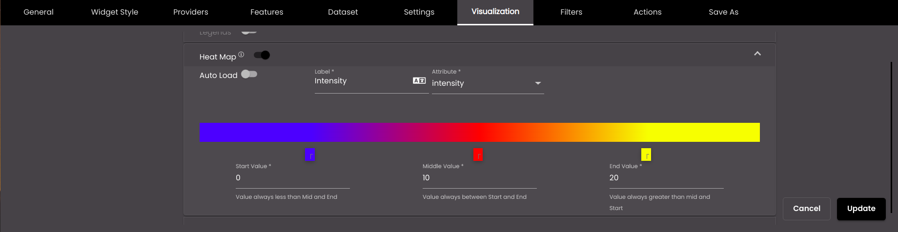
The following settings refer to the use of a continuous color scale to represent the value of the Attribute field for each marker. Ensure that the Heat Map slider is slid to the right so that you can open the panel.
Setting
Description
Auto Load
Displays the heat map on the map when the map is refreshed.
Label
The heat map name that is displayed in the heat map tool on the Designer floating panel.
You can also translate this text by clicking on the Translate icon
and entering the translation of the desired language selected. Auto-suggestions are also available where the reused contents are auto-suggested.Attribute
The dataset field that is used to determine how each marker should be displayed.
Start Value
The value of the Attribute field to be represented by the color that you select using the color picker that is just above the Start Value box.
Middle Value
The value of the Attribute field to be represented by the color that you select using the color picker that is just above the Middle Value box.
End Value
The value of the Attribute field to be represented by the color that you select using the color picker that is just above the End Value box.
The example below shows the configuration for the visualization of intensity:
On the map, each marker is shown in a different color, according to where its intensity value is on the heat map scale.
The following settings refer to the zoom level at which markers are visible and to the clustering of markers at lower zoom levels.
Setting
Description
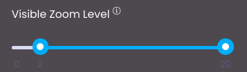
Visible Zoom Level
The numbers next to the bar correspond to zoom levels on the zoom slider control on the Quick Panel, where 0 is least magnification and 20 is most magnification. By default, markers are visible at all zoom levels. However, you can slide the blue circles along the bar to indicate a different range. The example below shows that markers are visible only at zoom levels 8–20:
Clustering
Enables you to configure how markers are clustered together in a single marker when there are multiple markers near to each other. The settings below are revealed.
Attribute
The dataset field that is used to determine how markers are clustered together in a single marker when there are multiple markers near to each other.
Cluster Color
The color of the cluster marker.
Also, based on the Palette in the Widget Style tab, a set of Preset colors are available to directly choose from, which if selected, change based on the theme.
Icon Type
The icon that is used for the cluster marker. The options are as follows:
Icon Picker Enables you to select an icon from a pop-up by clicking ICON.
HTML Icon Reveals the Label Type box, in which you should select Count to display the number of individual markers that are represented by the cluster marker. The example below shows a cluster marker that represents two individual markers:

Icon & Text Enables you to select an icon from a pop-up by clicking ICON and also reveals the Label Type box, in which you should select Count to display the number of individual markers that are represented by the cluster marker.
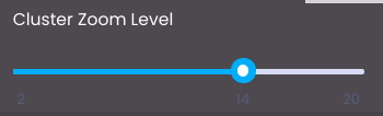
Cluster Zoom Level
The number on the bar corresponds to zoom levels on the zoom slider control on the Quick Panel, where 0 is least magnification and 20 is most magnification. It indicates the zoom level at which and below which individual markers are clustered together, and above which they are shown separately. The example below shows that markers are clustered from zoom levels 0–14:
Click Update.
On the left-hand side of the tab, click any other layer for which you want to configure visualization and change the settings as required.