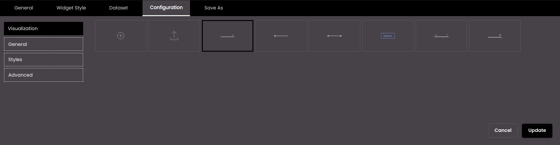
Configure Data Selector visualization
You can specify what the overall presentation of information should be, for example how many data selectors are displayed and whether they are displayed like Input ,Value Slider, Range Slider, Buttons, List or Calendar data selectors.
If the widget configuration dialog box is not already open, do as follows:
If the widget is on a Grid layout dashboard, click the Menu icon
 in the top right-hand corner of the widget and select Settings.
If the widget is on a Fluid layout dashboard, on the floating toolbar for the widget, click the Settings icon:
.
Click the Configuration tab.
On the left-hand side, click Visualization.
Select one of the options for visualizing information:
Setting
Description
Creates a custom data selector template layout.

Imports a previously exported custom data selector template layout.
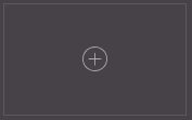
Displays the Input data selector to enter a search string.
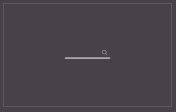
Displays the Value Slider data selector to select the values from a min to a max value.
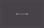
Displays the Range Slider data selector to select the values between a min and max value.
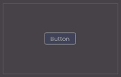
Displays the Buttons data selector to create buttons for selection.
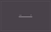
Displays the List data selector to enter or select an item from a list.
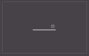
Displays the Calendar data selector to select a date or time or both.
If the custom template
icon is selected, the Create Template dialog is displayed.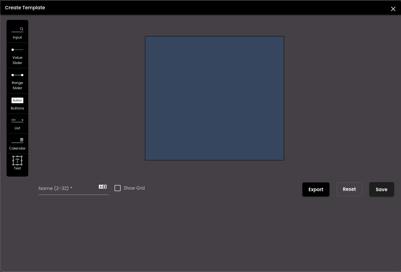
In the Create Template dialog, configure the following settings.
Setting
Description
Input
Displays a text field to enter a search string.
Value Slider
Displays a slider to select the values from a min to a max value.
Range Slider
Displays a slider to select the values between a min and max value.
Buttons
Displays buttons for selection.
List
Displays a list to select an item from.
Calendar
Displays a calendar to select a date or time or both.
Text
Displays a text area.
Name
The name of the data selector layout.
You can also translate this text by clicking on the Translate icon
 and entering the translation of the desired language selected. Auto-suggestions are also available where the reused contents are auto-suggested.
Note
It must be 2-32 characters only.
Show Grid
Displays horizontal and vertical lines on the canvas.
You can drag and drop the above data selectors onto the 100*100 canvas and can resize it by dragging the container’s sides to the desired size. The size of the data selector template preview is same as the widget size. Also, you can delete the data selectors by clicking on the
 icon.
icon.To export the custom template, click on the Export button. The custom templates is downloaded as JSON code on your computer.
You can undo the changes made on the canvas by clicking the Reset button.
Finally, click Save.
The new data selector layout created is shown in the Visualization section.
Note
You can create only one custom template.
You can also edit and delete the custom data selector template:
Click on the Edit
 icon to edit the custom data selector template.
Click on the Delete
 icon to delete the custom data selector template.
Click Update.
Note
When switching between the Input , Value Slider , Range Slider , Buttons , List, Calendar and custom data selectors, you need to confirm if the previous data selector template can be overridden.