Configure widget style
You can configure the appearance and visibility of the widget title, whether the widget can be dragged, its size, and, for Fluid layout dashboards only, its visibility. In general, the settings here override any corresponding settings that you set for the dashboard as a whole.
If the widget configuration dialog box is not already open, do as follows:
If the widget is on a Grid layout dashboard, click the Menu icon
 in the top right-hand corner of the widget and select Settings.
If the widget is on a Fluid layout dashboard, on the floating toolbar for the widget, click the Settings icon:
.
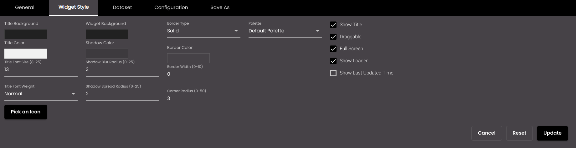
In the widget configuration dialog box, click the Widget Style tab.
Change the settings as required:
Setting
Description
Title Background
The widget title bar color.
You can select any of the following color types to be displayed along with the transparency:
Solid - A single color to be displayed all over.
Linear - Multiple colors are used, where one color gradually fades and changes into another color, linearly.
The following options are available for the Linear color type:
You can select the colors to be displayed in an area of the background by clicking on the color strip and can remove the color selected by clicking on the
 icon.
icon.You can set the direction of the color progression from left to right or center or top to bottom.
Radial - Multiple colors are used, where one color gradually fades and changes into another color, radially.
The following options are available for the Radial color type:
You can select the colors to be displayed in an area of the background by clicking on the color strip and can remove the color selected by clicking on the
icon.You can set the direction of the color progression from left to right or center or top to bottom.
Widget Background
The widget background color.
You can select any of the following color types to be displayed along with the transparency:
Solid - A single color to be displayed all over.
Linear - Multiple colors are used, where one color gradually fades and changes into another color, linearly.
The following options are available for the Linear color type:
You can select the colors to be displayed in an area of the background by clicking on the color strip and can remove the color selected by clicking on the
icon.You can set the direction of the color progression from left to right or center or top to bottom.
Radial - Multiple colors are used, where one color gradually fades and changes into another color, radially.
The following options are available for the Radial color type:
You can select the colors to be displayed in an area of the background by clicking on the color strip and can remove the color selected by clicking on the
icon.You can set the direction of the color progression from left to right or center or top to bottom.
Title Color
The widget title font color.
Shadow Color
The color of the shadow around the widget.
Title Font Size
The widget title font size in points.
Note
Allowed values are from 8-25 points.
Shadow Blur Radius
The amount of blurring for the shadow shown around the widget.
Note
Allowed values are from 0-25 points.
Title Font Weight
The thickness of the title font which can be one of the following:
Normal
Bold
Shadow Spread Radius
The width of the shadow shown around the widget.
Note
Allowed values are from 0-25 points.
Border Type
The widget border type. It can be one of the following:
Solid
Dashed
Double
Dotted
Border Color
The widget border color.
Border Width
The width of the widget border.
Note
Allowed values are from 0-25 points.
Corner Radius
The widget corner radius.
Note
Allowed values are from 0-100 points.
Palette
Displays a set of colors based on the theme selected in Advanced.
Note
If the theme selected is Heavenly Hues then apart from the Default Palette another Palette-1 is shown.
Pick an Icon
Click this to select an icon to display next to the widget title.
Show Title
Displays the widget title at all times. If not selected, the title is displayed only when the mouse cursor hovers over the widget.
Draggable
Determines whether you can drag the widget across the dashboard. For this to work, Drag items must also be selected in the dashboard Layout settings.
Full Screen
For Fixed layout dashboard, determines whether the Maximize option is available when you click the Menu icon
in the top right-hand corner of the widget. If it is, you can click Maximize to resize the widget to fill the entire browser window.For Fluid layout dashboard, determines whether the Maximize option is available on the Fluid layout floating toolbar. If it is, you can resize the widget to fill the entire browser window.
Show Loader
Displays a progress bar while the widget loads. If not selected, the progress bar is not displayed.
Show Last Updated
Displays the last updated date and time of the widget in their respective formats that was selected in Configure branding settings, at the bottom of the widget. If not selected, the last updated date and time is not displayed.
Click Update.