Configure KPI widget KPI selection
You need to configure which values you want to display as KPIs for whichever visualization you have selected, and, if appropriate, which values you want to compare against or use for a bullet graph.
If the widget configuration dialog box is not already open, do as follows:
If the widget is on a Grid layout dashboard, click the Menu icon
 in the top right-hand corner of the widget and select Settings.
If the widget is on a Fluid layout dashboard, on the floating toolbar for the widget, click the Settings icon:
.
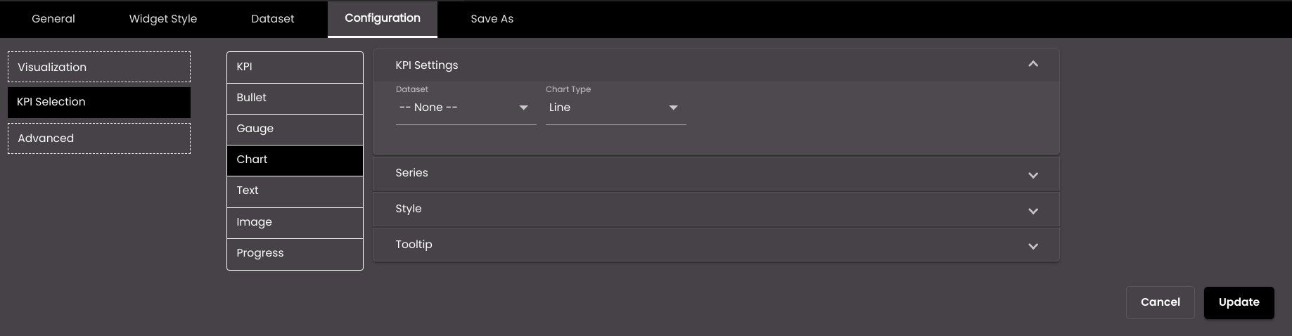
Click the Configuration tab.
On the left-hand side, click KPI Selection.
A number of drop-down panels are displayed, depending on which visualization has been selected. Click one and change the settings as required.
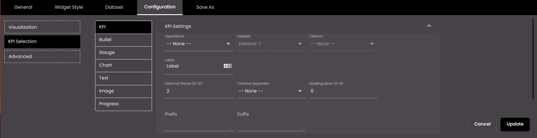
The following common settings across all templates refer to the KPI values that should be displayed.
Setting
Description
Select KPI (available only if there is more than one)
The KPI that you want to configure.
Operation
Determines whether to simply display a specific value from a dataset column or to perform an operation on all the values in that column. The operations apply only when the dataset is retrieving all the rows of data from the data source, instead of using request parameters to retrieve a single row. The options are as follows:
Sum The sum of the values in the selected column.
Min The minimum value in the selected column.
Max The maximum value in the selected column.
Average The average of the values in the selected column.
Count The number of values in the selected column.
Distinct The number of unique values in the selected column.
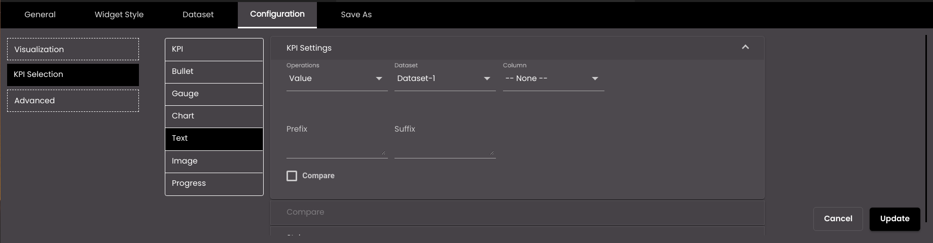
Value A specific value from the selected column.
User Input A numeric value that you enter in the KPI Value box.
Dataset
The dataset that is selected.
Column
The column from which you want to display data.
If the dataset is returning a sequence of key–value pairs, the options are as follows:
Key The title of the column.
Value The value in the column.
Label
The text of the label to be displayed next to the KPI.
You can also translate this text by clicking on the Translate icon
 and entering the translation of the desired language selected. Auto-suggestions are also available where the reused contents are auto-suggested.
Prefix
Text to display before the KPI value.
Suffix
Text to display after the KPI value.
Decimal Places
The number of decimal places to display for numeric values.
Note
Allowed values are from 0-12.
Comma Separator
Displays a comma separator in numeric values. The options are as follows:
1,000,000 Western numbering system
10,00,000 Indian numbering system
Leading Zeros
The number of digits that are displayed before the decimal point for a numeric value. 0 digits are added before the first nonzero digit in order to satisfy this case.
Note
Allowed values are from 1-9.
User Input (available only if Operation is set to User Input)
A fixed numeric value that you want to display. For this setting, it doesn't matter which dataset is selected because it's not retrieving a value from a dataset; instead you're entering the value yourself.
Compare
When selected, the Compare drop-down panel is also displayed below so that another value can be selected for comparison.
Display Compare Label
Displays the Operations and Label value that has been selected for comparison in the Compare section.
Tooltip
If selected, a text can be entered in Tooltip description as the tooltip.
Tooltip description
The text that is shown on hovering the mouse over the text displayed. It is displayed if Tooltip is selected.
You can also translate this text by clicking on the Translate icon
and entering the translation of the desired language selected. Auto-suggestions are also available where the reused contents are auto-suggested.Display as Link
If selected, and if the value is a URL it is displayed as a link. When clicked, it opens the URL in another tab in the browser. It is also present for the text visualization.
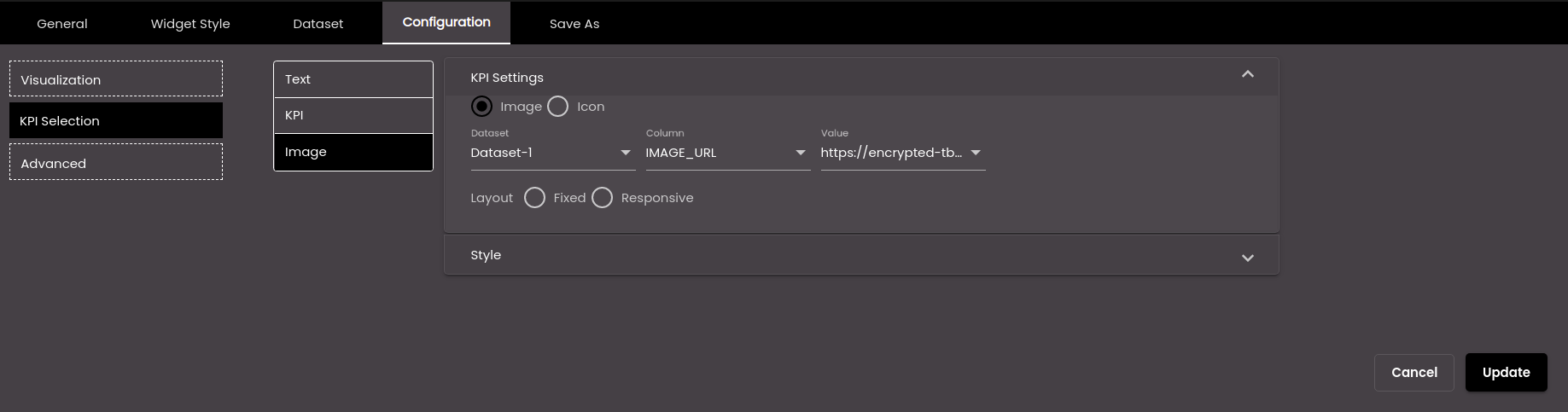
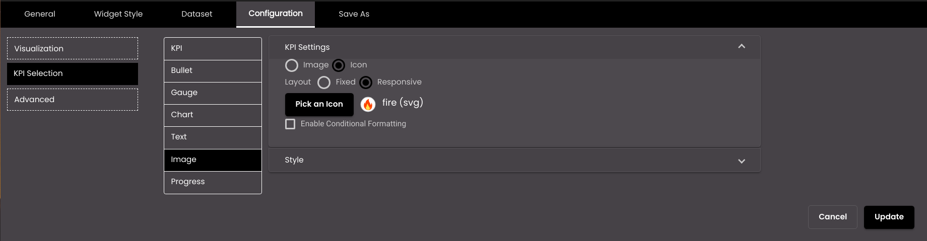
The following settings refer to image visualizations.
Setting
Description
Image
The image from a URL that is to be used for the KPI.
Icon
The icon that is to be used for the KPI.
If Image has been selected, then configure the following settings.
Setting
Description
Dataset
The dataset that is selected.
Column
The column from which you want to display data.
Value
The dropdown to select the URL of the image.
Layout Fixed
The size of the layout is fixed and doesn’t change if the widget is resized. If this option is selected, Width and Height are displayed.
Layout Responsive
The layout resizes based on the size of the widget.
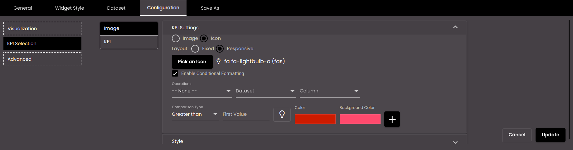
If Icon has been selected, then configure the following settings.
Setting
Description
Pick an Icon
Enables you to select the icon for the KPI.
Layout Fixed
The size of the layout is fixed and doesn’t change if the widget is resized.
Layout Responsive
The layout resizes based on the size of the widget.
Enable Conditional Formatting
Displays the Conditional Formatting setting which is used to configure different colors for the icon based on the value of a dataset field.
If Enable Conditional Formatting has been selected above, then apart from the common settings, configure the following formatting options.
Setting
Description
Comparison Type
The comparison to be performed on the column value and the value in the First Value box to the right. Exact can be used with any data type; the others can be used only with numeric data types.
First Value
Select the literal value to be compared with the value of the selected dataset attribute.
Second Value
The upper value of the range, if Comparison Type is Between.
Color
Select the display color to be used for words which meet this condition.
Background Color
Select the background display color to be used for words which meet this condition.
+
Enables you to add another condition.

Removes the added condition.
The following setting refer to chart visualizations.
Setting
Description
Chart Type
The visualization for the chart. The options are as follows:
Bar Presents information as a horizontal bar chart.
Line Presents information as a line that joins data points.
Area Similar to a line chart but with the area under the line shaded.
Column Presents information as a vertical bar chart.
The following setting refer to text visualizations if the Dashboard option is selected in Operations.
Note
The direct navigation to other dashboards is available only for the Text visualization and not the other visualizations.
Setting
Description
Operations
Display a specific value from a dataset column or enter a value or navigate to a dashboard. The options are as follows:
Value A specific value from the selected column.
User Input A text value that you enter in the User Input box.
You can also translate this text by clicking on the Translate icon
and entering the translation of the desired language selected. Auto-suggestions are also available where the reused contents are auto-suggested.Dashboard Directly navigates to the selected dashboard and displays it in another window of the web browser.
Dashboard (available only if Operations is set to Dashboard)
Select or search for another dashboard to directly navigate to upon clicking the dashboard name, from the list of dashboards in the drop-down.
Enable Custom Name (available only if Operations is set to Dashboard)
If enabled, displays the Display Name field to enter the desired custom name for the selected dashboard.
Display Name (available only if Operations is set to Dashboard)
The custom name for the selected dashboard. It is displayed if Enable Custom Name is enabled.
You can also translate this text by clicking on the Translate icon
and entering the translation of the desired language selected. Auto-suggestions are also available where the reused contents are auto-suggested.Note
The aggregation Operations like Sum, Min, Max etc are not present for the Progress, Text, Chart and Image selection in KPI Settings of Image visualizations.
For the aggregation Operations all the columns data are considered, aggregated based on the operation selected and the aggregated value is shown. For the operation Value, the first row and first column data gets selected from the Dataset to be shown for the KPI widget.
The KPI widget accepts string values too along with numeric values.
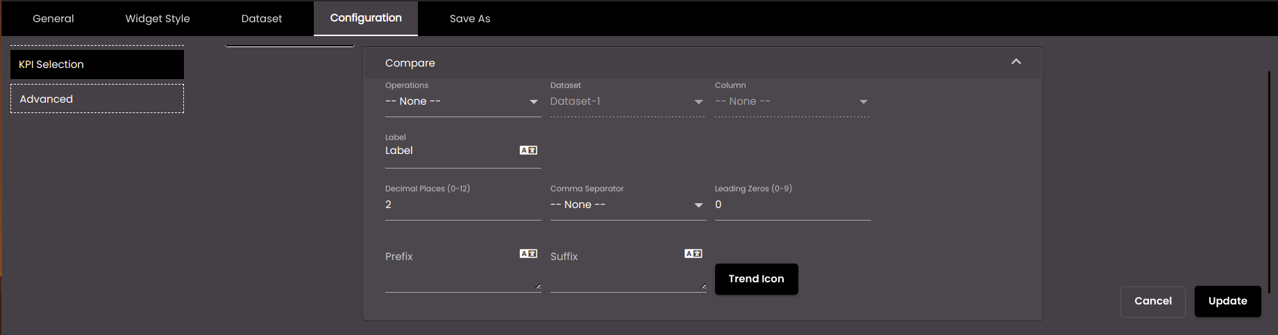
The following settings refer to the value with which the KPI value should be compared, if you have selected one of the comparison visualizations.
Setting
Description
Operation
This box works in the same way as the Operation box in the KPI Value panel.
Dataset
The dataset that is selected.
Column
The column with which you want to compare the KPI.
If the dataset is returning a sequence of key–value pairs, the options are as follows:
Key The title of the column.
Value The value in the column.
Label
The text of the label to be displayed next to the value with which you want to compare the KPI.
You can also translate this text by clicking on the Translate icon
and entering the translation of the desired language selected. Auto-suggestions are also available where the reused contents are auto-suggested.User Input (available only if Operation is set to User Input)
A fixed numeric value to be compared with the KPI. For this setting, it doesn't matter which dataset is selected because it's not retrieving a value from a dataset; instead you're entering the value yourself.
Decimal Places
The number of decimal places to display for numeric values.
Note
Allowed values are from 0-12.
Comma Separator
Displays a comma separator in numeric values. The options are as follows:
1,000,000 Western numbering system
10,00,000 Indian numbering system
Leading Zeros
The number of digits that are displayed before the decimal point for a numeric value. 0 digits are added before the first nonzero digit in order to satisfy this case.
Note
Allowed values are from 1-9.
Prefix
Text to display before the comparison value.
You can also translate this text by clicking on the Translate icon
and entering the translation of the desired language selected. Auto-suggestions are also available where the reused contents are auto-suggested.Suffix
Text to display after the comparison value.
You can also translate this text by clicking on the Translate icon
and entering the translation of the desired language selected. Auto-suggestions are also available where the reused contents are auto-suggested.Trend Icon
Click this to select an icon to display as the comparison icon.
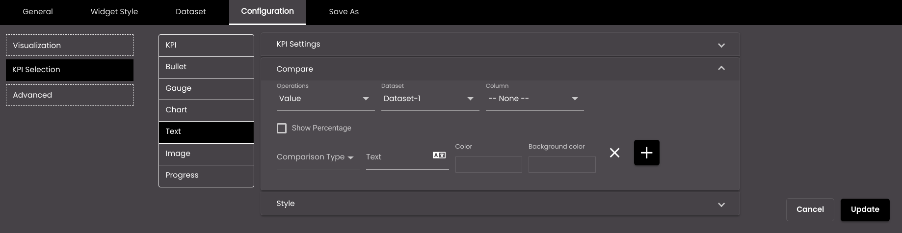
The following settings refer to text visualizations if the Value or User Input option is selected in Operations in KPI Settings.
Setting
Description
Show Percentage
Displays the percentage increase or decrease from the value selected in the KPI Settings.
Comparison Type
The comparison to be performed on the KPI Settings value and the comparison value. Exact can be used with any data type; the others can be used only with numeric data types.
Text
The text displayed which overrides the value selected in the KPI Settings.
Color
The color of the text when it satisfies the comparison.
Note
This color overrides the Text Color in the Style section if the condition mentioned here is met.
Background color
The background color of the text when it satisfies the comparison.
Note
This color overrides the Text Background in the Style section if the condition mentioned here is met.
+
Enables you to add another comparison.
Removes the added comparison.
The following settings refer to the goal value on a bullet graph visualization.
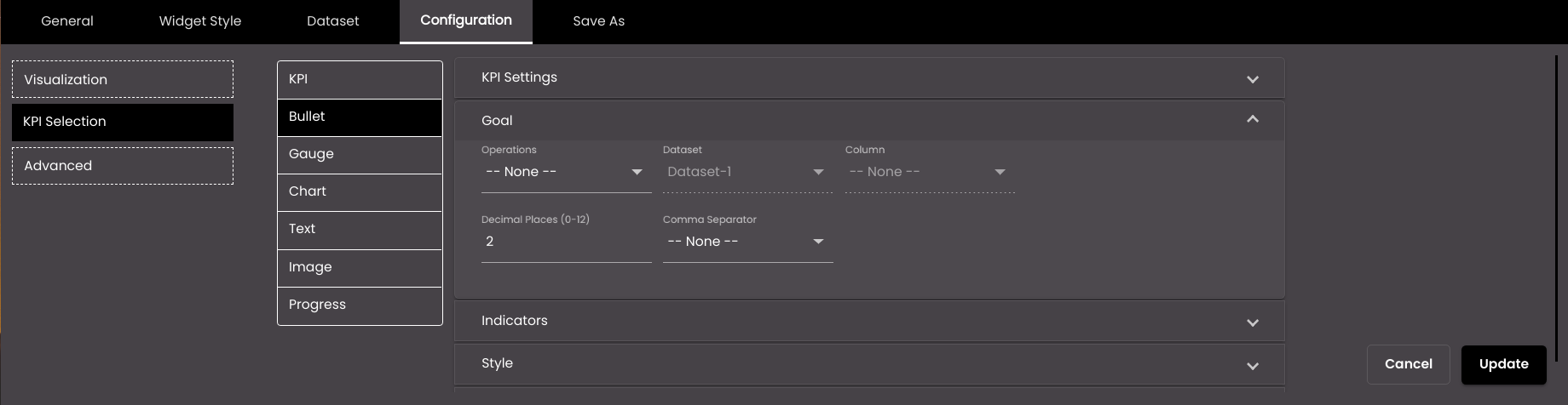
Setting
Description
Operations
This box works in the same way as the Operations box in the KPI Settings panel.
Dataset
The dataset that is selected.
Column
The column from which you want to display data.
User Input (available only if Operation is set to User Input)
A fixed numeric value that you want to display. For this setting, it doesn't matter which dataset is selected because it's not retrieving a value from a dataset; instead you're entering the value yourself.
Decimal Places
The number of decimal places to display for numeric values.
Note
Allowed values are from 0-12.
Comma Separator
Displays a comma separator in numeric values. The options are as follows:
1,000,000 Western numbering system
10,00,000 Indian numbering system
The following settings refer to the indicator values on a gauge chart and bullet graph visualization.
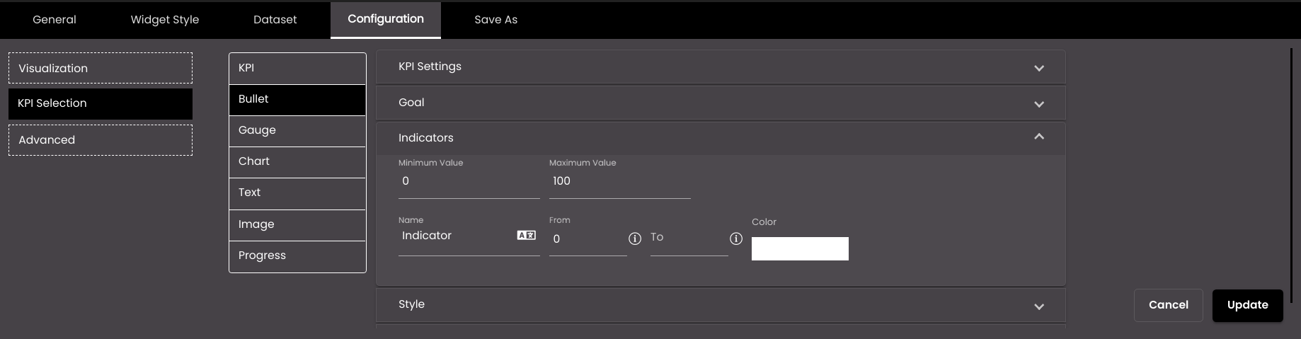
Setting
Description
Minimum Value
The minimum value to be displayed on the gauge chart or bullet graph.
Maximum Value
The maximum value to be displayed on the gauge chart or bullet graph.
Name
The name of the indicator. This may be used to label a subset of the gauge value range configured above. For example, if the gauge range is 0-100 then there may be three indicators for 'Cold' with values 0-20, 'Warm' for values 20-50, and 'Hot' for values in the range 50-100.
You can also translate this text by clicking on the Translate icon
and entering the translation of the desired language selected. Auto-suggestions are also available where the reused contents are auto-suggested.From
The minimum value for the indicator range. For the first indicator, this must be equal to the minimum value for the gauge configured above; for subsequent indicators, it must be equal to the maximum value of the previous indicator.
To
The maximum value for the indicator range.
Indicator Color
The display color to be used for this indicator.
+
Enables you to add another indicator.
Removes the added indicator.
The following settings refer to the chart visualization.
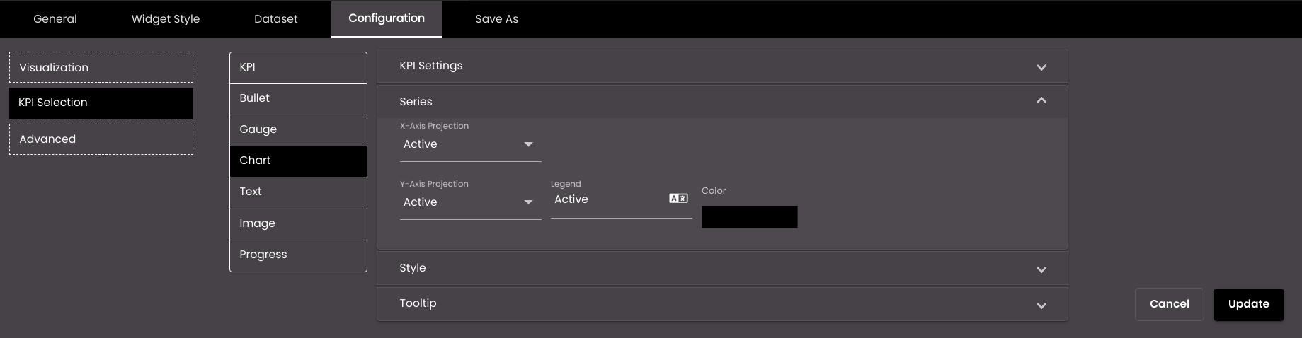
Setting
Description
X-Axis Projection
The dataset field that is used for the independent variable.
Y-Axis Projection
The dataset field that is used for a dependent variable.
Legend
The name of the series that is displayed alongside the chart, usually underneath.
Color
The color that is used to represent the series. A default color is already selected for each series but you can change it.
Also, based on the Palette in the Widget Style tab, a set of Preset colors are available to directly choose from, which if selected, change based on the theme.
+
Enables you to add another series.
Removes the added series.
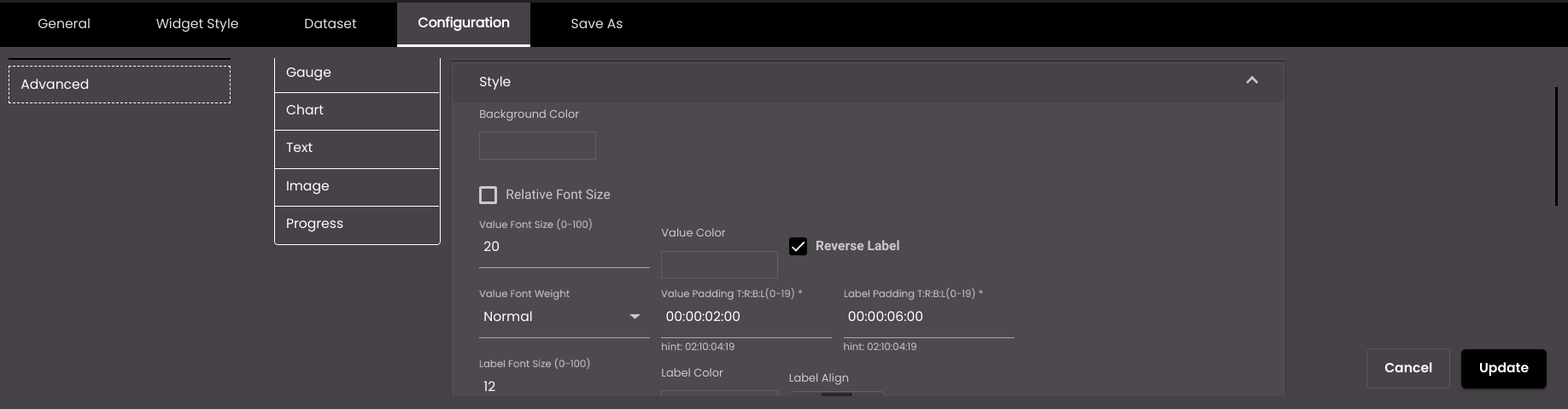
The following settings refer to the KPI visualization. If the Display Compare Value is selected in KPI Settings, the compare label-value settings are displayed.
Setting
Description
Background Color
The background color of the KPI widget.
Also, based on the Palette in the Widget Style tab, a set of Preset colors are available to directly choose from, which if selected, change based on the theme.
Value Font Size
The font size of the value, in points.
Note
Allowed values are from 0-100.
Value Color
The color of the value.
Also, based on the Palette in the Widget Style tab, a set of Preset colors are available to directly choose from, which if selected, change based on the theme.
Reverse Label
Reverse the label and value so that the label is shown above the value.
Value Font Weight
The thickness of the value font which can be one of the following:
Normal
Bold
Value Padding T:R:B:L
Adjust the space between the value and the border in top, right, bottom, and left.
Note
Allowed values are from 0-19.
Label Padding T:R:B:L
Adjust the space between the Label and the border in top, right, bottom, and left.
Note
Allowed values are from 0-19.
Label Font Size
The font size of the label, in points.
Note
Allowed values are from 0-100.
Label Color
The color of the label.
Also, based on the Palette in the Widget Style tab, a set of Preset colors are available to directly choose from, which if selected, change based on the theme.
Label Align
The horizontal alignment of the label relative to the value. It can be left, center or right.
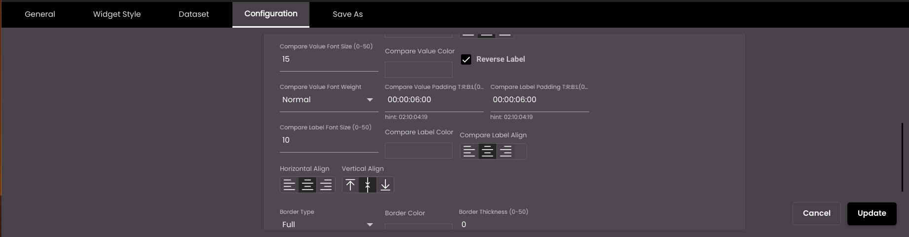
Compare Value Font Size
The font size of the comparison value, in points.
Note
Allowed values are from 0-50.
Compare Value Color
The color of the comparison value.
Also, based on the Palette in the Widget Style tab, a set of Preset colors are available to directly choose from, which if selected, change based on the theme.
Reverse Label
(For the compare value)
Reverse the compare label and compare value so that the compare label is shown above the compare value.
Compare Value Font Weight
The thickness of the compare value font which can be one of the following:
Normal
Bold
Compare Value Padding T:R:B:L
Adjust the space between the comparison value and the border in top, right, bottom, and left position.
Note
Allowed values are between 0-19
Compare Label Padding T:R:B:L
Adjust the space between the comparison Label and the border in top, right, bottom, and left position.
Note
Allowed values are between 0-19
Compare Label Font Size
The font size of the comparison label, in points.
Note
Allowed values are from 0-50.
Compare Label Color
The color of the comparison label.
Also, based on the Palette in the Widget Style tab, a set of Preset colors are available to directly choose from, which if selected, change based on the theme.
Compare Label Align
The horizontal alignment of the compare label relative to the compare value. It can be left, center or right.
Horizontal Align
The horizontal alignment of the label-value and compare label-compare value – left, center or right.
Vertical Align
The vertical alignment of the label-value and compare label - compare value – top, middle or bottom.
Border Type
The type of border for the KPI component – Full or Semi.
Border Color
The color of the border.
Also, based on the Palette in the Widget Style tab, a set of Preset colors are available to directly choose from, which if selected, change based on the theme.
Border Thickness
The thickness of the border.
Note
Allowed values are from 0-50.
Border
The position of the border – top, bottom, left and right.
Border Radius
Radius of the border.
Note
Allowed values are from 0-50.
Label Padding T:R:B:L
Padding / Space between the border & Value or label.
Note
Allowed values are from 0-19.
By selecting the Relative Font Size all the values and labels will change to relative font size with the default relative font size as 1.
Note
Relative font size provides the responsiveness to the labels and values in the KPI widgets, and it is relative the widget size.
Note
Relative Font Size will allow values from 0-10 only.
The following settings refer to bullet graph visualizations.
Setting
Description
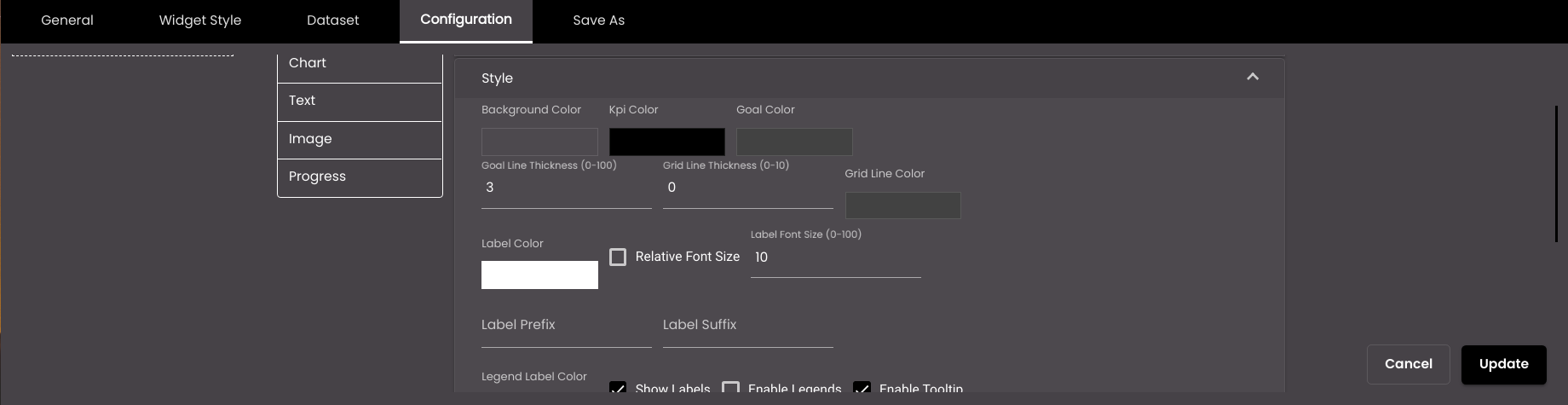
Background Color
The background color of the bullet graph.
Also, based on the Palette in the Widget Style tab, a set of Preset colors are available to directly choose from, which if selected, change based on the theme.
KPI Color
The color of the KPI portion of the graph.
Goal Color
The color of the goal portion of the graph.
Goal line thickness
The thickness of the goal portion of the graph.
Note
Allowed values are from 0-100.
Grid line thickness
The thickness of the vertical line between values.
Note
Allowed values are from 0-10.
Grid Line Color
The color of the vertical line between values.
Also, based on the Palette in the Widget Style tab, a set of Preset colors are available to directly choose from, which if selected, change based on the theme.
Label Color
The color of the label.
Also, based on the Palette in the Widget Style tab, a set of Preset colors are available to directly choose from, which if selected, change based on the theme.
Label Font Size
The font size of the axis labels and the label that appears above the graph, in points.
Note
Allowed values are from 0-100.
Relative Font Size
The Relative Font Size of the axis labels and the label that appears above the graph, in points.
Note
Allowed values are from 0-10
Label Suffix
An optional symbol to be displayed after the label.
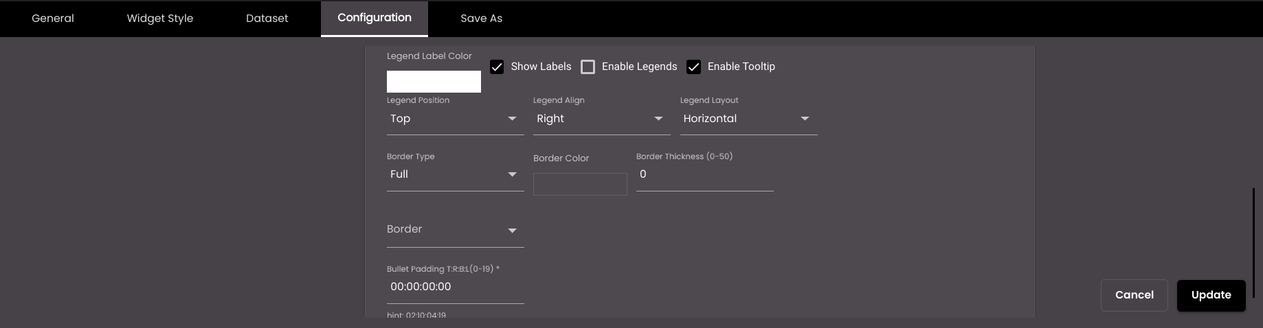
Legend Label Color
The font color of the legend label.
Also, based on the Palette in the Widget Style tab, a set of Preset colors are available to directly choose from, which if selected, change based on the theme.
Show Labels
Displays the labels on the graph.
Enable Legends
Displays the name(s) of the series alongside the graph.
Enable Tooltip
Displays a tooltip when the mouse pointer hovers over a data point.
Legend Position
Whether the legend is positioned above or below the graph.
Legend Align
The horizontal alignment of the legend.
Legend Layout
Displays the legend either horizontal or vertical.
Border Type
The type of border for the graph – Full or Semi.
Border Color
The color of the border.
Also, based on the Palette in the Widget Style tab, a set of Preset colors are available to directly choose from, which if selected, change based on the theme.
Border Thickness
The thickness of the border.
Note
Allowed values are from 0-50.
Border
The position of the border – top, bottom, left and right.
Bullet Padding T:R:B:L
Padding / Space between the border & Value or label.
Note
Allowed values are from 0-19.
The following settings refer to text visualizations.
Setting
Description
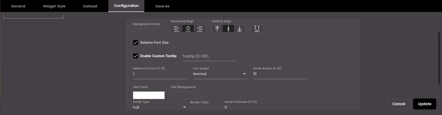
Background Color
The background color of the text.
Also, based on the Palette in the Widget Style tab, a set of Preset colors are available to directly choose from, which if selected, change based on the theme.
Horizontal Align
The horizontal alignment of the text – left, center or right.
Vertical Align
The vertical position of the text - top, middle, bottom.
Underline
Draws an underline below the text.
Relative Font Size
The relative font size of the text in points.
Note
Allowed values are from 0-10.
Font Size
The font size of the text, in points.
Note
Allowed values are from 0-100.
Font Weight
The thickness of the text font which can be one of the following:
Normal
Bold
Border Radius
The corner radius of the text background.
Note
Allowed values are from 0-50.
Text Color
The color of the text.
Note
This color will get overridden by the Color in the Compare section if the condition mentioned there is met.
Text Background
The background color of the text.
Note
This color will get overridden by the Background color in the Compare section if the condition mentioned there is met.
Border Type
The type of border for the text – Full or Semi.
Border Color
The color of the border.
Also, based on the Palette in the Widget Style tab, a set of Preset colors are available to directly choose from, which if selected, change based on the theme.
Border Thickness
The thickness of the border.
Note
Allowed values are from 0-50.
Border
The position of the border – top, bottom, left and right.
Text Padding T:R:B:L
Padding / Space between the border & Value or label.
Note
Allowed values are from 0-19.
The following settings refer to gauge graph visualizations.
Setting
Description
Background Color
The background color of the graph.
Also, based on the Palette in the Widget Style tab, a set of Preset colors are available to directly choose from, which if selected, change based on the theme.
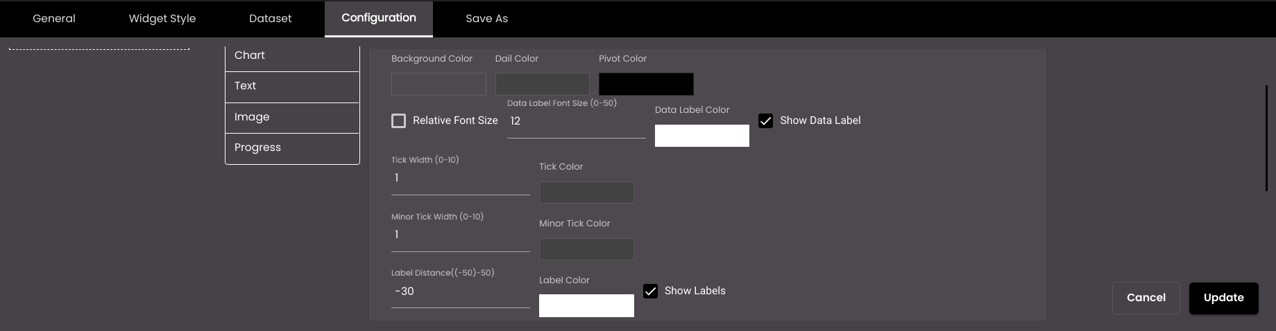
Dial Color
The color of the dial needle.
Also, based on the Palette in the Widget Style tab, a set of Preset colors are available to directly choose from, which if selected, change based on the theme.
Pivot Color
The color of the pivot on the needle.
Also, based on the Palette in the Widget Style tab, a set of Preset colors are available to directly choose from, which if selected, change based on the theme.
Relative Font Size
The relative font size of the data label in points.
Note
Allowed vales are from 0-10
Data Label Font Size
The font size of the data label, in points.
Note
Allowed values are from 0-50.
Data Label Color
The color of the data label.
Also, based on the Palette in the Widget Style tab, a set of Preset colors are available to directly choose from, which if selected, change based on the theme.
Show Data Label
Displays the data value below the pivot.
Tick Width
The width of the minimum, median and maximum calibrations on the dial.
Note
Allowed values are from 0-10.
Tick Color
The color of the calibrations on the dial.
Also, based on the Palette in the Widget Style tab, a set of Preset colors are available to directly choose from, which if selected, change based on the theme.
Minor Tick Width
The width of the calibrations on the dial.
Note
Allowed values are from 0-10.
Minor Tick Color
The color of the calibrations on the dial.
Also, based on the Palette in the Widget Style tab, a set of Preset colors are available to directly choose from, which if selected, change based on the theme.
Label Distance
The distance between the label and dial.
Note
Allowed values are from -50 to 50.
Label Color
The color of the calibrated labels of the indicator.
Also, based on the Palette in the Widget Style tab, a set of Preset colors are available to directly choose from, which if selected, change based on the theme.
Show Labels
Displays the labels on the graph.
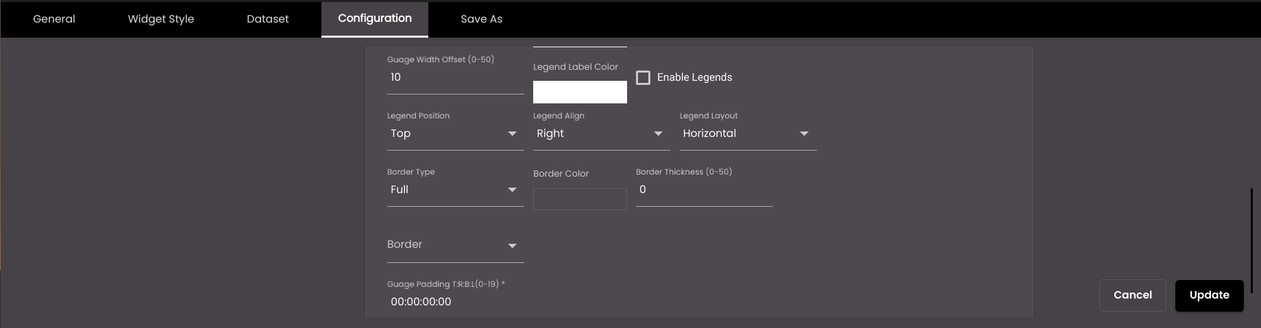
Gauge Width Offset
The width of the indicator.
Note
Allowed values are from 0-50.
Legend Label Color
The font color of the legend label.
Also, based on the Palette in the Widget Style tab, a set of Preset colors are available to directly choose from, which if selected, change based on the theme.
Enable Legends
Displays the name(s) of the series alongside the graph.
Legend Position
Whether the legend is positioned above or below the graph.
Legend Align
The horizontal alignment of the legend.
Legend Layout
Displays the legend either horizontal or vertical.
Border Type
The type of border for the graph – Full or Semi.
Border Color
The color of the border.
Also, based on the Palette in the Widget Style tab, a set of Preset colors are available to directly choose from, which if selected, change based on the theme.
Border Thickness
The thickness of the border.
Note
Allowed values are from 0-50.
Border
The position of the border – top, bottom, left and right.
Border Radius
Radius of the border.
Note
Allowed values are from 0-50.
Gauge Padding T:R:B:L
Padding / spacing between the border and the label.
Note
Allowed values are from 0-10.
The following settings refer to chart visualizations.
Setting
Description
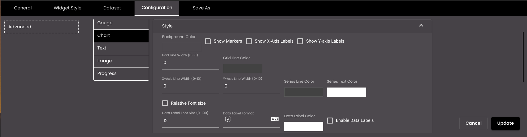
Background Color
The background color of the chart.
Also, based on the Palette in the Widget Style tab, a set of Preset colors are available to directly choose from, which if selected, change based on the theme.
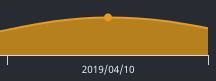
Show Markers
Displays a point that indicates the exact position of a data point. For example, the yellow point in the image below:
Show X-Axis Labels
Displays the labels on the x-axis of the chart.
Show Y-Axis Labels
Displays the labels on the y-axis of the chart.
Note
The Y-Axis labels can be disabled.
Enable Stacked (column and bar chart only)
Displays the chart values one on top of each other like a stack when there is more than one attribute for each item on the x-axis and the height of each is calculated based on their y values.
Grid Line Width
The thickness of the lines across the chart.
Note
Allowed values are from 0-10.
Grid Line Color
The color of the lines across the chart.
Also, based on the Palette in the Widget Style tab, a set of Preset colors are available to directly choose from, which if selected, change based on the theme.
X-Axis Line Width
The width of the line on the x axis.
Note
Allowed values are from 0-10.
Y-Axis Line Width
The width of the line on the y axis.
Note
Allowed values are from 0-10.
Series Line Color
The color of the line on the x and y axes.
Also, based on the Palette in the Widget Style tab, a set of Preset colors are available to directly choose from, which if selected, change based on the theme.
Series Text Color
The text color of the text on the x and y axes.
Also, based on the Palette in the Widget Style tab, a set of Preset colors are available to directly choose from, which if selected, change based on the theme.
Relative Font Size
The relative font size of the data label in points.
Note
Allowed vales are from 0-10
Data Label Font Size
The font size of the data label.
Note
Allowed values are from 0-100.
Data Label Format
The HTML code to format the labels.
You can also translate this text by clicking on the Translate icon
and entering the translation of the desired language selected. Auto-suggestions are also available where the reused contents are auto-suggested.Data Label Font Color
The color of the data label.
Also, based on the Palette in the Widget Style tab, a set of Preset colors are available to directly choose from, which if selected, change based on the theme.
Enable Data Labels
Displays the numeric value next to each data point.
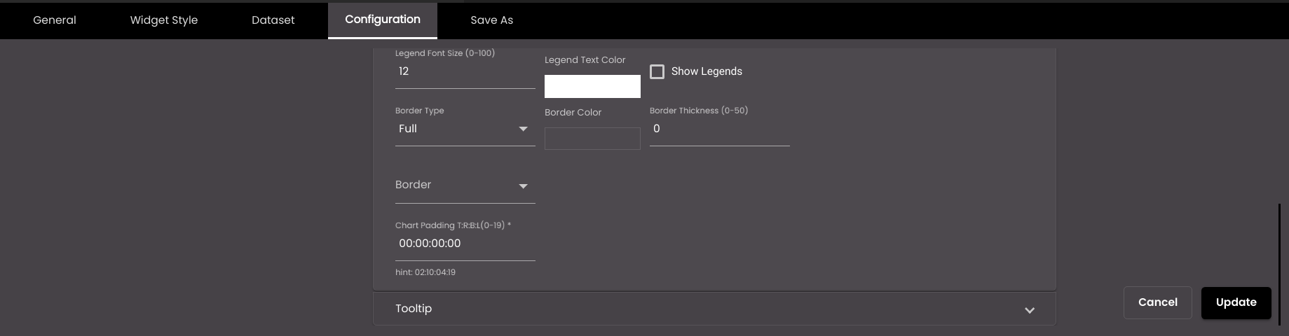
Legend Font Size
The font size of the legend label.
Note
Allowed values are from 0-100.
Legend Text Color
The text color of the legend label.
Also, based on the Palette in the Widget Style tab, a set of Preset colors are available to directly choose from, which if selected, change based on the theme.
Show Legends
Displays the name(s) of the series alongside the chart.
Border Type
The type of border for the chart – Full or Semi.
Border Color
The color of the border.
Also, based on the Palette in the Widget Style tab, a set of Preset colors are available to directly choose from, which if selected, change based on the theme.
Border Thickness
The thickness of the border.
Note
Allowed values are from 0-50.
Border
The position of the border – top, bottom, left and right.
Border Radius
Radius of the border.
Note
Allowed values are from 0-50.
Chart Padding T:R:B:L
Padding / spacing between the border and Data label in top, right, bottom, and left position.
Note
Allowed values are from 0-19
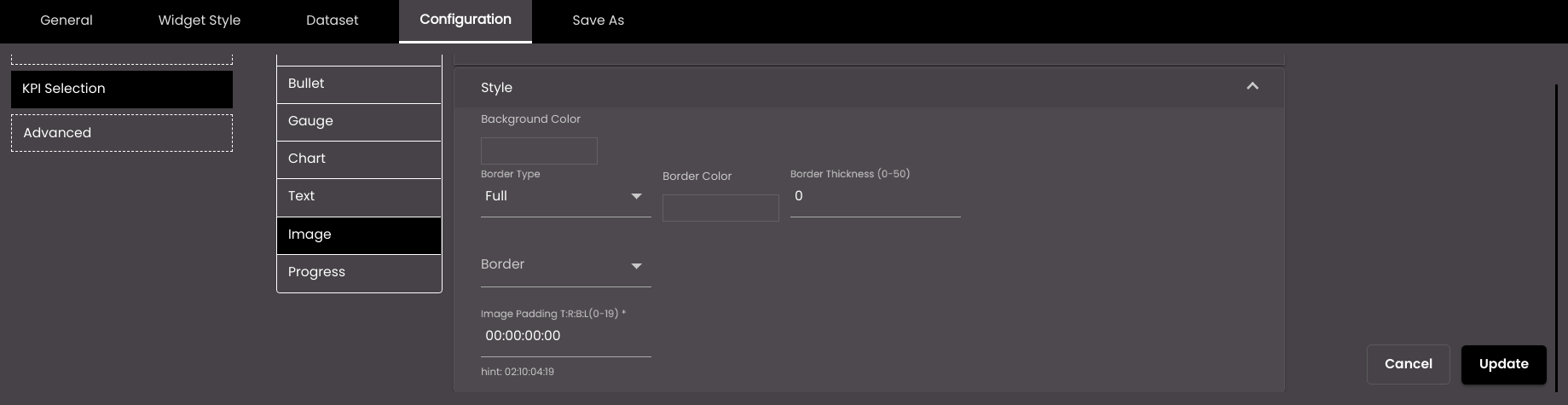
The following settings refer to image visualizations.
Setting
Description
Background Color
The background color of the image or icon.
Also, based on the Palette in the Widget Style tab, a set of Preset colors are available to directly choose from, which if selected, change based on the theme.
Border Type
The type of border for the image or icon – Full or Semi.
Border Color
The color of the border.
Also, based on the Palette in the Widget Style tab, a set of Preset colors are available to directly choose from, which if selected, change based on the theme.
Border Thickness
The thickness of the border.
Note
Allowed values are from 0-50.
Border
The position of the border – top, bottom, left and right.
Border Radius
Radius of the border.
Note
Allowed values are from 0-50
Image Padding T:R:B:L
Padding / spacing between the border and Data label in top, right, bottom, and left position.
Note
Allowed values are from 0-19.
The following settings refer to progress visualizations.
Setting
Description
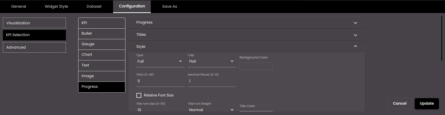
Type
The shape of the progress indicator. It can be one of the following types:
Full - Complete circle progress indicator.
Semi - Semi circle progress indicator.
Arch - 3/4th circle progress indicator.
Line - Rectangular progress indicator.
Cap
The style of line ending at the progress indicator’s end. It can be one of the following:
Round
Flat
Background Color
The background color of the progress indicator.
Also, based on the Palette in the Widget Style tab, a set of Preset colors are available to directly choose from, which if selected, change based on the theme.
Thick
The thickness of the progress indicator.
Note
Allowed values are from 0-40.
Title Font Size
The font size of the title, in points.
Note
Allowed values are from 0-50.
Title Color
The color of the title.
Also, based on the Palette in the Widget Style tab, a set of Preset colors are available to directly choose from, which if selected, change based on the theme.
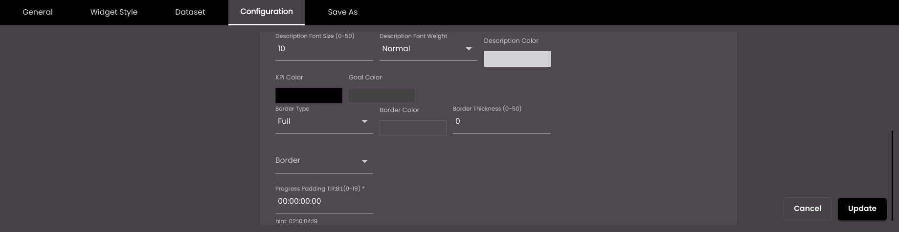
Description Font Size
The font size of the Description Operations value, in points.
Note
Allowed values are from 0-50.
Decimal Places
The number of decimal places to display for numeric values. The default value is 1.
Note
Allowed values are from 0-12.
Relative Font Size
The Relative Font size of the Description Operations value in points.
Note
Allowed values are from 0-10.
Description Color
The color of the Description Operations value.
Also, based on the Palette in the Widget Style tab, a set of Preset colors are available to directly choose from, which if selected, change based on the theme.
Description Font Weight
The thickness of the value font which can be one of the following:
Normal
Bold
Title Font Weight
The thickness of the title font which can be one of the following:
Normal
Bold
KPI Color
The color of the KPI portion of the progress indicator.
Also, based on the Palette in the Widget Style tab, a set of Preset colors are available to directly choose from, which if selected, change based on the theme.
Goal Color
The color of the goal portion of the progress indicator.
Also, based on the Palette in the Widget Style tab, a set of Preset colors are available to directly choose from, which if selected, change based on the theme.
Border Type
The type of border for the progress indicator – Full or Semi.
Border Color
The color of the border.
Also, based on the Palette in the Widget Style tab, a set of Preset colors are available to directly choose from, which if selected, change based on the theme.
Border Thickness
The thickness of the border.
Note
Allowed values are from 0-50.
Border
The position of the border – top, bottom, left and right.
Border Radius
Radius of the Border.
Note
Allowed values are from 0-50
Progress Padding T:R:B:L
Padding/spacing between the border and description operations value.
Note
Allowed values are from 0-19.
The following settings refer to progress visualizations.
Setting
Description
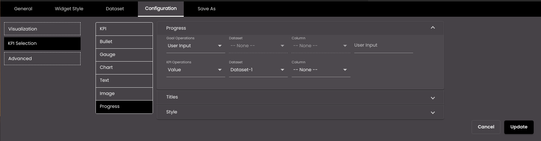
Goal Operations
Determines whether to simply display a specific value from a dataset column or enter a value as the goal. The options are as follows:
Value A specific value from the selected column.
User Input A value that you enter in the User Input field.
Dataset
(For the goal operations)
The dataset that is selected.
Column
(For the goal operations)
The column from which you want to display data.
User Input (available only if Goal Operations is set to User Input)
A fixed numeric value that you want to display. For this setting, it doesn't matter which dataset is selected because it's not retrieving a value from a dataset; instead you're entering the value yourself.
KPI Operations
Determines whether to simply display a specific value from a dataset column or enter a value as the KPI. The options are as follows:
Value A specific value from the selected column.
User Input A value that you enter in the User Input field.
Dataset
(For the KPI operations)
The dataset that is selected.
Column
(For the KPI operations)
The column from which you want to display data.
User Input (available only if KPI Operations is set to User Input)
A fixed numeric value that you want to display. For this setting, it doesn't matter which dataset is selected because it's not retrieving a value from a dataset; instead you're entering the value yourself.
The following settings refer to progress visualizations.
Setting
Description
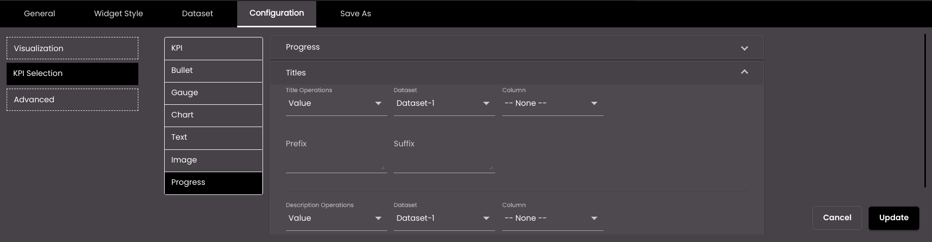
Title Operations
Determines whether to simply display a specific value from a dataset column or enter a value as the title. The options are as follows:
Value A specific value from the selected column.
User Input A value that you enter in the Title field.
Dataset
(for the title operations)
The dataset that is selected for the title.
Column
(for the title operations)
The column from which you want to display data for the title. If the dataset returns a sequence of key–value pairs, the options are as follows:
Key The title of the column.
Value The value in the column.
Title
(available only if Title Operations is set to User Input)
The title that you want to display. For this setting, it doesn't matter which dataset is selected because it's not retrieving a value from a dataset; instead you're entering the value yourself.
Prefix
Text to display before the title.
Suffix
Text to display after the title.
Description Operations
Determines whether to simply display a specific value from a dataset column or enter a value as the description. The options are as follows:
Value A specific value from the selected column.
User Input A value that you enter in the Description field.
Dataset
(for the description operations)
The dataset that is selected for the description.
Column
(for the description operations)
The column from which you want to display data for the description. If the dataset returns a sequence of key–value pairs, the options are as follows:
Key The title of the column.
Value The value in the column.
Description
(available only if Description Operations is set to User Input)
The description that you want to display. For this setting, it doesn't matter which dataset is selected because it's not retrieving a value from a dataset; instead you're entering the value yourself.
Tooltip
If selected, a text can be entered in Tooltip description as the tooltip.
Tooltip description
The text that is shown on hovering the mouse over the text displayed. It is displayed if Tooltip is selected.
The following settings refer to bullet graph, chart and gauge visualizations.
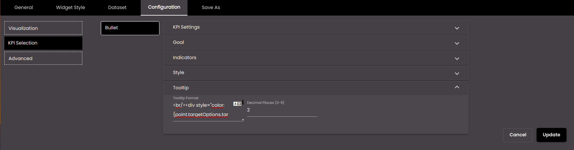
Setting
Description
Tooltip Format
The HTML code for the tooltip format.
You can also translate this text by clicking on the Translate icon
and entering the translation of the desired language selected. Auto-suggestions are also available where the reused contents are auto-suggested.Decimal Places
The number of decimal places to display for numeric values in the tooltip.
Note
Allowed values are from 0-9.
The following settings refer to KPI, chart and text visualizations.
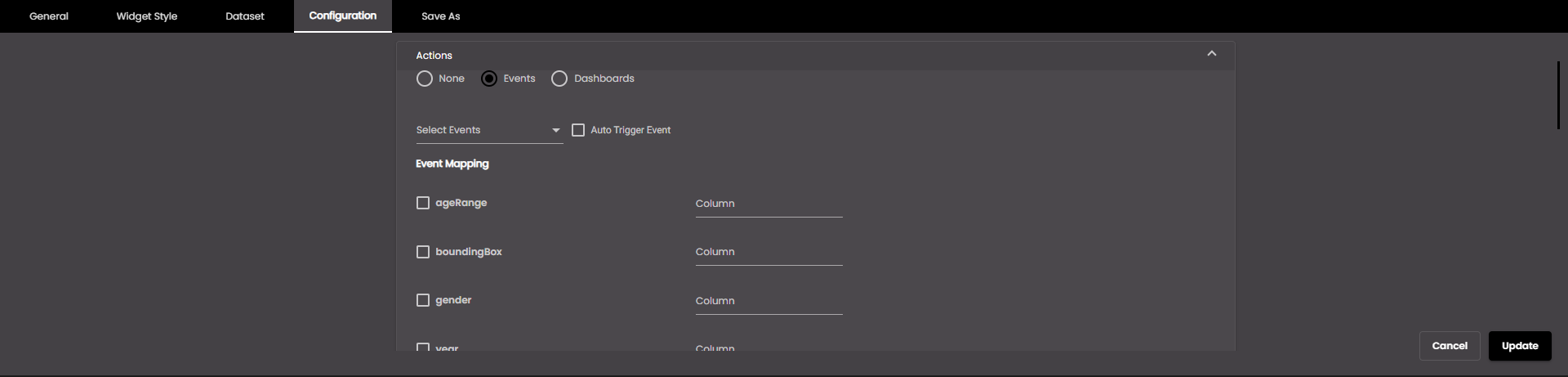
To trigger an event, select Events and change the settings as required:
Setting
Description
Auto trigger event
If enabled, an event is triggered in response to a dashboard load or another event trigger. For example, a widget can trigger an event on it's own when a dashboard is loaded first time without a click action.
Select Events
The event(s) on which the widget information is updated. The default events are as follows:
MAP_ENTITY_CLICK The user clicks a marker on a map widget.
DASHBOARD.REGION_CHANGE_EVENT The user selects a different Region from the Region filter.
DASHBOARD.DATE_RANGE_CHANGE_EVENT The user selects a different time period from the Date filter.
TABLE.SELECT_ROW_EVENT The user selects a row in a datagrid widget.
DASHBOARD.LANG_CHANGE_EVENT The user selects a different language from the Language drop-down at the top of the main screen.
DASHBOARD.GENDER_CHANGE_EVENT The user selects a different gender from the Gender filter.
DASHBOARD.AGE_RANGE_CHANGE_EVENT The user selects a different age range from the Age Range filter.
DASHBOARD.GRANULARITY_CHANGE_EVENT The user selects a different granularity from the Granularity filter.
Event Mapping
The parameter values that are passed when an event occurs. Select the parameter(s) that you want to pass and, for each one, select the column that would supply the value for the parameter.
These parameter values will be passed to the widget that gets updated when an event occurs.
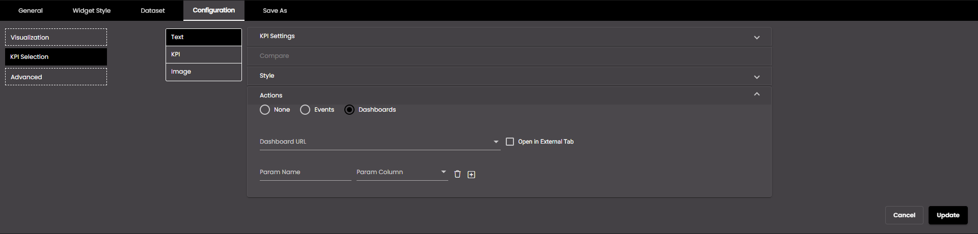
To go to another dashboard when you click this widget, select Dashboards and change the settings as required:
Setting
Description
Dashboard URL
The reference to the dashboard we need to navigate to.
Open in External Tab
If selected, the dashboard is opened in another tab.
Param Name
The name of the filter to be used to narrow down the data in the navigating dashboard. This will be included as a query parameter in the dashboard URL.
Param Column
The column whose value should be used as the filter value to filter the data in the dashboard it navigates to. So, you select the column that contains values that can be assigned to this parameter.
To add further parameters, click +.
Click Update.