Configure Data Selector widget style
You can configure in more detail the appearance of a data selector widget for the Input, Value Slider , Range Slider, Buttons, List, Calendar and Text data selectors selected in the Styles section.
If the widget configuration dialog box is not already open, do as follows:
If the widget is on a Grid layout dashboard, click the Menu icon
 in the top right-hand corner of the widget and select Settings.
If the widget is on a Fluid layout dashboard, on the floating toolbar for the widget, click the Settings icon:
.
Click the Configuration tab.
On the left-hand side, click Styles.
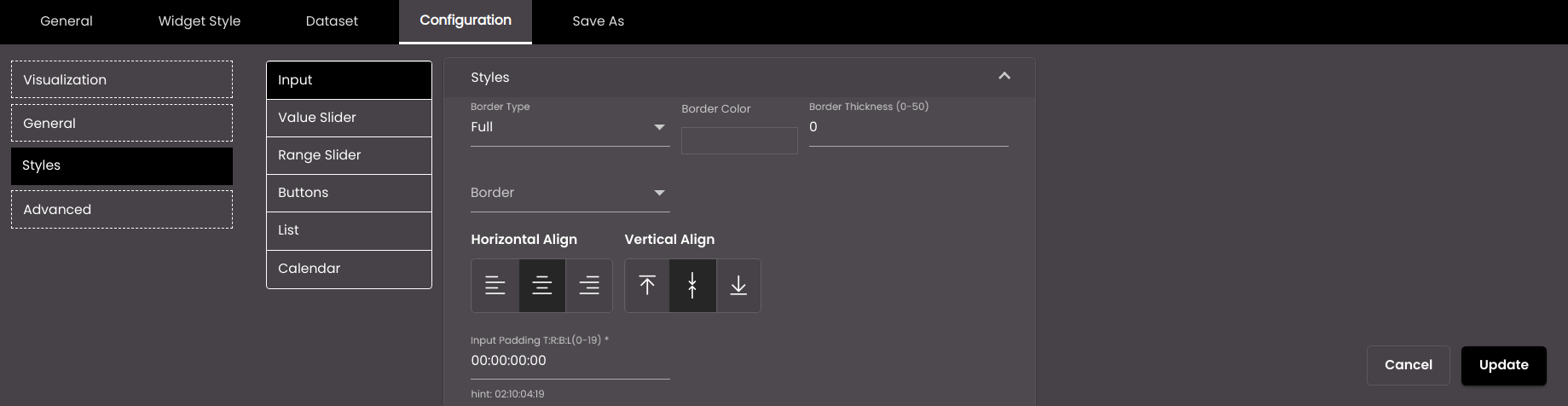
Change the settings as required for the Input, List and Calendar data selectors.
Setting
Description
Border Type
The type of border for the input/list/calendar – Full or Semi.
Border Color
The color of the border.
Also, based on the Palette in the Widget Style tab, a set of Preset colors are available to directly choose from, which if selected, change based on the theme.
Border Thickness
The thickness of the border.
Note
Allowed values are from 0-50.
Border
The position of the border – top, bottom, left and right.
Horizontal Align
The horizontal alignment of the text – left, center or right.
Vertical Align
The vertical position of the text - top, middle, bottom.
Input/List/Calendar Padding T:R:B:L
Padding / Space between the border & Value or label.
Note
Allowed values are from 0-19.
Prefix Icon Font Size (only for List)
The size of the icon displayed before the list item in points.
Note
Allowed values are from 8-25 points.
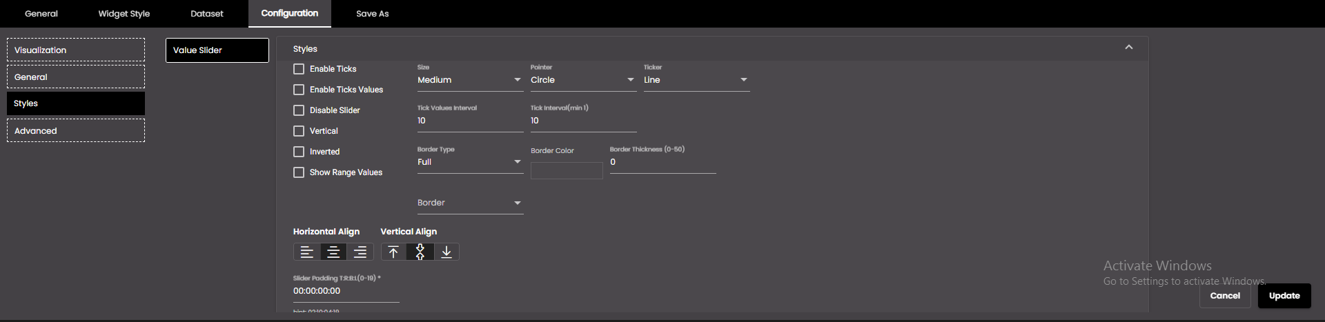
Change the settings as required for the Value Slider and Range Slider data selectors.
Setting
Description
Enable Ticks
Displays the calibrations on the slider.
Enable Tick Values
Displays the respective value at each calibration on the slider.
Disable Slider
Disables modifying the selected position(s) on the slider.
Vertical
Displays the slider vertically.
Inverted
Reverses the values on the slider.
Draggable Range (available only for the Range Slider data selector)
Allows modifying the selected range values on the slider by dragging it.
Show Range Values
Displays the minimum and maximum values of the range. It is not displayed when the Enable Tick Values is enabled.
Size
The size of the calibrations on the slider. The options are:
Low
Medium
High
Pointer
The shape of the indicator at the position selected on the slider. The options are:
Circle
Square
Ticker
The shape of the calibrations on the slider. They can be one of the following:
Circle
Square
Line
Tick Interval
The difference between consecutive calibrations on the slider.
Note
Allowed values are from 1.
Tick Values Interval
The values that can be shown for the tick intervals selected in the Tick Interval.
Border Type
The type of border for the slider – Full or Semi.
Border Color
The color of the border.
Also, based on the Palette in the Widget Style tab, a set of Preset colors are available to directly choose from, which if selected, change based on the theme.
Border Thickness
The thickness of the border.
Note
Allowed values are from 0-50.
Border
The position of the border – top, bottom, left and right.
Horizontal Align
The horizontal alignment of the text – left, center or right.
Vertical Align
The vertical position of the text - top, middle, bottom.
Slider Padding T:R:B:L
Padding / Space between the border & Value or label.
Note
Allowed values are from 0-19.
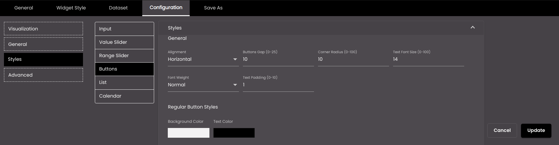
Change the settings as required for the Buttons data selector.
Setting
Description
General
The general styles applied to the buttons.
Alignment
The alignment of the buttons - horizontal or vertical.
Buttons Gap
The distance between the buttons.
Note
Allowed values are from 0-25.
Corner Radius
The button corner radius.
Note
Allowed values are from 0-100 points.
Text Font Size
The font size of the button text, in points.
Note
Allowed values are from 0-100 points.
Font Weight
The thickness of the button text font which can be one of the following:
Normal
Bold
Text Padding
The padding for the button text.
Note
Allowed values are from 0-10 points.
Regular Button Styles
The styles applied to the non selected buttons.
Background Color
The background color of the non selected button.
Also, based on the Palette in the Widget Style tab, a set of Preset colors are available to directly choose from, which if selected, change based on the theme.
Text Color
The color of the text on the non selected button.
Also, based on the Palette in the Widget Style tab, a set of Preset colors are available to directly choose from, which if selected, change based on the theme.
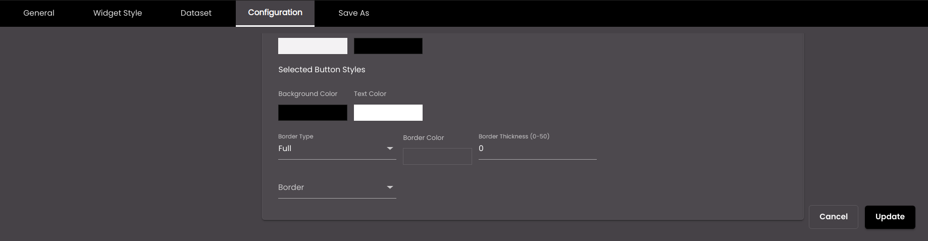
Selected Button Styles
The styles applied to the selected buttons.
Background Color
The background color of the selected button.
Also, based on the Palette in the Widget Style tab, a set of Preset colors are available to directly choose from, which if selected, change based on the theme.
Text Color
The color of the text on the selected button.
Also, based on the Palette in the Widget Style tab, a set of Preset colors are available to directly choose from, which if selected, change based on the theme.
Border Type
The type of border for the buttons – Full or Semi.
Border Color
The color of the border.
Also, based on the Palette in the Widget Style tab, a set of Preset colors are available to directly choose from, which if selected, change based on the theme.
Border Thickness
The thickness of the border.
Note
Allowed values are from 0-50.
Border
The position of the border – top, bottom, left and right.
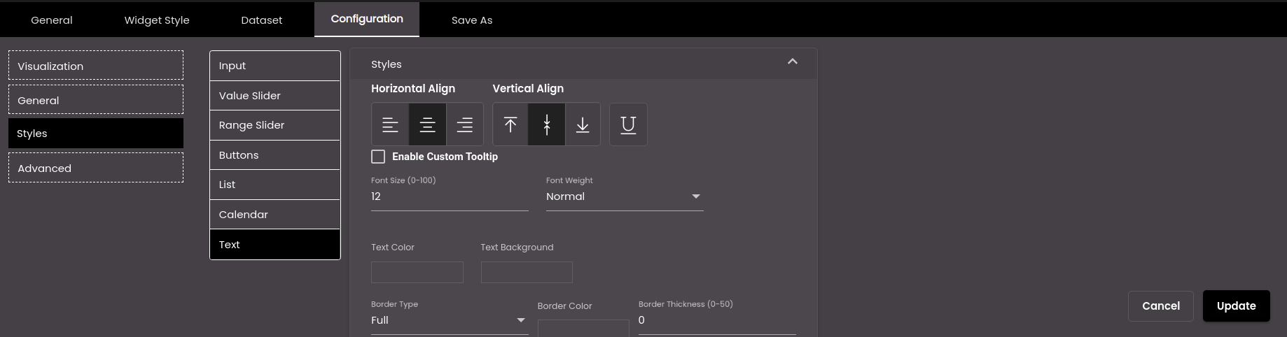
Change the settings as required for the Text data selector if you are using a custom data selector.
Setting
Description
Horizontal Align
The horizontal alignment of the text – left, center or right.
Vertical Align
The vertical position of the text - top, middle, bottom.
Underline
Draws an underline below the text.
Enable Custom Tooltip
If selected, a text can be entered in Tooltip as the tooltip. If it is deselected after selecting, the text that is currently being displayed is shown in the tooltip.
Tooltip
The text that is shown on hovering the mouse over the text displayed. It is displayed if Enable Custom Tooltip is selected.
Note
It must be 2-100 characters only.
Font Size
The font size of the text, in points.
Note
Allowed values are from 0-100.
Font Weight
The thickness of the text font which can be one of the following:
Normal
Bold
Border Radius
The corner radius of the text background.
Note
Allowed values are from 0-50.
Text Color
The color of the text.
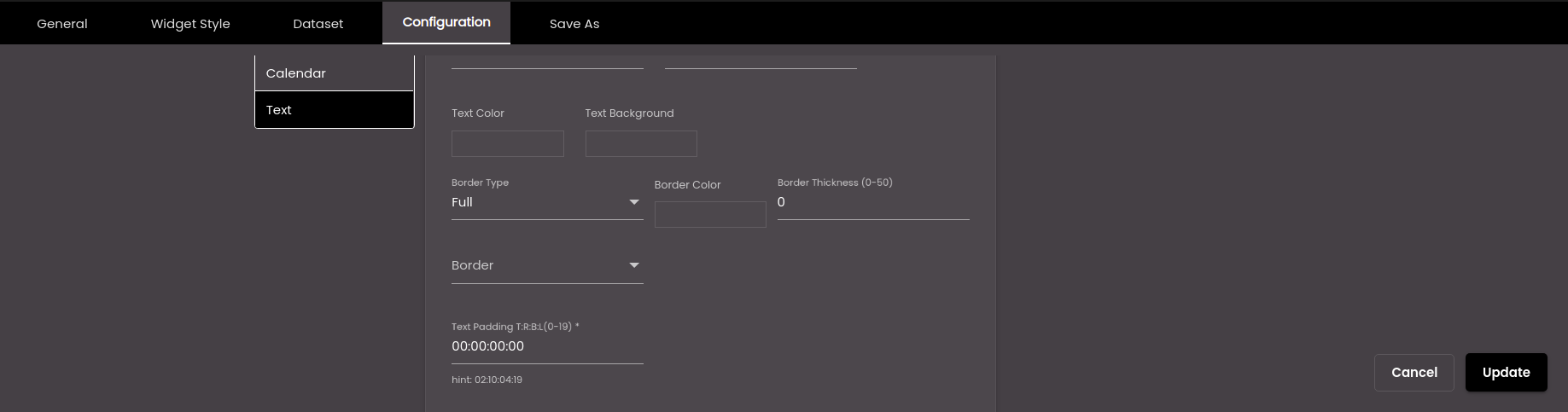
Text Background
The background color of the text.
Border Type
The type of border for the text – Full or Semi.
Border Color
The color of the border.
Also, based on the Palette in the Widget Style tab, a set of Preset colors are available to directly choose from, which if selected, change based on the theme.
Border Thickness
The thickness of the border.
Note
Allowed values are from 0-50.
Border
The position of the border – top, bottom, left and right.
Text Padding T:R:B:L
Padding / Space between the border & Value or label.
Note
Allowed values are from 0-19.
Click Update.