Configure chart widget visualization
You can specify what the overall presentation of information should be, for example whether the chart is a bar chart or a pie chart.
If the widget configuration dialog box is not already open, do as follows:
If the widget is on a Grid layout dashboard, click the Menu icon
 in the top right-hand corner of the widget and select Settings.
If the widget is on a Fluid layout dashboard, on the floating toolbar for the widget, click the Settings icon:
.
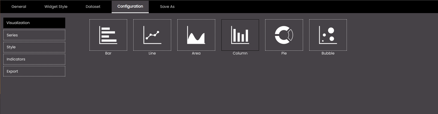
Click the Configuration tab.
On the left-hand side, click Visualization.
Select one of the options for visualizing information:
Setting
Description
Bar
Presents information as a horizontal bar chart.
Line
Presents information as a line that joins data points.
Area
Similar to a line chart but with the area under the line shaded.
Column
Presents information as a vertical bar chart.
Pie
Presents information as slices of a pie.
Bubble
Presents information as a bubble chart.
Click Save.