Configure chart widget filters
The chart widget can filter the displayed data based on the custom filters or aggregation configured.
Firstly, in order to be able to see the Filters option in the chart widget Configuration, the dataset has to be configured with Request Parameters in the Dataset tab of this chart widget. Also, in order to be able to create Dynamic Filters in Custom Filter, a separate dataset with Request Parameters in the Dataset tab has to be created for the filters with the data source type as CSV.
If the widget configuration dialog box is not already open, do as follows:
If the widget is on a Grid layout dashboard, click the Menu icon
 in the top right-hand corner of the widget and select Settings.
If the widget is on a Fluid layout dashboard, on the floating toolbar for the widget, click the Settings icon:
.
Click the Configuration tab.
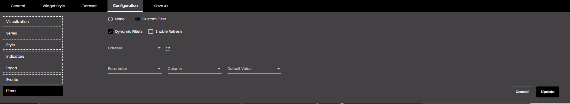
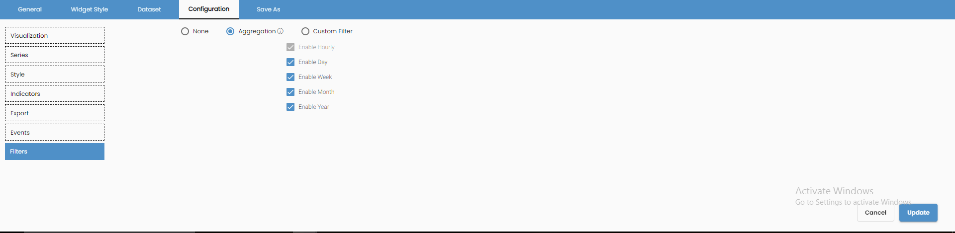
On the left-hand side, click Filters.
Select Custom Filter to create a custom filter.
Change the settings as required.
Setting
Description
Dynamic Filters
If selected, the filters can be created dynamically using the filters dataset.
Dropdown View
If selected, the filter is shown as a drop-down instead of horizontal buttons.
Enable Refresh
If selected, the dynamic filters are refreshed on reloading the page.
Parameter
The dataset field on which you want to filter.
Default Value
The value which should be selected by default. It is not mandatory.
Label
The label of the item in the filter.
Value
The value of the item in the filter.
Multi-level (shown only when Dynamic Filters is selected)
If selected, multiple level of filters can be created.
Dataset (shown only when Dynamic Filters is selected)
The filters dataset with which you want to filter.
Selection Type (shown only when Dynamic Filters is selected)
The type of selection by which you want to filter:
Single Selection
Multiple Selection
Column (shown only when Dynamic Filters is selected)
The dataset column with which you want to filter.

Adds another Label and Value.

Deletes a Label and Value.
Click Update.
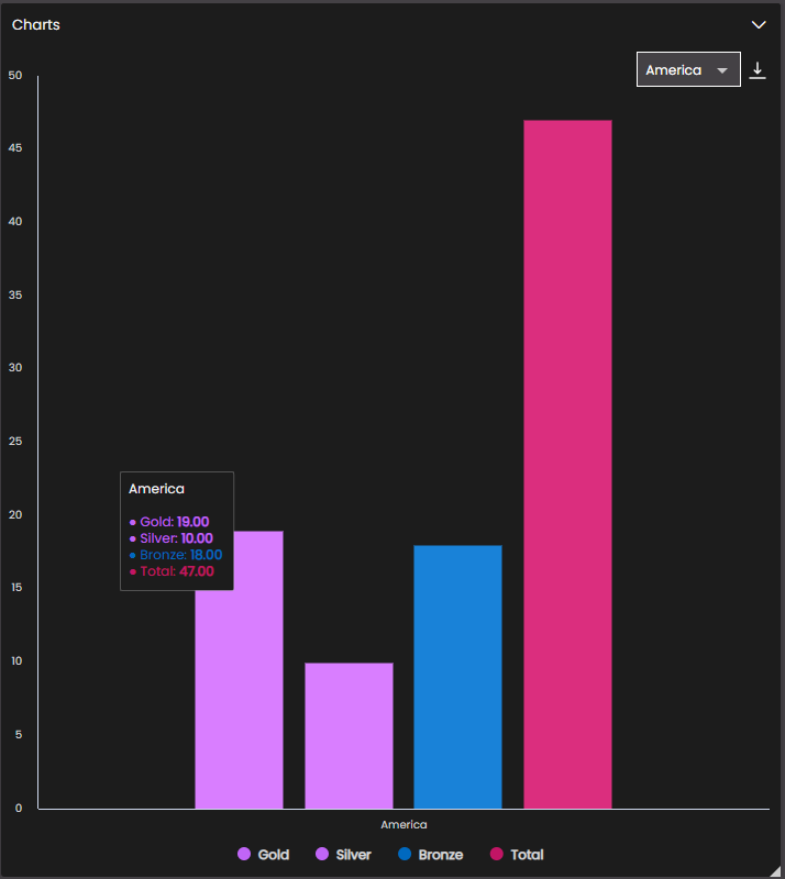
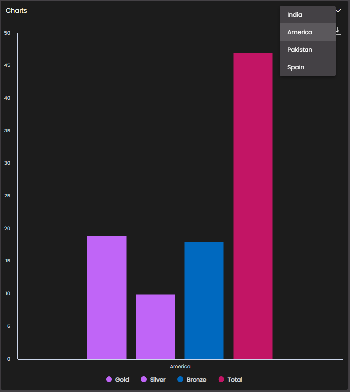
Once all the configuration settings are done you can see the filters in the chart widget.
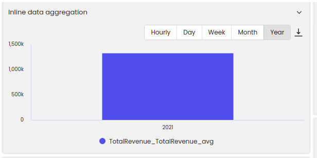
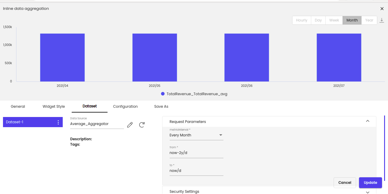
The chart widget can also display the aggregated data on an hourly, daily, weekly, monthly and yearly basis.
Firstly, in order to be able to see the Filters > Aggregation option in the chart widget Configuration, the dataset has to be configured with the input as metricInterval containing enum data. For eg: Every Hour, Every Day, Every Week, Every Month and Every Year. Along with this from and to inputs need to be configured for the time span.
Once the dataset is configured as above, the metricInterval, from and to fields in Request Parameters will be displayed as dropdowns in the Dataset tab of this chart widget and you can make your selections.
Note
The item selected in the metricInterval will be considered as the default selection and the initial aggregation will be done based on that selection.
If the widget configuration dialog box is not already open, do as follows:
If the widget is on a Grid layout dashboard, click the Menu icon
in the top right-hand corner of the widget and select Settings.If the widget is on a Fluid layout dashboard, on the floating toolbar for the widget, click the Settings icon:
.
Click the Configuration tab.
On the left-hand side, click Filters.
Select Aggregation.
Change the settings as required.
Setting
Description
Enable Hourly
If enabled, displays the Hourly button on the widget so that if it is selected, aggregation can be done hourly.
Enable Day
If enabled, displays the Day button on the widget so that if it is selected, aggregation can be done daily.
Enable Week
If enabled, displays the Week button on the widget so that if it is selected, aggregation can be done weekly.
Enable Month
If enabled, displays the Month button on the widget so that if it is selected, aggregation can be done monthly.
Enable Year
If enabled, displays the Year button on the widget so that if it is selected, aggregation can be done yearly.
Click Update.
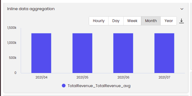
Once all the configuration settings are done you can see the aggregation in the chart widget.
For example, in the first screenshot, we had selected the metricInterval as Every Month so by default, after the configurations are done, the data will be aggregated monthly as seen in the figure below:
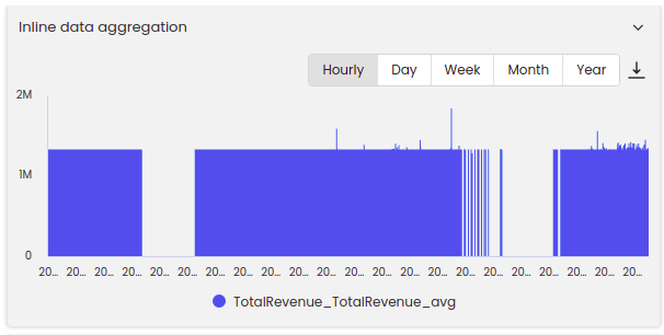
If Hourly button is then selected, the data will be aggregated hourly as seen in the figure below:
If Day button is then selected, the data will be aggregated daily as seen in the figure below:

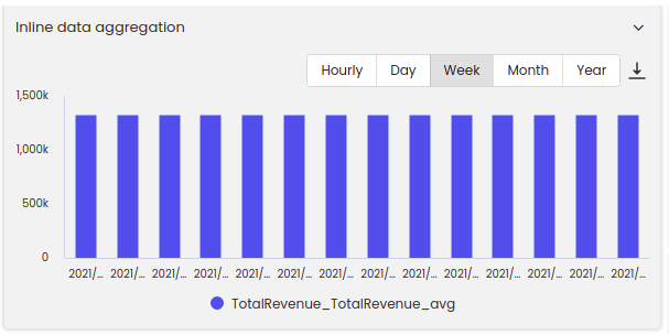
If Week button is then selected, the data will be aggregated weekly as seen in the figure below:
If Year button is then selected, the data will be aggregated yearly as seen in the figure below: