Configure datagrid widget columns
You can change column order, hide columns, change the appearance of a column, replace column values with images or icons, or associate actions with a column.
If the widget configuration dialog box is not already open, do as follows:
If the widget is on a Grid layout dashboard, click the Menu icon
 in the top right-hand corner of the widget and select Settings.
If the widget is on a Fluid layout dashboard, on the floating toolbar for the widget, click the Settings icon:
.
Click the Configuration tab.
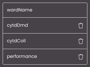
On the left-hand side, click Columns.
All the columns from the datagrid are displayed:
Change the column settings as required:
To change the column order, click and drag one of the columns in the list.
To hide a column, click the Remove icon
 for that column.
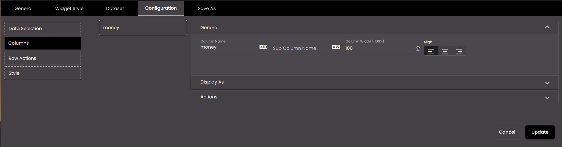
To change the appearance of a column, replace column values with images or icons, or associate actions with it, click the column in the list. Three drop-down panels appear to the right.
Setting
Description
Column Name
The title that appears at the top of the column.
You can also translate this text by clicking on the Translate icon
 and entering the translation of the desired language selected. Auto-suggestions are also available where the reused contents are auto-suggested.
Sub Column Name
The subtitle that appears below the Column Name.
You can also translate this text by clicking on the Translate icon
and entering the translation of the desired language selected. Auto-suggestions are also available where the reused contents are auto-suggested.Column Width (to %)
The width of the column in %.
Note
If the cumulate column width percentage is more than 100% and if the horizontal scroll is enabled, then the content beyond 100% will be visible by scrolling the data-grid horizontally
Note
Allowed value are from 0-100.
Align
Whether the content is aligned left, center, or right.
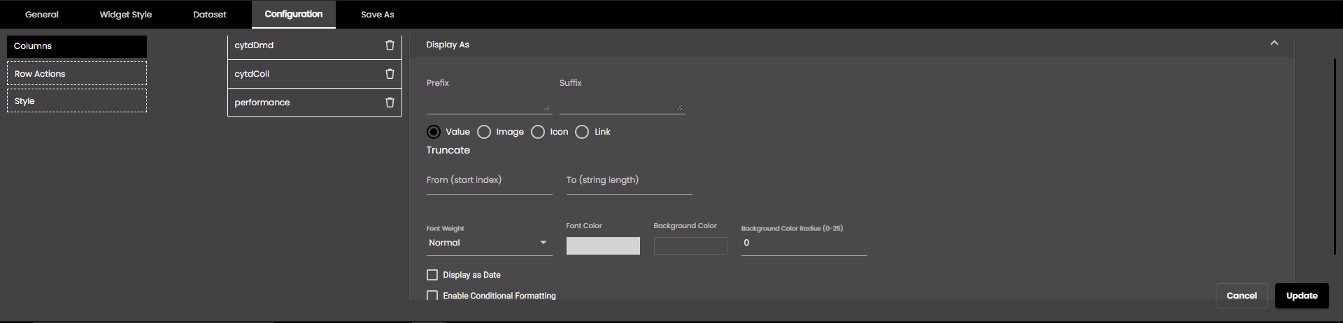
To change the cell values in a column, select Value and change the settings as required:
Setting
Description
Prefix
Text in plain text or HTML code to display before each value in the column.
Suffix
Text in plain text or HTML code to display after each value in the column.
Decimals
The number of decimal places to display for numeric values.
Note
Allowed values are from 0-4.
Comma Separator
Displays a comma separator in numeric values. The options are as follows:
• 1,000,000 Western numbering system
• 10,00,000 Indian numbering system
Short Number Format
If selected, the numeric values are displayed in short forms which are as follows:
K - Thousand. Eg: 1,000 is represented as 1K.
M - Million. Eg: 1,000,000 is represented as 1M.
B - Billion. Eg: 1,000,000,000 is represented as 1B.
Font Weight
The font weight of the character which you want to truncate string values in this column.
Font Color
The font color of the character which you want to truncate string values in this column.
Background Color
The background color of the cell in this column.
Background Color Radius
The corner radius of the background color of the cell in this column.
Note
Allowed values are from 0-25 points.
Display as Date
If selected, the value in the column is displayed as a date accordingly to the format selected in the Date Formats dropdown.
To apply formula for a column click on Apply Formula and change the settings as required:
Setting
Description
(
To apply brackets to the text in the column
)
To apply brackets to the text in the column
*
To apply multiplication in a column
/
To apply division in a column
+
To apply addition in a column
-
To apply subtraction in a column
x
To delete applied formula in a column
Note
Apply Formula is applicable only for numeric columns.
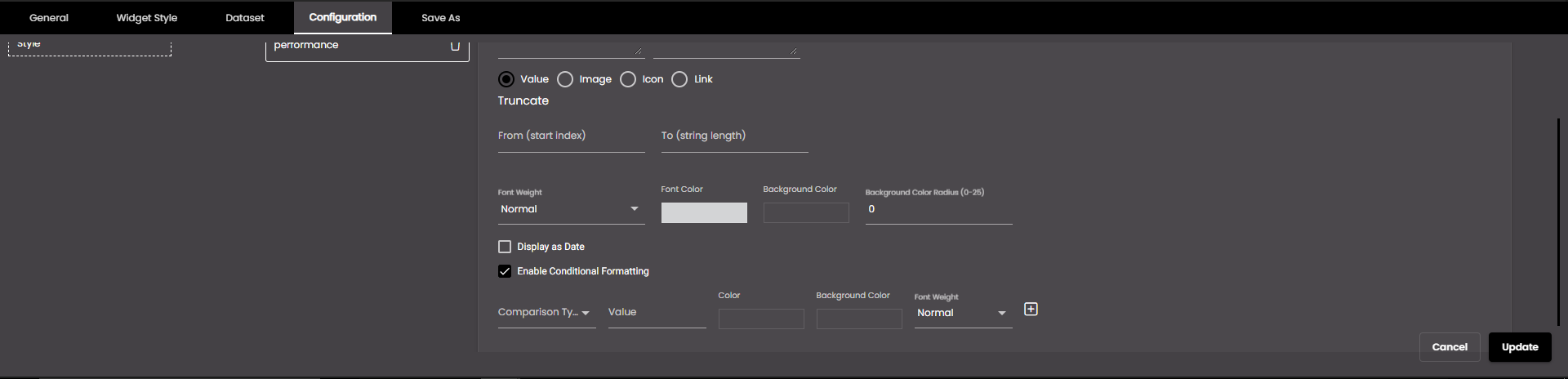
To format the column cell colour and text colour, select Enable Conditional Formatting and change the settings as required:
Setting
Description
Comparison Type
The comparison to be performed on the column cells and the value in the Value box to the right.
Exact: The font color and background color will be applied to the exact value. Ex: if the value is 1 then the condition is applied to the first body cell in the column.
Greater Than It will take the greater value than the applied Value provided cell. Ex: if the value provided is 1 then the condition will be applied to the rest of the body cells from the 2 cell in the column leaving the first body cell.
Less Than: The condition will be applied to the lesser value than the given Value. Ex: if the value provided is 3 then the condition will be applied to the 1st and 2nd rows in the column.
Between: The condition will be applied between the given Values. Ex: if the first value is 2 and the second value is 5 then this condition will be applied to the rows between 2 and 5 i.e. the background color and font color will be applied to row 3 and 4.
Top: The condition will be applied to the top two rows in a column. Ex: If the value is 2 for then the condition will be applied to row 99 & 100 in column.
Bottom:The condition will be applied to the above rows from the given Value. Ex: if the value is 5 then the condition will be applied from the 5th row to first row in a column while the condition will not be applied to the rows below the 5th row in a column.
Range:The condition will be applied to the range of rows in a column for the given Value. Ex: If the First value is 1 and the second value is 5 then the the background and font color will be applied from row 1 to row 5 in a column.
Note
If the same comparison type is applied for multiple conditions then the precedent condition will be applied for the the following condition.
First Value
The value against which to compare the column value.
Color
The font color of the cell character in the column.
Background Color
The background color of the cell in the column.
Font Weight
The Font Weight of the cell characters in the column.
+
Enables you to add another condition.
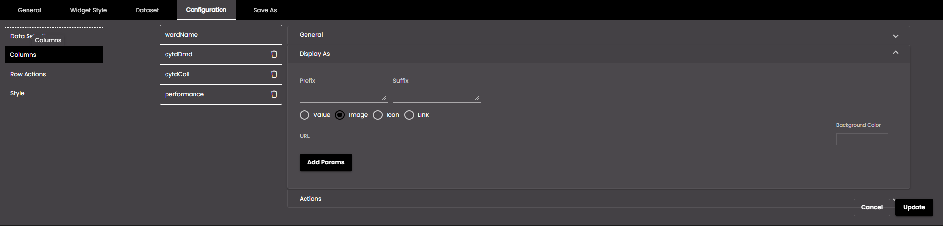
To replace column values with images, select Image and change the settings as required:
Setting
Description
Url
The web address of an image to display instead of the values in this column. The same image is displayed, regardless of the value.
To display a different image depending on the value in this column or any other column, you can add HTTP parameters to the address. To specify parameters and values, click Add Params and change the parameter settings below.
Background Color
The background color of the cell in this column.
Param Name
The name of the HTTP parameter. This must match the parameter name in the web address for the images. For example, if the address is www.example.com/?image=1, the parameter name is 'image'.
Param Column
The column whose value should be used for the parameter value. For example, if the address is www.example.com/?image=1, the parameter value is '1'. So, you select the column that contains values that can be assigned to this parameter.
To add further parameters, click +.
To replace column values with icons, select Icon. To select a default icon to use for all rows, click Pick Icon and select an icon. To display a different icon depending on the column value, select Enable Conditional Formatting and change the settings as required:
Setting
Description
Comparison Type
The comparison to be performed on the column value and the value in the Value box to the right. Exact can be used with any data type; the others can be used only with numeric data types.
Value
The value against which to compare the column value.
Second Value
The upper value of the range, if Comparison Type is Between.
Icon button
Enables you to select the icon for this condition.
Choose Color
Enables you to choose the color for the icon, unless it is an SVG icon.
+
Enables you to add another condition.
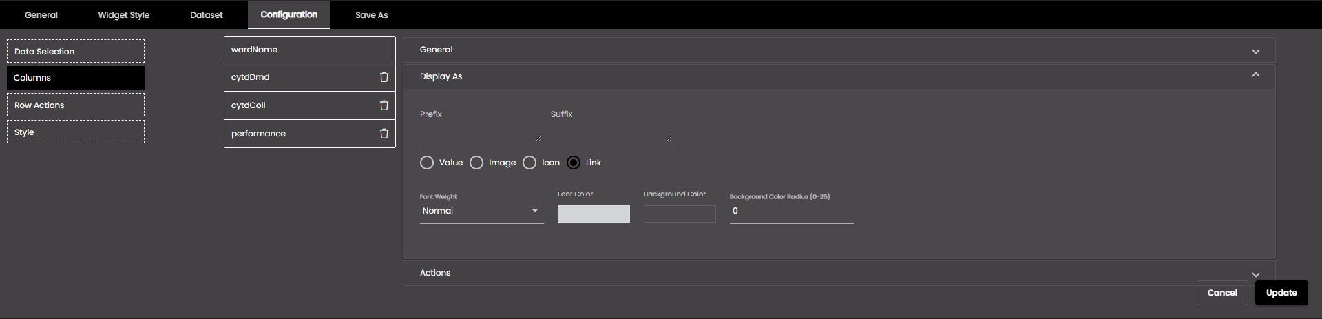
If the column values are having a URL, select Link so that they appear as a clickable URL and change the settings as required:
Setting
Description
Font Weight
The font weight of the string values in this column.
Font Color
The font color of the string values in this column.
Background Color
The background color of the cell in this column.
Background Color Radius
The corner radius of the background color of the cell in this column.
Note
Allowed values are from 0-25 points.
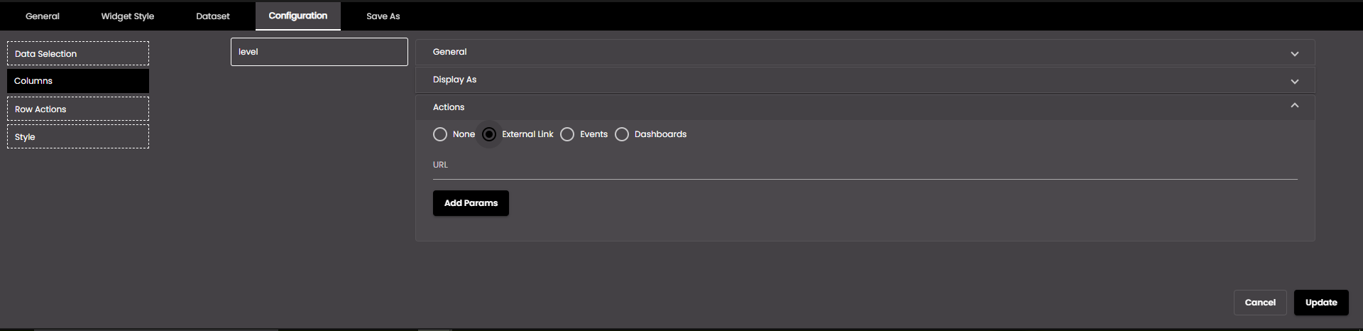
To go to a web address when you click a value in this column, select External Link and change the settings as required:
Setting
Description
Url
The web address appears when the user clicks a value in this column. The same web address is used, regardless of the column value.
If this column already contains web addresses, and you leave this box blank, clicking an address in this column will cause the browser to go to that address.
You can add HTTP parameters to the address, whose values are obtained from the values in this column or any other column. To specify parameters and values, click Add Params and change the parameter settings below.
Param Name
The name of the HTTP parameter. This must match the parameter name in the web page address. For example, if the address is www.example.com/?lang=en, the parameter name is 'lang'.
Param Column
The column whose value should be used for the parameter value. For example, if the address is www.example.com/?lang=en, the parameter value is 'en'. So, you select the column that contains values that can be assigned to this parameter.
To add further parameters, click +.
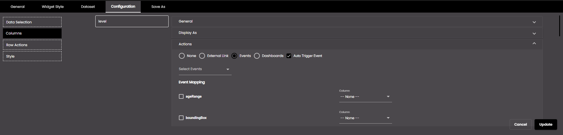
To trigger an event when you click a value in this column, select Events and change the settings as required:
Setting
Description
Auto Trigger Event
If enabled, the event is immediately triggered with the selection when the widget is first displayed.
Select Events
The event(s) that will be triggered. The default events are as follows:
MAP_ENTITY_CLICK The user clicks a marker on a map widget.
DASHBOARD.REGION_CHANGE_EVENT The user selects a different Region from the Region filter.
DASHBOARD.DATE_RANGE_CHANGE_EVENT The user selects a different time period from the Date filter.
TABLE.SELECT_ROW_EVENT The user selects a row in a datagrid widget.
DASHBOARD.LANG_CHANGE_EVENT The user selects a different language from the Language drop-down at the top of the main screen.
DASHBOARD.GENDER_CHANGE_EVENT The user selects a different gender from the Gender filter.
DASHBOARD.AGE_RANGE_CHANGE_EVENT The user selects a different age range from the Age Range filter.
DASHBOARD.GRANULARITY_CHANGE_EVENT The user selects a different granularity from the Granularity filter.
Event Mapping
The parameter values that are passed when an event occurs. Select the parameter(s) that you want to pass and, for each one, select the column that will supply the value for the parameter.
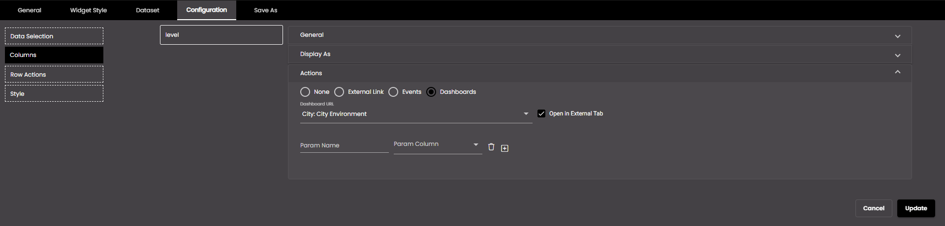
To go to another dashboard when you click a value in this column, select Dashboards and change the settings as required:
Setting
Description
Dashboard URL
The reference to the dashboard we need to navigate to.
Open in External Tab
If selected, the dashboard is opened in another tab.
Param Name
The name of the filter to be used to narrow down the data in the navigating dashboard. This will be included as a query parameter in the dashboard URL.
Param Column
The column whose value should be used as the filter value to filter the data in the dashboard it navigates to. So, you select the column that contains values that can be assigned to this parameter.
To add further parameters, click +.
When you click on a value in this column, it gets highlighted.
Click Update.