People flow movement visualization in advanced charts widget
People flow movement visualization is an advanced charts visualization used to depict the flow of people from one place to another. The following are the visualizations that are available in it:
Sankey Chart
Dependency-wheel
Heatmap
Sunburst
Network Graph
The following are the dataset or editor configurations that need to be done in advanced charts in order to achieve the above visualizations.
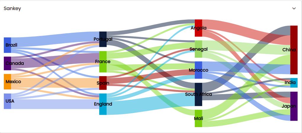
Sankey Chart
Sankey Charts are used to visualize data flow and volume between nodes. The wider lines indicate larger volumes.
During dataset creation, the dataset should be in the following format and contain the following attributes as illustrated below. It mainly needs to contain the keys from, to, weight and the type key with value as sankey.
{
  "series": [
    {
      "keys": [
        "from",
        "to",
        "weight"
      ],
      "data": [
        {
          "from": "Brazil",
          "to": "Portugal",
          "weight": 5
        },
        {
          "from": "Brazil",
          "to": "France",
          "weight": 1
        },
        {
          "from": "Brazil",
          "to": "Spain",
          "weight": 1
        },
        {
          "from": "Brazil",
          "to": "England",
          "weight": 1
        }
      ],
      "type": "sankey",
      "name": "Sankey demo series"
    }
  ]
}
The data array part can also be written as follows:
"data": [
            ['Brazil', 'Portugal', 5],
            ['Brazil', 'France', 1],
            ['Brazil', 'Spain', 1],
            ['Brazil', 'England', 1]
]
Configure the rest of the settings in the advanced chart widget as described earlier.
Once you have configured all the settings the sankey chart is displayed.
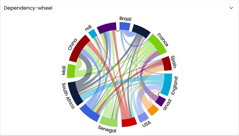
Dependency-wheel
Dependency-wheel is used to visualize data flow and can be a striking way to illustrate relationships in data.
During dataset creation, the dataset should be in the following format and contain the following attributes as illustrated below. It mainly needs to contain the keys from, to, weight and the type key with value as dependencywheel.
{
  "accessibility": {
    "point": {
      "valueDescriptionFormat": "{index}. From {point.from} to {point.to}: {point.weight}."
    }
  },
  "series": [
    {
      "keys": [
        "from",
        "to",
        "weight"
      ],
      "data": [
        [
          "Brazil",
          "Portugal",
          5
        ],
        [
          "Brazil",
          "France",
          1
        ],
        [
          "Brazil",
          "Spain",
          1
        ],
        [
          "Brazil",
          "England",
          1
        ]
      ],
      "type": "dependencywheel",
      "name": "Dependency wheel series",
      "dataLabels": {
        "color": "#333",
        "textPath": {
          "enabled": true,
          "attributes": {
            "dy": 5
          }
        },
        "distance": 10
      },
      "size": "95%"
    }
  ]
}
The data array part can also be written as follows:
"data": [
        {
          "from": "Brazil",
          "to": "Portugal",
          "weight": 5
        },
        {
          "from": "Brazil",
          "to": "France",
          "weight": 1
        },
        {
          "from": "Brazil",
          "to": "Spain",
          "weight": 1
        },
        {
          "from": "Brazil",
          "to": "England",
          "weight": 1
        }
]
Configure the rest of the settings in the advanced chart widget as described earlier.
Once you have configured all the settings the dependency-wheel is displayed.
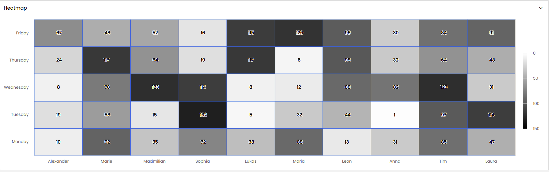
Heatmap
Heatmap is commonly used to visualize hot spots within datasets and to show patterns or correlations. Due to their compact nature, they are often used with large sets of data.
During dataset creation, the dataset should be in the following format and contain the following attributes as illustrated below. It mainly needs to contain the keys
data,categories,ycategoriesand thetypekey with value asheatmap.{ "categories": [ "Alexander", "Marie" ], "ycategories": [ "Monday", "Tuesday", "Wednesday", "Thursday", "Friday" ], "series": [ { "type": "heatmap", "data": [ [ 0, 0, 10 ], [ 0, 1, 19 ], [ 0, 2, 8 ], [ 0, 3, 24 ], [ 0, 4, 67 ], [ 1, 0, 92 ], [ 1, 1, 58 ], [ 1, 2, 78 ], [ 1, 3, 117 ], [ 1, 4, 48 ] ], "borderWidth": 1 } ] }In the Editor panel of the Configuration tab, if you would like the
tooltipto be displayed in a custom way, you can add thecustomPointFormatterattribute. Also, aminColorandmaxColorneeds to be selected incolorAxisin order to set the gradient of colors for the heatmap. These attributes are shown below.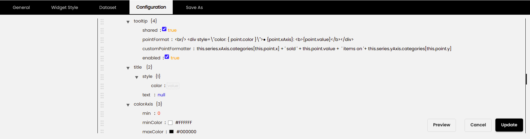
Configure the rest of the settings in the advanced chart widget as described earlier.
Once you have configured all the settings the heatmap is displayed.
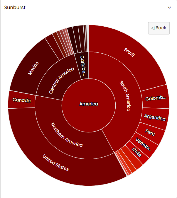
Sunburst
Sunburst chart is used to visualize hierarchical data in a circular shape. The inner elements are parent nodes, with child nodes distributed on the outer rings. Click on a parent node to drill down and inspect the sunburst chart in more detail.
During dataset creation, the dataset should be in the following format and contain the following attributes as illustrated below. It mainly needs to contain the keys id, parent where the value is the id of the parent, name, allowDrillToNode key with value as true, levelsand the type key with value as sunburst.
{
  "series": [
    {
      "type": "sunburst",
      "data": [
        {
          "id": "0.0",
          "parent": "",
          "name": "The World"
        },
        {
          "id": "1.3",
          "parent": "0.0",
          "name": "Asia"
        },
        {
          "id": "1.1",
          "parent": "0.0",
          "name": "Africa"
        },
        {
          "id": "1.2",
          "parent": "0.0",
          "name": "America"
        },
        {
          "id": "1.4",
          "parent": "0.0",
          "name": "Europe"
        },
        {
          "id": "1.5",
          "parent": "0.0",
          "name": "Oceanic"
        },
        {
          "id": "2.1",
          "parent": "1.1",
          "name": "Eastern Africa"
        },
        {
          "id": "3.1",
          "parent": "2.1",
          "name": "Ethiopia",
          "value": 104957438
        },
        {
          "id": "3.2",
          "parent": "2.1",
          "name": "Tanzania",
          "value": 57310019
        },
        {
          "id": "3.3",
          "parent": "2.1",
          "name": "Kenya",
          "value": 49699862
        },
        {
          "id": "3.4",
          "parent": "2.1",
          "name": "Uganda",
          "value": 42862958
        },
        {
          "id": "3.5",
          "parent": "2.1",
          "name": "Mozambique",
          "value": 29668834
        }
      ],
      "allowDrillToNode": true,
      "dataLabels": {
        "format": "{point.name}",
        "filter": {
          "property": "innerArcLength",
          "operator": ">",
          "value": 16
        },
        "rotationMode": "circular"
      },
      "levels": [
        {
          "level": 1,
          "levelIsConstant": false,
          "dataLabels": {
            "filter": {
              "property": "outerArcLength",
              "operator": ">",
              "value": 64
            }
          }
        },
        {
          "level": 2,
          "colorByPoint": true
        },
        {
          "level": 3,
          "colorVariation": {
            "key": "brightness",
            "to": -0.5
          }
        },
        {
          "level": 4,
          "colorVariation": {
            "key": "brightness",
            "to": 0.5
          }
        }
      ]
    }
  ]
}
Configure the rest of the settings in the advanced chart widget as described earlier.
Once you have configured all the settings the sunburst chart is displayed.
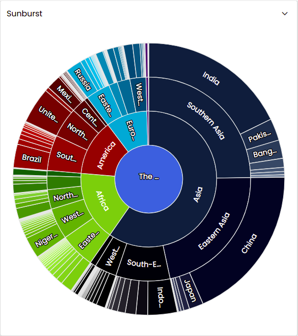
You can click on each of the portions in the sunburst chart to drill down to the next level. To return to the previous level you can either click on the 'Back' button, which is displayed on the top right hand corner of the widget, or you can click on the center portion of the sunburst chart.
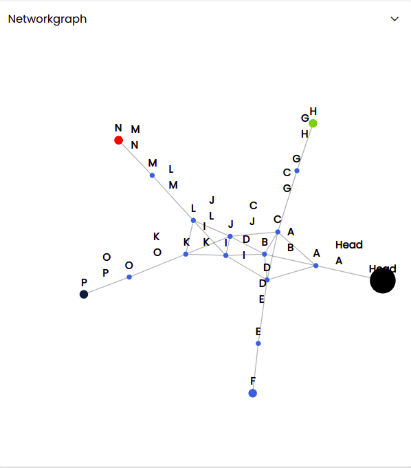
Network Graph
Network Graph is typically used to show relations in data. In this case, we are showing a hierarchical structure. The nodes can be dragged around and will be re-positioned dynamically.
During dataset creation, the dataset should be in the following format and contain the following attributes as illustrated below. It mainly needs to contain the keys from, to , id, marker, radius, color and the type key with value as networkgraph.
{
  "series": [
    {
      "keys": [
        "from",
        "to"
      ],
      "marker": {
        "radius": 3
      },
      "nodes": [
        {
          "id": "Head",
          "marker": {
            "radius": 15
          },
          "color": "#000000"
        },
        {
          "id": "H",
          "marker": {
            "radius": 5
          },
          "color": "#8bbc21"
        },
        {
          "id": "N",
          "marker": {
            "radius": 5
          },
          "color": "#FF0000"
        },
        {
          "id": "P",
          "marker": {
            "radius": 5
          },
          "color": "#0d233a"
        }
      ],
      "data": [
        [
          "L",
          "H"
        ],
        [
          "L",
          "P"
        ],
        [
          "L",
          "M"
        ],
        [
          "M",
          "N"
        ],
        [
          "Head",
          "M"
        ]
      ],
      "type": "networkgraph"
    }
  ]
}
Configure the rest of the settings in the advanced chart widget as described earlier.
Once you have configured all the settings the network graph is displayed.