Configure dashboard layout
For Grid layout dashboards, you can configure the grid that is displayed on a dashboard and is used to position widgets. For either Grid or Fluid layout dashboards, you can configure whether widgets can be resized.
In the top left-hand corner of the main screen, click the Dashboards menu icon.
Click Dashboard Settings at the bottom of the panel.
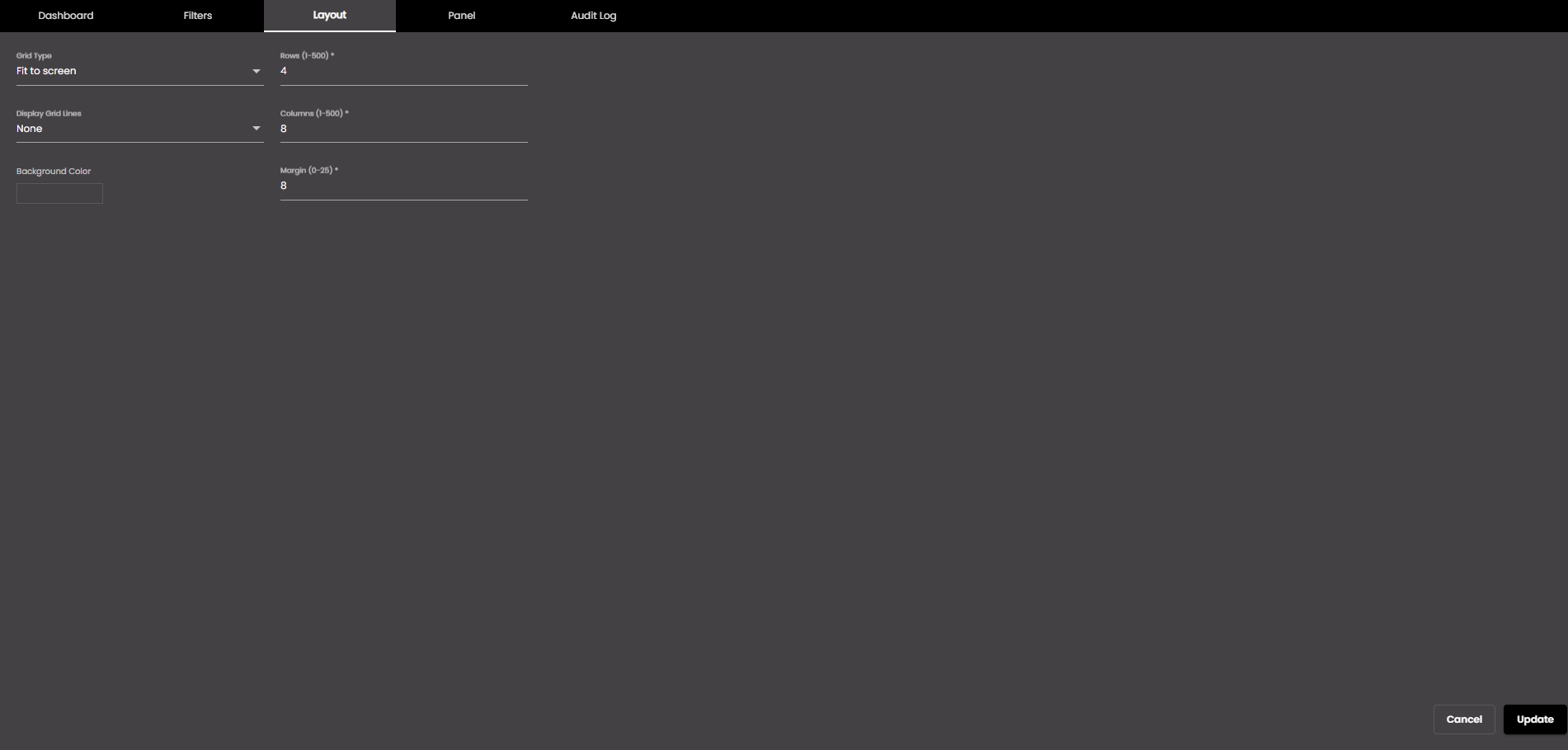
In the dialog box that is displayed, click the Layout tab.
Change the settings as required:
Setting
Description
Grid Type
The size of the dashboard grid relative to the size of the browser window. The options are as follows:
Fit to screen The dashboard is resized to fit within the browser window. This enables you to see all widgets at once.
Scroll Vertical The dashboard is enlarged vertically so that you need to scroll to see all of it. This enlarges the widgets but you can't necessarily see them all at once. However, the dashboard width fits within the browser window.
Fixed The dashboard size is increased both horizontally and vertically so that you may need to scroll in both directions to see some widgets.
Display Grid Lines
Determines when grid lines (for widget positioning) are displayed on the dashboard. The options are as follows:
None Grid lines are never displayed.
Always Grid lines are always displayed.
Only On Drag And Resize Grid lines are displayed only when you drag or resize a widget.
Background Color
The dashboard background color.
You can select any of the following color types to be displayed along with the transparency:
Solid - A single color to be displayed all over.
Linear - Multiple colors are used, where one color gradually fades and changes into another color, linearly.
The following options are available for the Linear color type:
You can select the colors to be displayed in an area of the background by clicking on the color strip and can remove the color selected by clicking on the
 icon.
icon.You can set the direction of the color progression from left to right or center or top to bottom.
Radial - Multiple colors are used, where one color gradually fades and changes into another color, radially.
The following options are available for the Radial color type:
You can select the colors to be displayed in an area of the background by clicking on the color strip and can remove the color selected by clicking on the
icon.You can set the direction of the color progression from left to right or center or top to bottom.
Margin
The distance between grid squares in pixels.
Note
Allowed values are from 0-25 pixels.
Rows
The number of rows in the grid.
Note
Allowed values are from 1-500.
Columns
The number of columns in the grid.
Note
Allowed values are from 1-500.
Click Update.
Your settings are applied to the current dashboard.