Configure map widget features
There are three floating panels that can be displayed on a map widget, which enable you to specify how the map should be displayed and what you can see on the map. For example, they enable you to select the map provider, adjust the zoom level, select layers, select markers and search for markers on the map.
If the widget configuration dialog box is not already open, do as follows:
If the widget is on a Grid layout dashboard, click the Menu icon
 in the top right-hand corner of the widget and select Settings.
If the widget is on a Fluid layout dashboard, on the floating toolbar for the widget, click the Settings icon:
.
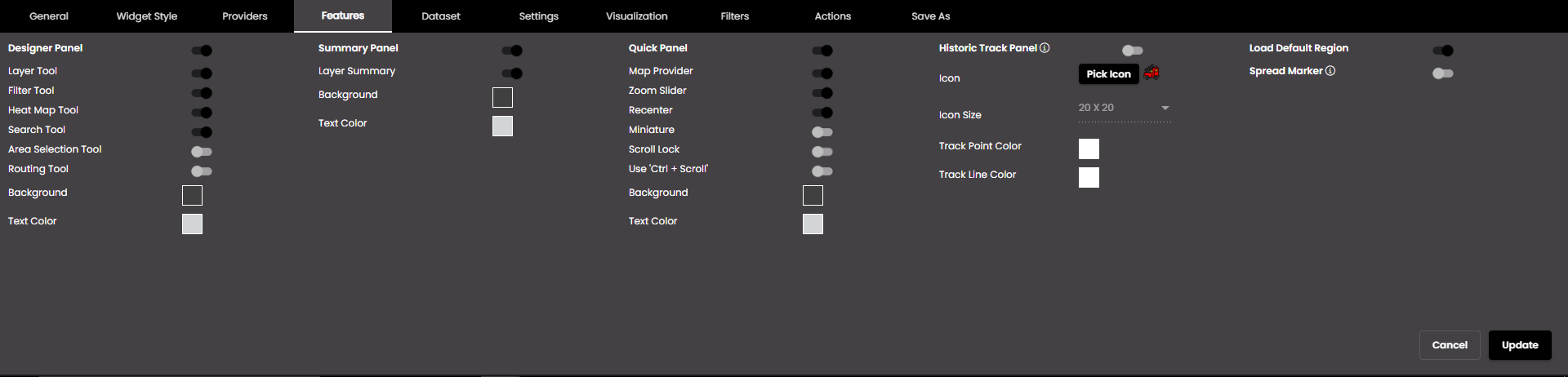
In the widget configuration dialog box, click the Features tab.
Change the settings as required:
Setting
Description
Designer Panel
Displays the Designer floating panel.
Layer Tool
Displays a tool on the Designer Panel to enable you to select which layer(s) should be displayed.
Filter Tool
Displays a tool on the Designer Panel to enable you to filter markers that are displayed, according to filters that you have set up on the Filters tab.
Heatmap Tool
Displays a tool on the Designer Panel to enable you to display heat maps that you have set up on the Visualization tab.
Search Tool
Displays a tool on the Designer Panel to enable you to find markers using the search parameters that you have set up on the Settings tab.
Area Selection Tool
Displays a tool on the Designer Panel to enable you to select multiple markers by clicking and dragging to draw a polygon or rectangle that contains the desired markers in that area. The options are as follows:
Polygonal Selection - enables you to draw a polygon to select the desired markers.
Rectangular Selection - enables you to draw a rectangle to select the desired markers.
Routing Tool
Displays a tool on the Designer Panel to enable you to view the shortest route on the map based on the locations that you select in the Start and Destination fields and via locations if they are added.
Alternate Route
Displays the alternate routes between the locations that you select in the Start and Destination fields and via locations if they are added.
Tool Background
The background color of the tools on the Designer Panel.
You can select any of the following color types to be displayed along with the transparency:
Solid - A single color to be displayed all over.
Linear - Multiple colors are used, where one color gradually fades and changes into another color, linearly.
The following options are available for the Linear color type:
You can select the colors to be displayed in an area of the background by clicking on the color strip and can remove the color selected by clicking on the
 icon.
icon.You can set the direction of the color progression from left to right or center or top to bottom.
Radial - Multiple colors are used, where one color gradually fades and changes into another color, radially.
The following options are available for the Radial color type:
You can select the colors to be displayed in an area of the background by clicking on the color strip and can remove the color selected by clicking on the
icon.You can set the direction of the color progression from left to right or center or top to bottom.
Also, based on the Palette in the Widget Style tab, a set of Preset colors are available to directly choose from, which if selected, change based on the theme.
Tool Text color
The text color of the tools on the Designer Panel.
Also, based on the Palette in the Widget Style tab, a set of Preset colors are available to directly choose from, which if selected, change based on the theme.
Summary Panel
Displays the Summary floating panel.
Layer Summary
Displays a summary on the Summary Panel of the markers on each layer that has been selected using the Layer Tool, including the number of markers on the layer and any filters that have been set up.
Tool Background
The background color of the tools on the Summary Panel.
You can select any of the following color types to be displayed along with the transparency:
Solid - A single color to be displayed all over.
Linear - Multiple colors are used, where one color gradually fades and changes into another color, linearly.
The following options are available for the Linear color type:
You can select the colors to be displayed in an area of the background by clicking on the color strip and can remove the color selected by clicking on the
icon.You can set the direction of the color progression from left to right or center or top to bottom.
Radial - Multiple colors are used, where one color gradually fades and changes into another color, radially.
The following options are available for the Radial color type:
You can select the colors to be displayed in an area of the background by clicking on the color strip and can remove the color selected by clicking on the
icon.You can set the direction of the color progression from left to right or center or top to bottom.
Also, based on the Palette in the Widget Style tab, a set of Preset colors are available to directly choose from, which if selected, change based on the theme.
Tool Text color
The text color of the tools on the Summary Panel.
Also, based on the Palette in the Widget Style tab, a set of Preset colors are available to directly choose from, which if selected, change based on the theme.
Quick Panel
Displays the Quick floating panel.
Zoom Slider
Displays a slider control on the Quick Panel for controlling the magnification.
Map Provider
Displays icons on the Quick Panel to enable you to select one of the default map providers that you have set up on the Providers tab.
Recenter
Displays an icon to recenter the map to the selected Region.
Miniature
Displays icons to Zoom In, Zoom Out and recenter the map to the selected Region
Scroll Lock
Displays a static map that can be visualized without any zooming of the map when scrolling the dashboard. It can be enabled only if Use 'Ctrl+Scroll' is disabled.
Use 'Ctrl+Scroll'
Prevents the map from zooming in when the scrolling the dashboard. In order to zoom in the map, use 'Ctrl+Scroll'. It can be enabled only if Scroll Lock is disabled.
Tool Background
The background color of the tools on the Quick Panel.
You can select any of the following color types to be displayed along with the transparency:
Solid - A single color to be displayed all over.
Linear - Multiple colors are used, where one color gradually fades and changes into another color, linearly.
The following options are available for the Linear color type:
You can select the colors to be displayed in an area of the background by clicking on the color strip and can remove the color selected by clicking on the
icon.You can set the direction of the color progression from left to right or center or top to bottom.
Radial - Multiple colors are used, where one color gradually fades and changes into another color, radially.
The following options are available for the Radial color type:
You can select the colors to be displayed in an area of the background by clicking on the color strip and can remove the color selected by clicking on the
icon.You can set the direction of the color progression from left to right or center or top to bottom.
Also, based on the Palette in the Widget Style tab, a set of Preset colors are available to directly choose from, which if selected, change based on the theme.
Tool Text color
The text color of the tools on the Quick Panel.
Also, based on the Palette in the Widget Style tab, a set of Preset colors are available to directly choose from, which if selected, change based on the theme.
Historic Track Panel
Displays the historical route of vehicles and the Historic Track floating panel
Note
The selected icon and track configuration will be applied to all the layers.
Refresh the dashboard if this Historic Track Panel is toggled for better results.
Icon
The icon that is used for the marker. The option is as follows:
Icon Picker Enables you to select an icon from a pop-up by clicking ICON.
Icon Size
Enables you to upload configurable size icons in the following sizes
16*16
20*20
24*24
32*32
48*48
64*64
128*128
256*256
512*512
Track Point Color
The color of the track points in the path of the vehicle.
Also, based on the Palette in the Widget Style tab, a set of Preset colors are available to directly choose from, which if selected, change based on the theme.
Track Line Color
The color of the track lines in the path of the vehicle.
Also, based on the Palette in the Widget Style tab, a set of Preset colors are available to directly choose from, which if selected, change based on the theme.
Load Default Region
Displays the outline on the map of the default Region.
Note
Regions are set up under Menu > Admin Panel > Definitions.
Spread Marker
Spreads out the markers if they are overlapped. The markers are displayed at a certain radius around the location point so that they can be selected and actions can be performed on them.
Note
It will not be applied for high performance datasets or when the Zone of Influence/Strength is enabled in the Visualization tab.
Re-enable the layer or refresh the dashboard for the markers to be spread.
Click Update.