Configure chart widget data series
A chart widget contains one or more data series. A data series is a plot of data on the y-axis that is dependent on values on the x-axis. For example, a series may be a plot of average light intensity on the y-axis that is dependent on date on the x-axis. If the dataset contains several fields, you could have a series for each field. You can configure which series are displayed and how they appear.
Tip
For some visualizations, the x-axis may be vertical and the y-axis horizontal. However, the x-axis always represents the independent variable and the y-axis always represents the dependent variable(s).
If the widget configuration dialog box is not already open, do as follows:
If the widget is on a Grid layout dashboard, click the Menu icon
 in the top right-hand corner of the widget and select Settings.
If the widget is on a Fluid layout dashboard, on the floating toolbar for the widget, click the Settings icon:
.
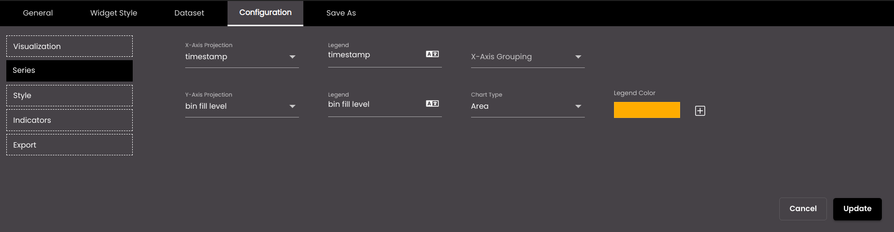
Click the Configuration tab.
On the left-hand side, click Series.
A list of all the series is displayed. The first time that you configure the series, there is a series for each field in the dataset.
To delete a series that you don't want to display, click the trash icon
 to the right of the series.
To add a series, click the plus icon
 to the right of the last series in the list.
Note
For pie charts, you should have just two series, one of which is the independent variable. Then the pie chart displays a slice of the pie for each value of the dependent variable. For example, if you have a series for dates and a series for humidity on each date, the pie chart displays a slice for each date, whose size corresponds to the value of the humidity on that date.
For each series, change the settings as required. For pie charts, only Axis Projection is available:
Setting
Description
X-Axis Projection
The dataset field that is used for the independent variable.
X-Axis Grouping
The dataset field whose values are grouped together with each value of the X-Axis Projection. For example, if X-Axis Projection is the year and X-Axis Grouping is the quarter within each year, the chart may look like this:
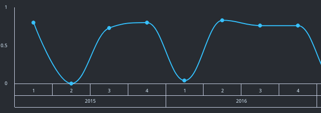
In the example, the four quarters are grouped together with a single year.
Y-Axis Projection
The dataset field that is used for a dependent variable.
Axis Projection (pie chart only)
The dataset field that is used for the independent variable or a dependent variable.
Legend
The name of the series that is displayed alongside the chart, usually underneath.
You can also translate this text by clicking on the Translate icon
 and entering the translation of the desired language selected. Auto-suggestions are also available where the reused contents are auto-suggested.
Chart Type (not available if the overall visualization is Bubble)
The visualization that applies to the series. You can choose a different setting to the overall visualization for the widget. For example, if the overall visualization is Line, you could change the visualization for one of the series to Area, so that the area under the line is filled in, just for that series.
Choose Color
The color that is used to represent the series. A default color is already selected for each series but you can change it.
You can select any of the following color types to be displayed along with the transparency:
Solid - A single color to be displayed all over.
Linear - Multiple colors are used, where one color gradually fades and changes into another color, linearly.
The following options are available for the Linear color type:
You can select the colors to be displayed in an area of the background by clicking on the color strip and can remove the color selected by clicking on the
 icon.
icon.You can set the direction of the color progression from left to right or center or top to bottom.
Radial - Multiple colors are used, where one color gradually fades and changes into another color, radially.
The following options are available for the Radial color type:
You can select the colors to be displayed in an area of the background by clicking on the color strip and can remove the color selected by clicking on the
icon.You can set the direction of the color progression from left to right or center or top to bottom.
Pie charts use a different color for each slice of the pie. They don't use the colors that are used to represent the series.
Z-Axis Projection
The dataset field that is plotted on the z-axis. The sizes of the values of this field determine how big the bubbles appear on the chart.
Click Save.