Configure advanced chart widget editor
You can configure the visualization of the data in the advanced chart widget.
If the widget configuration dialog box is not already open, do as follows:
If the widget is on a Grid layout dashboard, click the Menu icon
 in the top right-hand corner of the widget and select Settings.
If the widget is on a Fluid layout dashboard, on the floating toolbar for the widget, click the Settings icon:
.
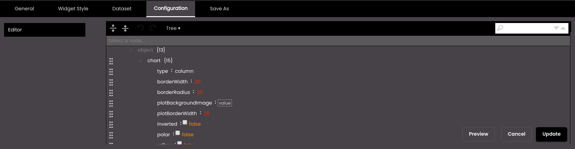
In the widget configuration dialog box, click the Configuration tab.
On the left-hand side, click Editor.
At the top of the editor, you can select the format in which you would like the JSON data to be displayed. The formats are as follows:
Format
Description
Code
The data is displayed in code. You can edit and copy the existing data as well as copy external data to the editor. Click on the Format JSON data and Compact JSON data buttons, to change the JSON display structure.
Text
The data is displayed in raw text format. You can edit and copy the existing data as well as copy external data to the editor. Click on the Format JSON data and Compact JSON data buttons, to change the JSON display structure.
Tree
The data is displayed in a hierarchical JSON structure. You can only edit the existing data and can click on an individual field in the structure to expand or collapse it, or you can click on the Expand all fields or Collapse all fields buttons. A drag option
 is available for each field which you can use to reorder them. To search for specific attributes or values, enter text in the search box on the top right, press the search icon, then use the next/previous buttons to iterate through the results:
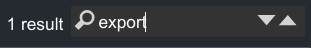
View
The data is displayed in a hierarchical JSON structure. You can only view the existing data and can click on an individual field in the structure to expand or collapse it, or you can click on the Expand all fields or Collapse all fields buttons. To search for specific attributes or values, enter text in the search box on the top right, press the search icon, then use the next/previous buttons to iterate through the results:
For example, you can select the Code option and modify the JSON data as shown in the snippet below:
By default, exporting is disabled for the advanced chart.
{
	"subtitle": {
		"exporting": {
			"enabled": false,
			"sourceHeight": 0,
			"sourceWidth": 0,
			"scale": 0
		}
	}
}
You can set the
enabledattribute totrueto enable exporting as shown below.{ "subtitle": { "exporting": { "enabled": true, "sourceHeight": 0, "sourceWidth": 0, "scale": 0 } } }Similarly, you can modify the JSON data in the editor as required to create your own advanced chart.
You can sort the values in a tooltip by setting the
sortattribute intooltiptodescfor descending orascfor ascending.You can scroll within the tooltip by setting the
scrollattribute intooltiptotrue.You can display the numeric values in short forms such as the following by setting the
shortNumberFormatattribute indataLabelstotrue.K - Thousand. Eg: 1,000 is represented as 1K.
M - Million. Eg: 1,000,000 is represented as 1M.
B - Billion. Eg: 1,000,000,000 is represented as 1B.
You can modify the x and y axes properties or attributes under
xAxisandyAxisand they will be applied accordingly. For example, ifrotationattribute is set to45underlabelsattribute inxAxisthen the x-axis labels will be displayed at an angle of 45 degrees.Also, to add a prefix or suffix to the values in a tooltip you can set them in the
pointFormatattribute.
These operations can be performed in a tooltip as illustrated in the code snippet below.
{
	"plotOptions": {
		"area": {
			"stacking": "normal"
		},
		"bar": {
			"borderColor": "transparent"
		},
		"areaspline": {
			"stacking": "normal"
		},
		"series": {
			"dataLabels": {
				"color": "#DBEFFF",
				"useHTML": true,
				"format": "{point.y} ({point.custom})",
				"style": {
					"fontSize": "12px"
				},
				"enabled": false
			},
			"marker": {
				"symbol": "circle",
				"enabled": false
			},
			"animation": false
		},
		"column": {
			"borderColor": "transparent"
		}
	},
	"xAxis": {
		"gridLineColor": "#fff",
		"tickWidth": 0,
		"visible": true,
		"gridLineWidth": 0,
		"tickColor": "#fff",
		"opposite": false,
		"title": {
			"style": {
				"fontSize": "14px",
				"fontStyle": "",
				"fontWeight": ""
			}
		},
		"reversed": false,
		"lineWidth": 1,
		"gridLineDashStyle": "Solid",
		"labels": {
			"style": {
				"fontFamily": "Calibri",
				"color": "#000",
				"fontSize": "12px"
			}
		}
	},
	"exporting": {
		"sourceWidth": 0,
		"scale": 0,
		"sourceHeight": 0,
		"enabled": false
	},
	"data": {
		"switchRowsAndColumns": false,
		"csv": "",
		"firstRowAsNames": true,
		"firstColumnAsNames": true
	},
	"accessibility": {
		"enabled": false
	},
	"legend": {
		"layout": "horizontal",
		"verticalAlign": "bottom",
		"borderRadius": 0,
		"floating": false,
		"borderWidth": 0,
		"x": 0,
		"y": 0,
		"itemStyle": {
			"color": "#000",
			"fontSize": 12
		},
		"align": "center",
		"enabled": true
	},
	"tooltip": {
		"shared": true,
		"backgroundColor": "rgba(255,255,255, 1)",
		"pointFormat": "<div style=\"color: {point.color}\"><b>{series.name}:</b> <b  style=\"color: {point.color}\">{point.y}</b> ({point.custom})</b></div>",
		"scroll": true,
		"style": {
			"fontFamily": "Calibri",
			"fontSize": "14px"
		},
		"sort": "desc",
		"enabled": true
	},
	"title": {
		"style": {
			"color": ""
		},
		"text": ""
	},
	"colors": [
		"#2f7ed8",
		"#0d233a",
		"#8bbc21",
		"#910000",
		"#1aadce",
		"#492970",
		"#f28f43",
		"#77a1e5",
		"#c42525",
		"#a6c96a",
		"#2f7ed8",
		"#492970",
		"#f28f43",
		"#77a1e5",
		"#c42525",
		"#a6c96a",
		"#4f90c8ff",
		"#21639bff",
		"#a6d6ffff",
		"#10b85eff",
		"#bc3fedff",
		"#d2d2d2ff",
		"#e21818ff",
		"#19cc38ff",
		"#1d16dfff"
	],
	"yAxis": {
		"gridLineColor": "#fff",
		"visible": true,
		"max": null,
		"tickColor": "#fff",
		"lineColor": "#fff",
		"opposite": false,
		"title": {
			"style": {
				"fontSize": "14px",
				"fontStyle": "",
				"fontWeight": ""
			},
			"text": ""
		},
		"lineWidth": 1,
		"labels": {
			"rotation": 0,
			"format": ""
		},
		"tickWidth": 0,
		"gridLineWidth": 0,
		"min": null,
		"gridLineDashStyle": "Solid",
		"reversed": false
	},
	"credits": {
		"enabled": false
	},
	"subtitle": {
		"style": {
			"color": "#fff"
		},
		"text": ""
	},
	"chart": {
		"polar": false,
		"backgroundColor": "transparent",
		"borderColor": "",
		"alignTicks": true,
		"reflow": false,
		"type": "line",
		"plotBorderWidth": 0,
		"animation": true,
		"options3d": {
			"alpha": 0,
			"enabled": false,
			"beta": 0
		},
		"borderRadius": 0,
		"borderWidth": 0,
		"plotBackgroundImage": "",
		"styledMode": false,
		"style": {},
		"inverted": false
	}
}
Note
In order to add a % value in the tooltip for example, 1%, you must select a JSON dataset. This dataset must contain the
customattribute and it must be without any hierarchy as shown below.{ "categories": [ "20 Nov", "21 Nov", "22 Nov", "23 Nov", "24 Nov", "25 Nov", "26 Nov", "27 Nov", "28 Nov", "29 Nov", "30 Nov", "01 Dec", "02 Dec", "03 Dec" ], "series": [{ "name": "Mumbai", "data": [{ "y": 8973, "custom": "1%" }, { "y": 9973, "custom": "1%" }, { "y": 10973, "custom": "1%" }, { "y": 11973, "custom": "1%" }, { "y": 12973, "custom": "1%" }, { "y": 13973, "custom": "1%" }, { "y": 14973, "custom": "1%" }, { "y": 15973, "custom": "1%" } ] }, { "name": "Pune", "data": [{ "y": 8231, "custom": "1%" }, { "y": 9231, "custom": "1%" }, { "y": 10231, "custom": "1%" }, { "y": 11231, "custom": "1%" }, { "y": 12231, "custom": "1%" }, { "y": 13231, "custom": "1%" }, { "y": 14231, "custom": "1%" }, { "y": 15231, "custom": "1%" } ] }, { "name": "Thane", "data": [{ "y": 5501, "custom": "1%" }, { "y": 6501, "custom": "1%" }, { "y": 7501, "custom": "1%" }, { "y": 8501, "custom": "1%" }, { "y": 9501, "custom": "1%" }, { "y": 10501, "custom": "1%" }, { "y": 11501, "custom": "1%" }, { "y": 12501, "custom": "1%" } ] } ] }
You can also scroll within the widget by setting the
scrollattribute inchartstotrueas illustrated in the code snippet below.{ "plotOptions": { "area": { "stacking": "normal" }, "bar": { "borderColor": "transparent" }, "areaspline": { "stacking": "normal" }, "series": { "dataLabels": { "color": "#000000", "useHTML": true, "style": { "fontFamily": "Calibri", "fontSize": "12px", "align": "right" }, "enabled": true }, "marker": { "enabled": false }, "animation": false }, "column": { "borderColor": "transparent" } }, "xAxis": { "gridLineColor": "#fff", "tickWidth": 0, "visible": true, "gridLineWidth": 0, "tickColor": "#fff", "opposite": false, "title": { "style": { "fontFamily": "Calibri", "fontSize": "9px", "fontWeight": "" } }, "reversed": true, "lineWidth": 1, "gridLineDashStyle": "Solid", "labels": { "rotation": 0, "format": "" } }, "exporting": { "sourceWidth": 0, "scale": 0, "sourceHeight": 0, "enabled": false }, "data": { "switchRowsAndColumns": false, "csv": "", "firstRowAsNames": true, "firstColumnAsNames": true }, "accessibility": { "enabled": false }, "legend": { "layout": "horizontal", "verticalAlign": "bottom", "borderRadius": 0, "floating": false, "borderWidth": 0, "x": 0, "y": 0, "itemStyle": { "color": "#5d88ad", "fontSize": 12 }, "align": "center", "enabled": false }, "tooltip": { "shared": true, "useHTML": true, "pointFormat": "<div style=\"color: {point.color}\"><b>{series.name}:</b> <b style=\"color: {point.color}\">{point.y}</b></div>", "style": { "fontFamily": "Calibri", "color": "#000", "fontSize": "13px" }, "enabled": true }, "title": { "style": { "color": "" }, "text": "" }, "colors": [ "#ca9b14", "#8bbc21", "#bfdfffff", "#0d233a", "#910000", "#1aadce", "#492970", "#f28f43", "#77a1e5", "#c42525", "#a6c96a" ], "yAxis": { "gridLineColor": "#fff", "visible": false, "max": null, "tickColor": "#fff", "lineColor": "rgba(0,255,255, 0.1)", "opposite": false, "title": { "style": { "fontSize": "14px", "fontStyle": "", "fontWeight": "" } }, "lineWidth": 1, "labels": { "rotation": 0, "format": "" }, "tickWidth": 0, "gridLineWidth": 0, "min": null, "gridLineDashStyle": "Solid", "reversed": false }, "credits": { "enabled": false }, "subtitle": { "style": { "color": "#fff" }, "text": "" }, "chart": { "polar": false, "backgroundColor": "transparent", "borderColor": "", "alignTicks": true, "reflow": false, "scroll": true, "type": "bar", "plotBorderWidth": 0, "animation": true, "options3d": { "alpha": 0, "enabled": false, "beta": 0 }, "borderRadius": 0, "borderWidth": 0, "plotBackgroundImage": "", "styledMode": false, "style": {}, "inverted": false } }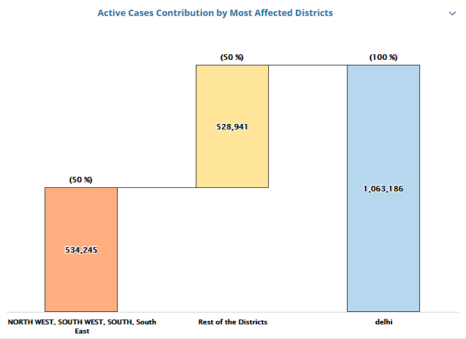
The support of a 'waterfall' chart type has also been introduced which can be achieved by using a JSON dataset and a particular format as illustrated in the code snippet below.
{
	"plotOptions": {
		"area": {
			"stacking": "normal"
		},
		"bar": {
			"borderColor": "transparent"
		},
		"areaspline": {
			"stacking": "normal"
		},
		"series": {
			"dataLabels": [{
					"color": "black",
					"format": "{point.y:.,f}",
					"align": "center",
					"inside": true,
					"enabled": true
				},
				{
					"color": "black",
					"format": "({point.percent} %)",
					"align": "center",
					"inside": false,
					"enabled": true
				}
			],
			"dashStyle": "solid",
			"marker": {
				"enabled": false
			},
			"animation": false
		},
		"column": {
			"borderColor": "transparent"
		}
	},
	"xAxis": {
		"gridLineColor": "#fff",
		"visible": true,
		"tickColor": "#fff",
		"opposite": false,
		"type": "category",
		"title": {
			"style": {
				"fontSize": "14px",
				"fontWeight": "Bold"
			}
		},
		"lineWidth": 1,
		"enabled": true,
		"labels": {
			"rotation": 0,
			"style": {
				"padding": 5,
				"whiteSpace": "wrap",
				"color": "#000000",
				"fontSize": "10px",
				"textOverflow": "none",
				"fontWeight": "bold"
			}
		},
		"tickWidth": 0,
		"gridLineWidth": 0,
		"reversed": false,
		"gridLineDashStyle": "Solid"
	},
	"exporting": {
		"sourceWidth": 0,
		"scale": 0,
		"sourceHeight": 0,
		"enabled": false
	},
	"data": {
		"switchRowsAndColumns": false,
		"csv": "",
		"firstRowAsNames": true,
		"firstColumnAsNames": true
	},
	"accessibility": {
		"enabled": false
	},
	"legend": {
		"layout": "horizontal",
		"verticalAlign": "bottom",
		"borderRadius": 0,
		"floating": false,
		"borderWidth": 0,
		"x": 0,
		"y": 0,
		"itemStyle": {
			"color": "#5d88ad",
			"fontSize": 12
		},
		"align": "center",
		"enabled": false
	},
	"tooltip": {
		"shared": true,
		"pointFormat": "<br/><div style=\"color:{point.color}\">● {series.name}:<span style=\"font-weight:bold;color:{point.color}\">{point.y}</span></div>",
		"enabled": true
	},
	"title": {
		"style": {
			"color": ""
		},
		"text": ""
	},
	"colors": [
		"#2f7ed8",
		"#0d233a",
		"#8bbc21",
		"#910000",
		"#1aadce",
		"#492970",
		"#f28f43",
		"#77a1e5",
		"#c42525",
		"#a6c96a"
	],
	"yAxis": {
		"gridLineColor": "#fff",
		"visible": false,
		"max": null,
		"tickColor": "#fff",
		"lineColor": "#ccd6eb",
		"opposite": false,
		"title": {
			"style": {
				"fontSize": "14px",
				"fontStyle": "",
				"fontWeight": ""
			},
			"enabled": false
		},
		"lineWidth": 1,
		"labels": {
			"rotation": 0,
			"format": ""
		},
		"tickWidth": 0,
		"gridLineWidth": 0,
		"min": null,
		"gridLineDashStyle": "Solid",
		"reversed": false
	},
	"credits": {
		"enabled": false
	},
	"subtitle": {
		"style": {
			"color": "#fff"
		},
		"text": ""
	},
	"chart": {
		"polar": false,
		"backgroundColor": "transparent",
		"borderColor": "",
		"alignTicks": true,
		"reflow": false,
		"type": "waterfall",
		"plotBorderWidth": 0,
		"animation": true,
		"options3d": {
			"alpha": 0,
			"enabled": false,
			"beta": 0
		},
		"borderRadius": 0,
		"borderWidth": 0,
		"plotBackgroundImage": "",
		"styledMode": false,
		"style": {},
		"inverted": false
	}
}
Click Preview to view the result of your changes. This option only allows you to preview your changes without saving them.
Click Update once you are satisfied with the changes that you have done. The advanced chart is saved and displays your customization accordingly.