Configure datagrid widget row actions
You can configure the selection of rows in the datagrid widget and raise events based on the selection.
If the widget configuration dialog box is not already open, do as follows:
If the widget is on a Grid layout dashboard, click the Menu icon
 in the top right-hand corner of the widget and select Settings.
If the widget is on a Fluid layout dashboard, on the floating toolbar for the widget, click the Settings icon:
.
Click the Configuration tab.
On the left-hand side, click Row Actions.
Change the settings as required:
Setting
Description
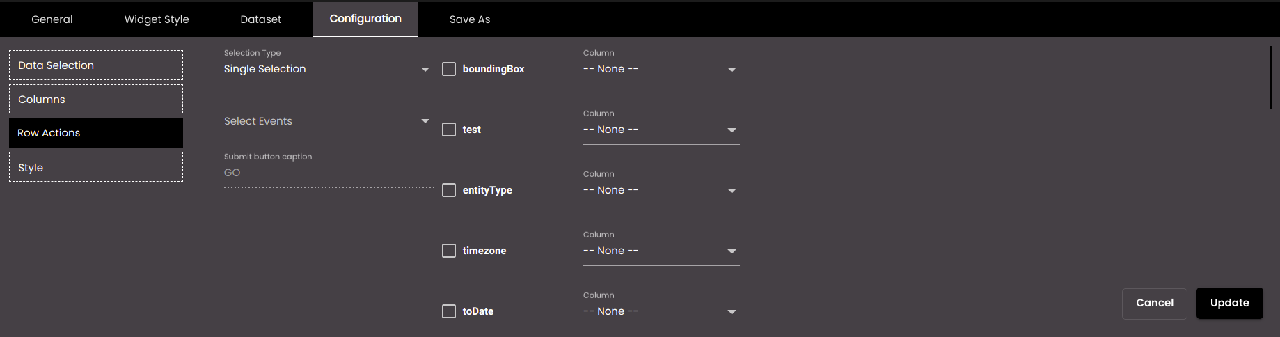
Selection Type
The type of selection of a row in the datagrid which can be one of the following:
None
Single Selection
Multi Selection
HTML Template
If the type selected in Selection Type is either Single or Multi Selection then configure the following settings:
Setting
Description
Select Events
The event(s) on which the widget information is updated. The default events are as follows:
MAP_ENTITY_CLICK The user clicks a marker on a map widget.
DASHBOARD.REGION_CHANGE_EVENT The user selects a different Region from the Region filter.
DASHBOARD.DATE_RANGE_CHANGE_EVENT The user selects a different time period from the Date filter.
TABLE.SELECT_ROW_EVENT The user selects a row in a datagrid widget.
DASHBOARD.LANG_CHANGE_EVENT The user selects a different language from the Language drop-down at the top of the main screen.
DASHBOARD.GENDER_CHANGE_EVENT The user selects a different gender from the Gender filter.
DASHBOARD.AGE_RANGE_CHANGE_EVENT The user selects a different age range from the Age Range filter.
DASHBOARD.GRANULARITY_CHANGE_EVENT The user selects a different granularity from the Granularity filter.
Submit button caption
The text of the submit button which is used to raise an event on selection of a row or rows in the widget.
Event Mapping
The parameter values that are passed when an event occurs. Select the parameter(s) that you want to pass and, for each one, select the column that would supply the value for the parameter.
On Load Trigger Event
If enabled, the event is immediately triggered with the selection when the widget is loaded. If it is enabled, Auto Trigger Event is displayed.
Auto Trigger Event
If enabled, the event is immediately triggered with the selection when the widget is first displayed. It is displayed when On Load Trigger Event is enabled.
Enable Submit Action (only for Multi Selection)
If enabled, the submit button is displayed which is used to raise an event after selection of a row or rows in the widget. If disabled, the submit button is not displayed and instead a short interval of 1.5 secs is given to select the required row or rows in the widget before the event is raised automatically.
Show Checkboxes (only for Multi Selection)
If enabled, displays the checkboxes in each row of the widget.
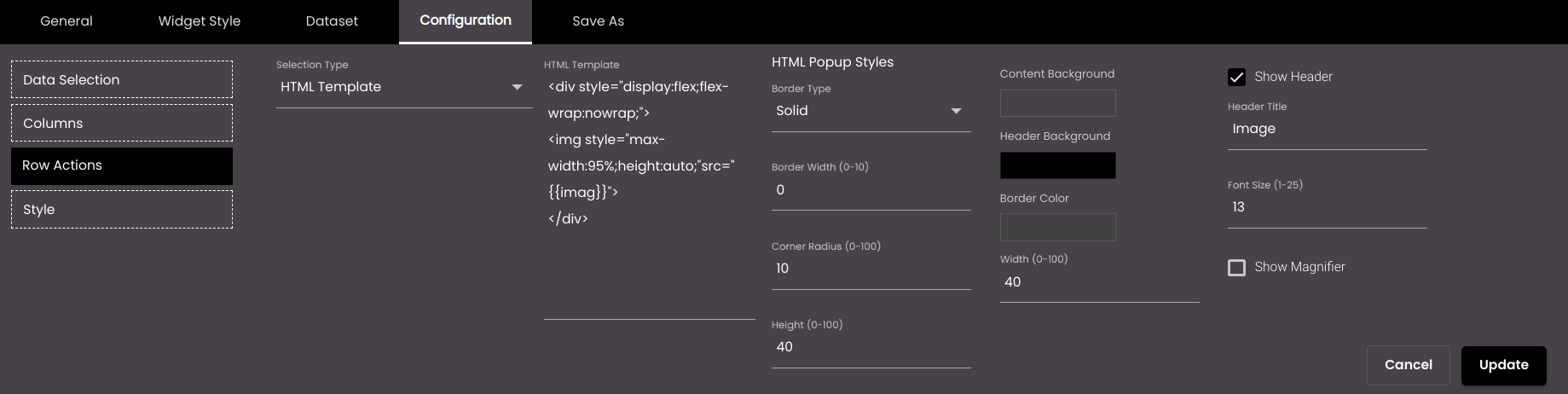
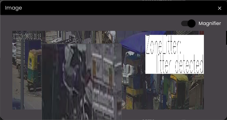
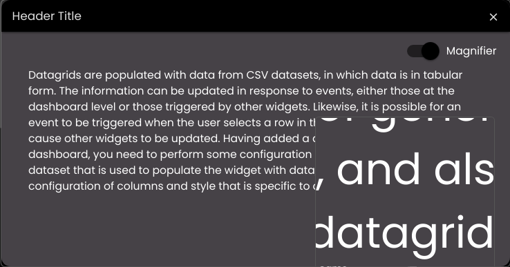
If the type selected in Selection Type is HTML Template then on clicking a row a dialog is displayed that shows the content of the HTML that you configure. The following are the configuration settings:
Setting
Description
HTML Template
The HTML formatted code to be displayed.
Border Type
The HTML dialog border type. It can be one of the following:
Solid
Dashed
Double
Dotted
Border Width
The width of the HTML dialog border.
Corner Radius
The HTML dialog corner radius.
Height(%)
The height of the HTML dialog in percentage.
Content Background
The color of the HTML content background.
Also, based on the Palette in the Widget Style tab, a set of Preset colors are available to directly choose from, which if selected, change based on the theme.
Header Background
The color of the header background.
Also, based on the Palette in the Widget Style tab, a set of Preset colors are available to directly choose from, which if selected, change based on the theme.
Border Color
The HTML dialog border color.
Also, based on the Palette in the Widget Style tab, a set of Preset colors are available to directly choose from, which if selected, change based on the theme.
Width(%)
The width of the HTML dialog in percentage.
Show Header
If enabled, it displays the header in the HTML dialog.
Header Title
The title of the header. It is displayed only when the Show Header option is enabled.
Font Size
The size of the header title in points.
Show Magnifier
If enabled, it displays the Magnifier toggle button in the HTML dialog and displays a magnifier over the image/text which helps to magnify a particular portion of the image/text to be able to see it clearly and get into its details .
Click Save.